AbleCoin - Accessible Web3 dApp
Project overview
The Product
AbleCoin.finance is a groundbreaking Web3 dApp designed to provide a fully accessible and inclusive experience for the crypto community. Our platform allows users to seamlessly buy, stake, and swap our new native token, AbleCoin (ABC), and other cryptocurrencies. With a mission to onboard users with disabilities into the world of DeFi, AbleCoin.finance is built from the ground up to meet and exceed AAA accessibility standards, featuring a user-friendly interface, robust keyboard navigation, and support for assistive technologies like screen readers and voice commands.
Project Duration
January 2024 - June 2024
The problem
The world of Web3 and cryptocurrency trading, while promising, remains largely inaccessible to a significant portion of the population. A research study revealed that an astounding 90% of people with disabilities are interested in crypto trading but are unable to participate due to a lack of accessible platforms. Existing dApps and trading websites fail to meet the diverse needs of users with physical, mental, and cognitive disabilities, creating a significant barrier to entry and a missed opportunity for the Web3 ecosystem.
The Goal
The primary goal of the AbleCoin project was to democratize access to the world of decentralized finance (DeFi). We set out to design and develop a Web3 dApp that is not only fully functional for buying, staking, and swapping cryptocurrencies but is also a beacon of accessibility. The aim was to create a great user experience that meets and exceeds the highest AAA accessibility standards, ensuring everyone, regardless of ability, can seamlessly onboard and engage with the Web3 space.
My Role
Accessibility Design, UX/UI Design, User Research, Design System Development, Brand Design & Marketing Materials, Responsive Web Design
Responsibilities
As a product designer, my responsibilities were multi-faceted and centered on creating a truly inclusive experience. I conducted extensive user research to understand the unique challenges faced by users with disabilities in the Web3 space. Throughout the process, I worked closely with accessibility experts and developers to ensure all design decisions met AAA standards. My work included designing and iterating on user flows, wireframes, and prototypes, while also developing a comprehensive design system focused on accessibility. I was responsible for creating high-fidelity mockups for the dApp, administrative panel, and the support website, and I also collaborated on the branding and marketing materials.
User Research Summary
Cognitive Overload
The complexity and visual clutter of Web3 interfaces are overwhelming, making it difficult for users with cognitive or developmental disabilities to understand and navigate.
Navigation Barriers
Most dApps lack robust keyboard navigation, and have small, poorly-defined clickable areas, creating significant barriers for users with physical motor disabilities or those who rely on screen readers.
Assistive Gaps
Existing platforms are not built to be compatible with assistive technologies like screen readers, voice commands, or specialized keyboards, rendering them unusable for a large segment of the population.
Visual Strain
Poor color contrast, lack of customizable font sizes, and complex visual layouts cause significant strain for users with low vision, visual impairments, or color blindness.
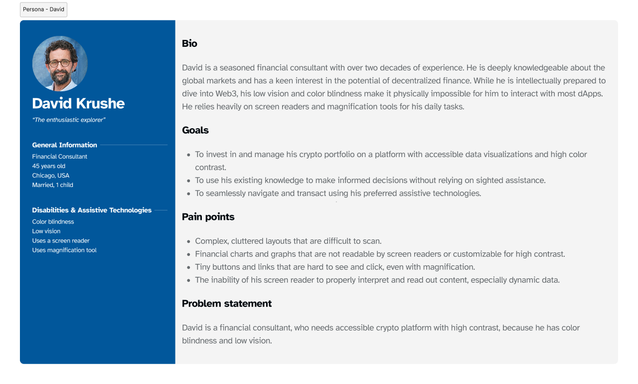
Personas
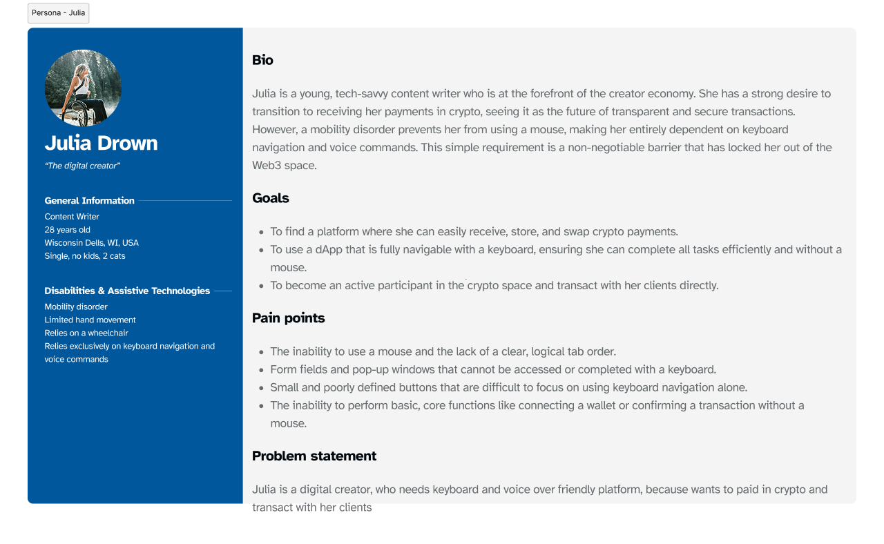
User flows
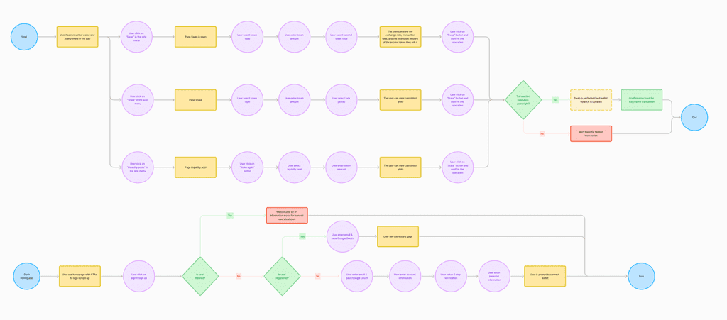
User Flows
The AbleCoin.finance dApp was a large-scale project designed to provide a comprehensive and deeply accessible experience from a user’s very first interaction. The user flows were meticulously crafted to accommodate the diverse needs of users like David and Julia, ensuring every step of the journey, from basic browsing to complex financial transactions, was intuitive and barrier-free. This holistic approach demonstrates the project’s ambition to go beyond a basic dApp and create a full ecosystem built on an “accessibility-first” foundation.
Guest User Flows
- Homepage & Onboarding: The initial entry point, allowing users to view content, explore the site’s functionality, and connect their crypto wallet.
- Account Creation: A streamlined sign-up process using O-Auth (Google, Apple, MetaMask) to create a new user account with minimal friction.
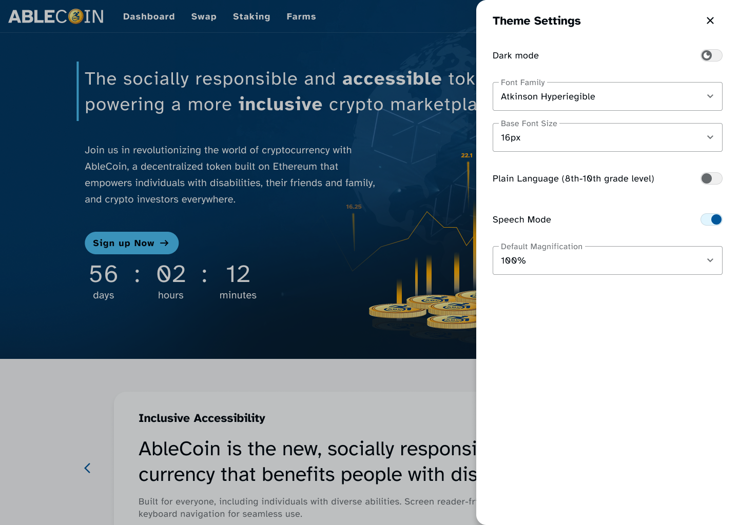
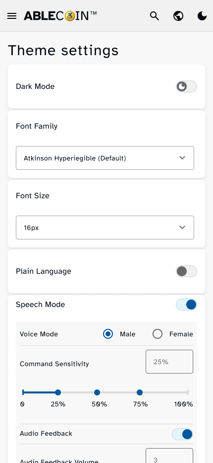
- Global Accessibility Settings: A persistent feature that allows guest users to customize their viewing experience, including font size, font type, magnification, and a plain language view.
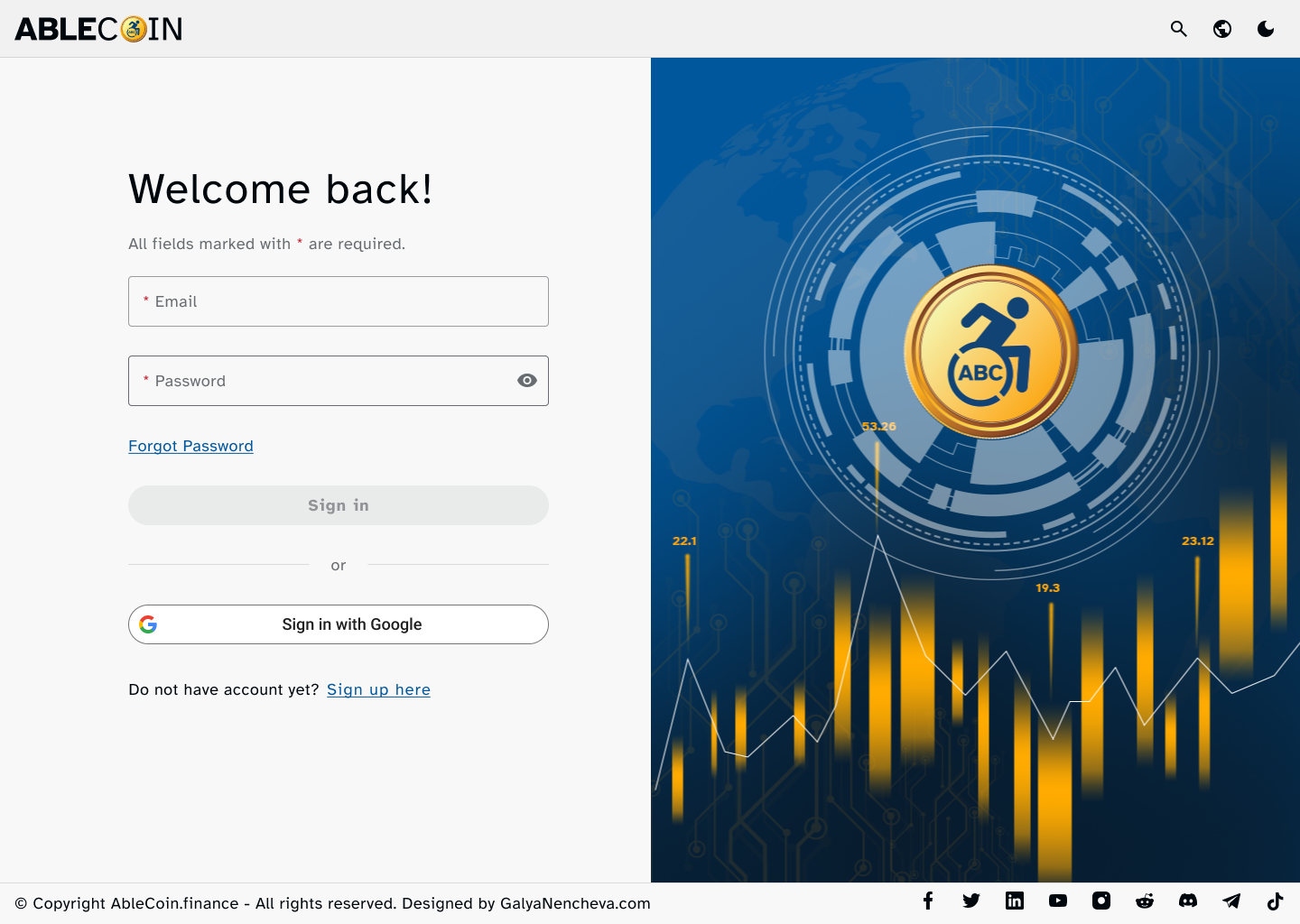
Authenticated User Flows
- Authentication: Includes a secure sign-in flow and a robust forgot password flow to ensure account access is always possible.
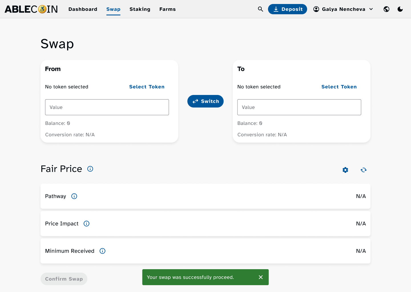
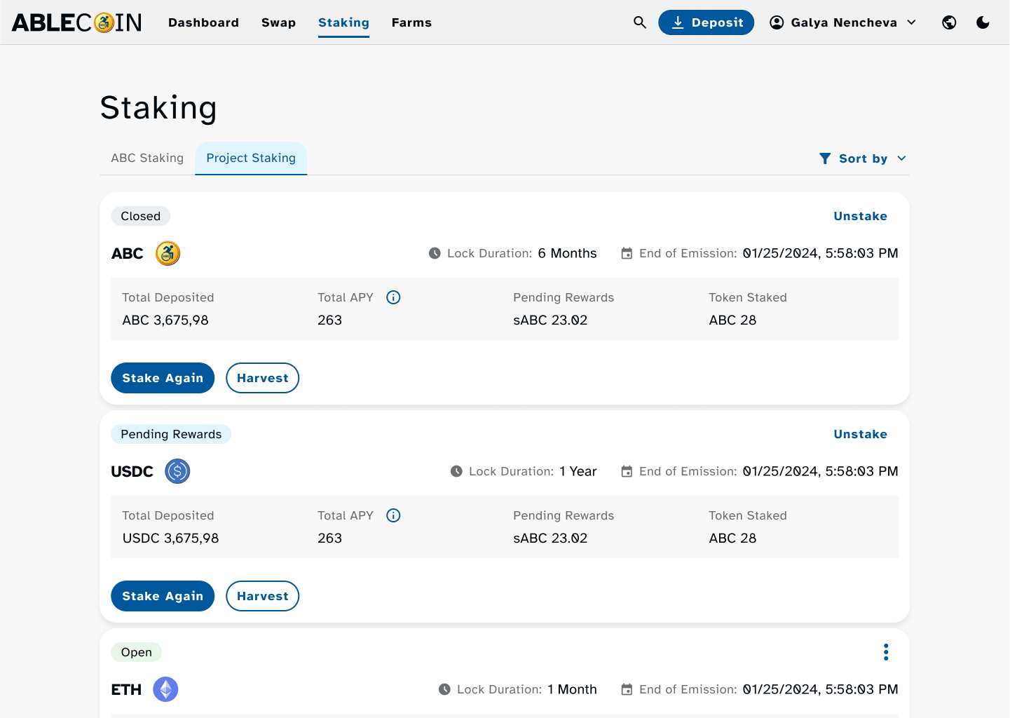
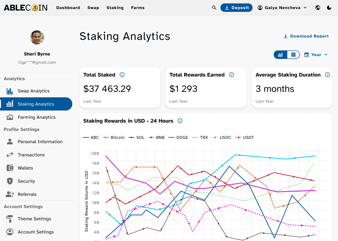
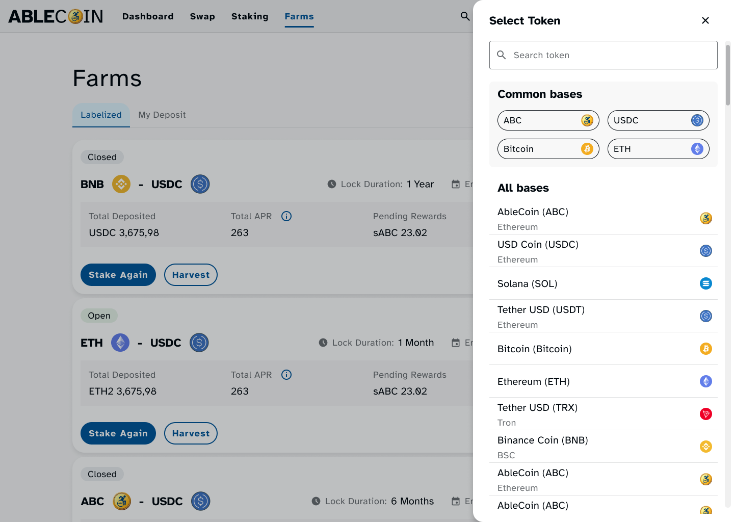
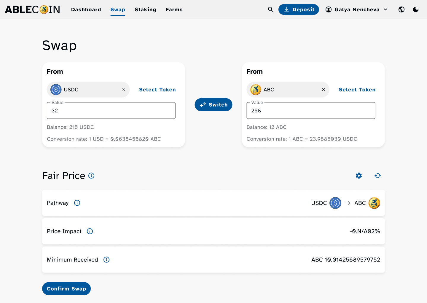
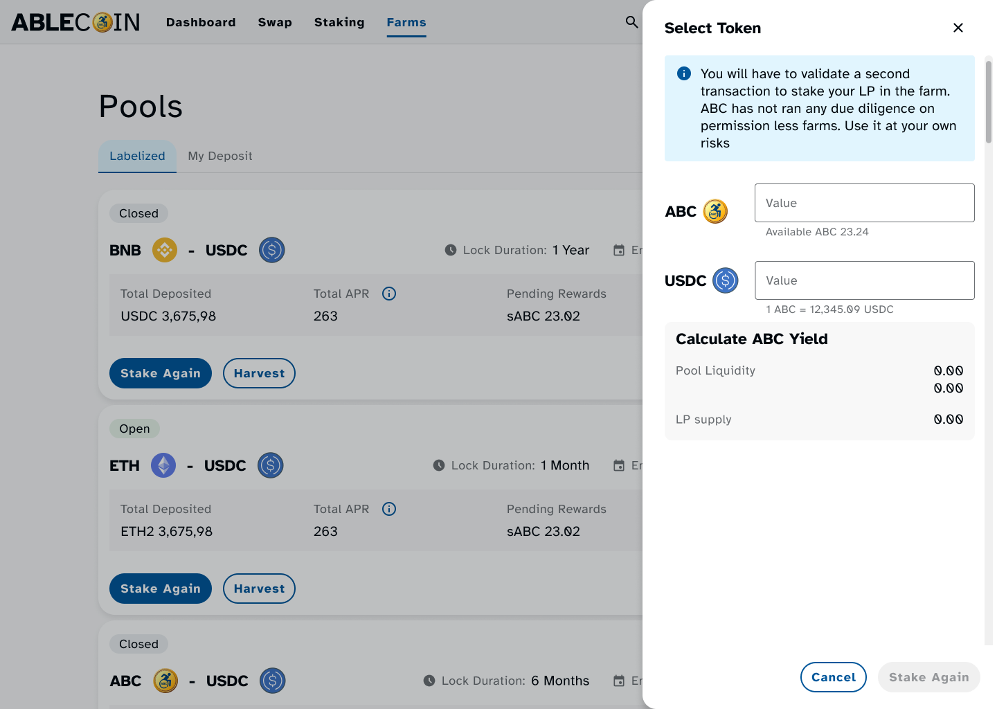
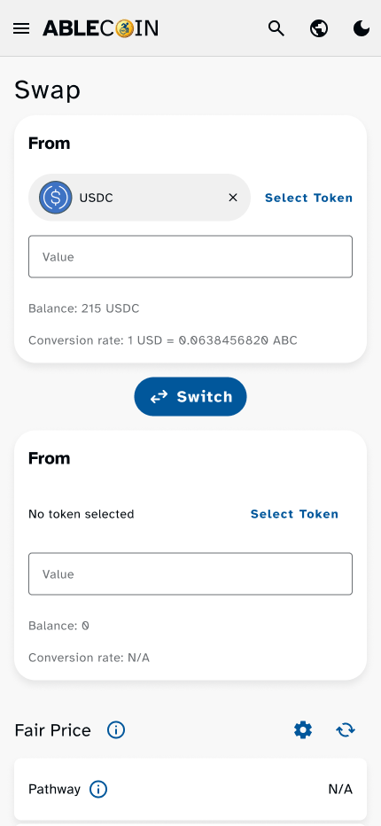
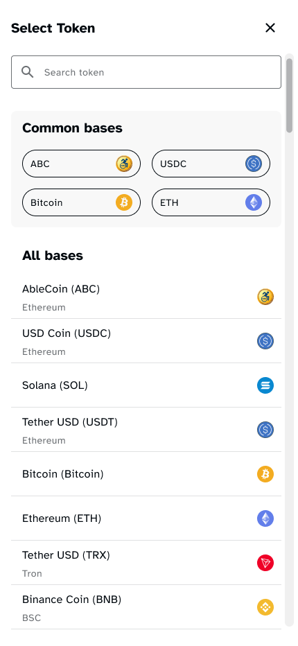
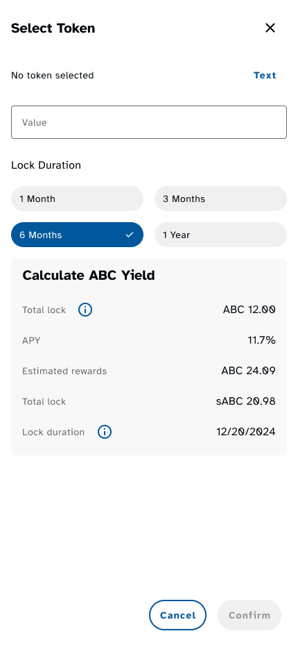
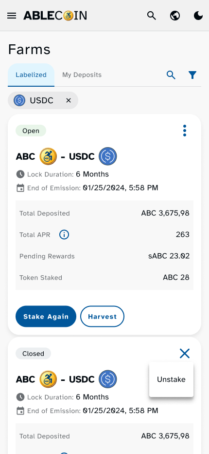
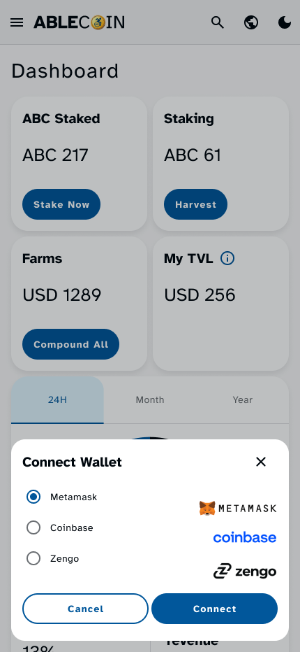
- Core DeFi Functionality: The heart of the dApp, including flows for swapping tokens, staking to earn rewards, and interacting with liquidity pools and farms.
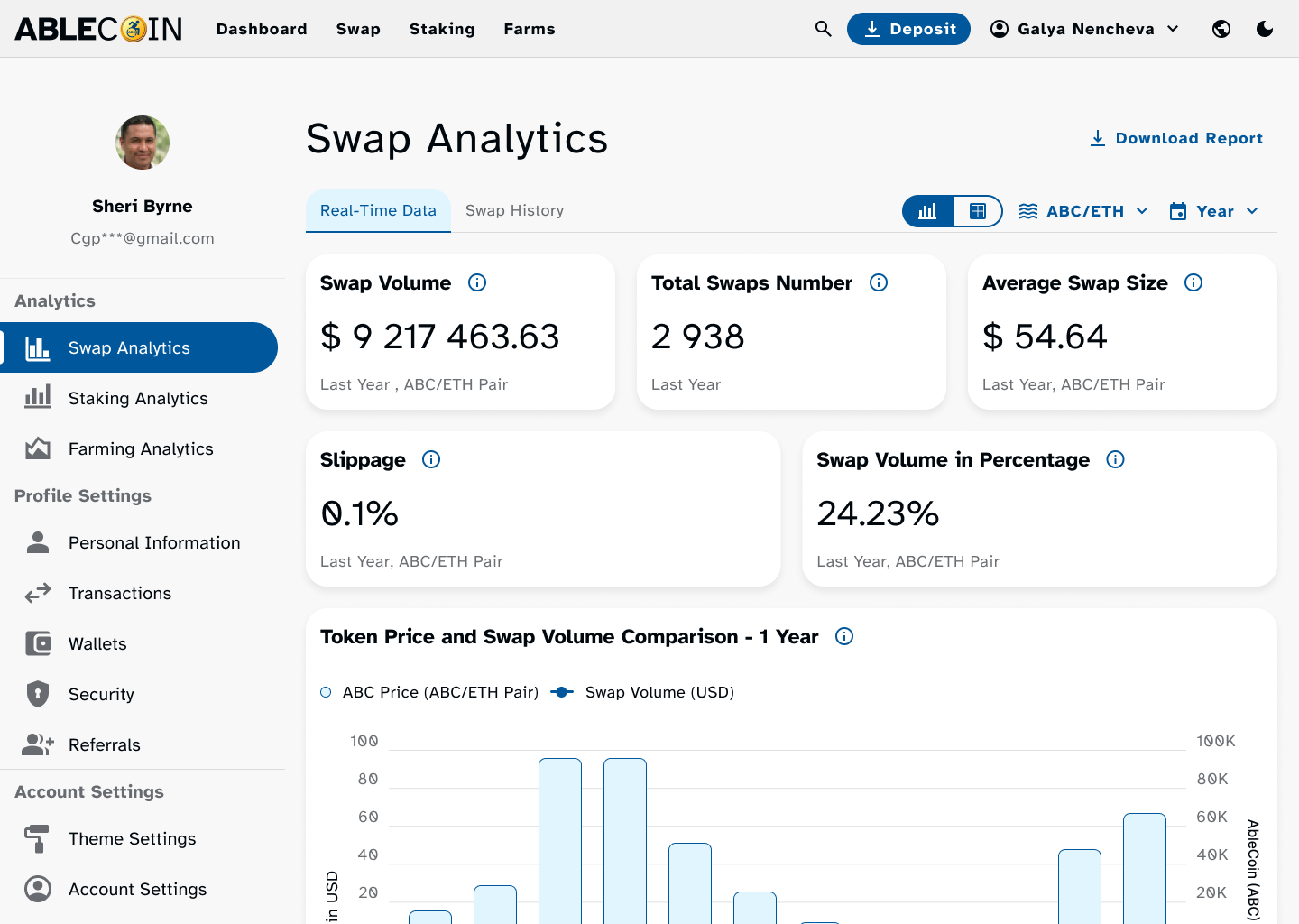
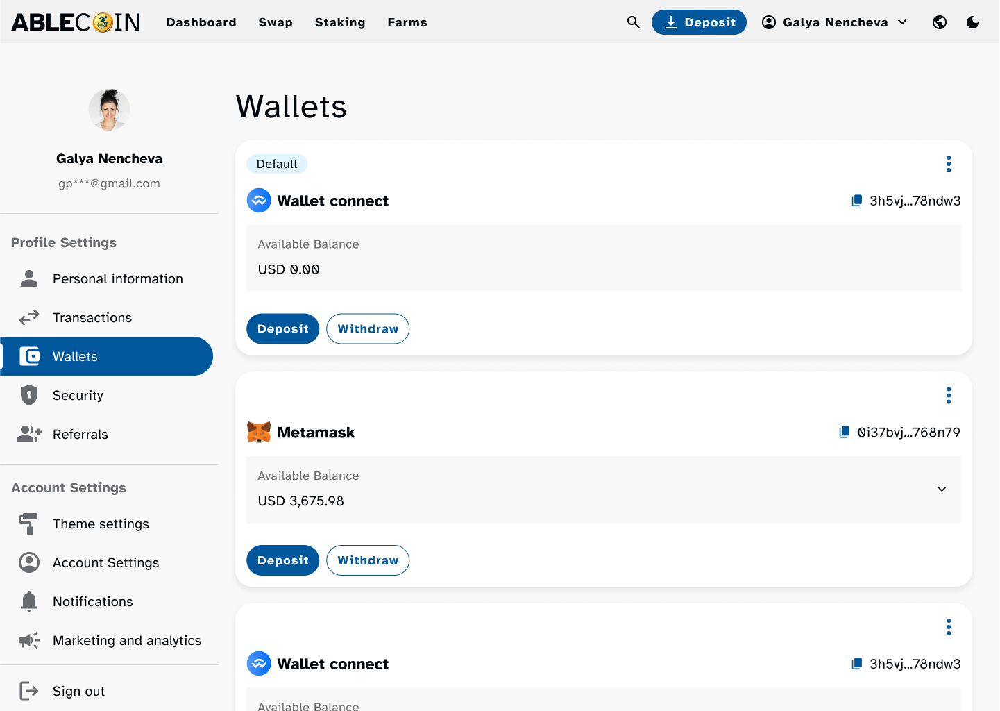
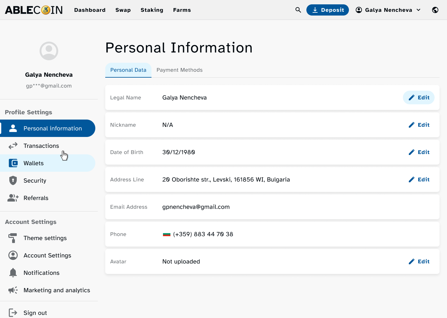
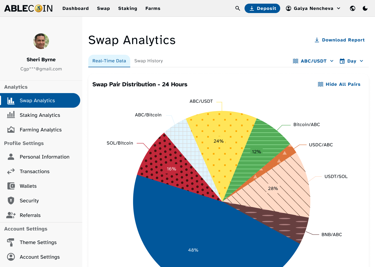
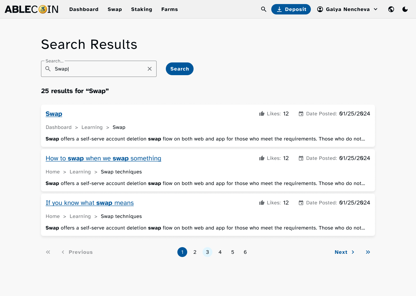
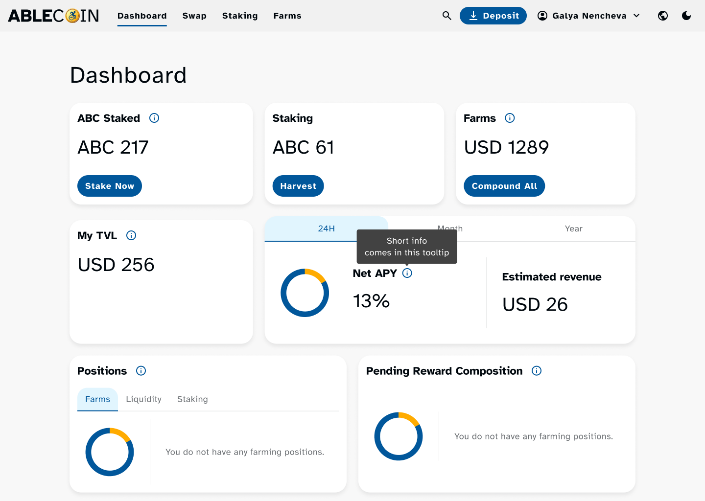
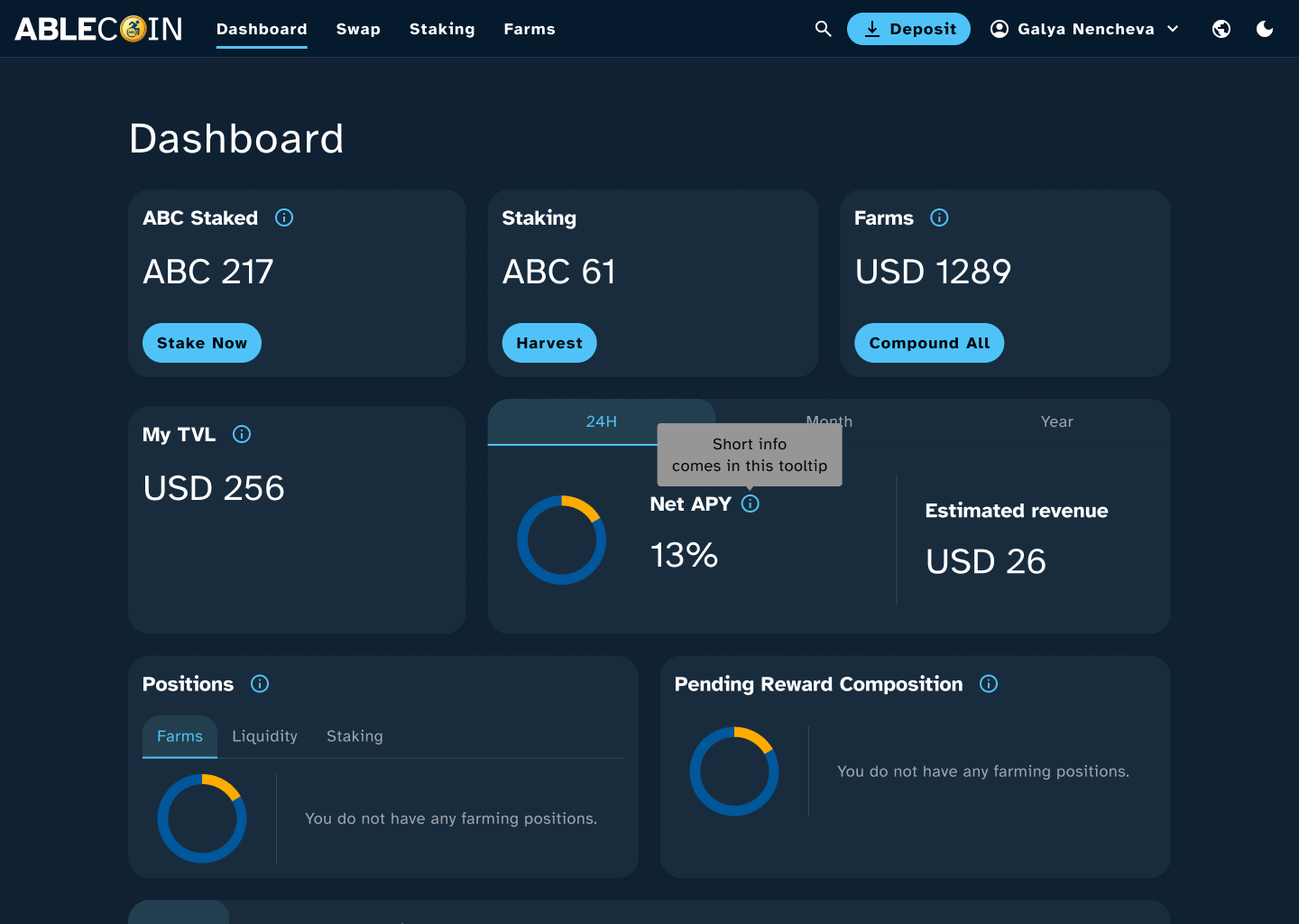
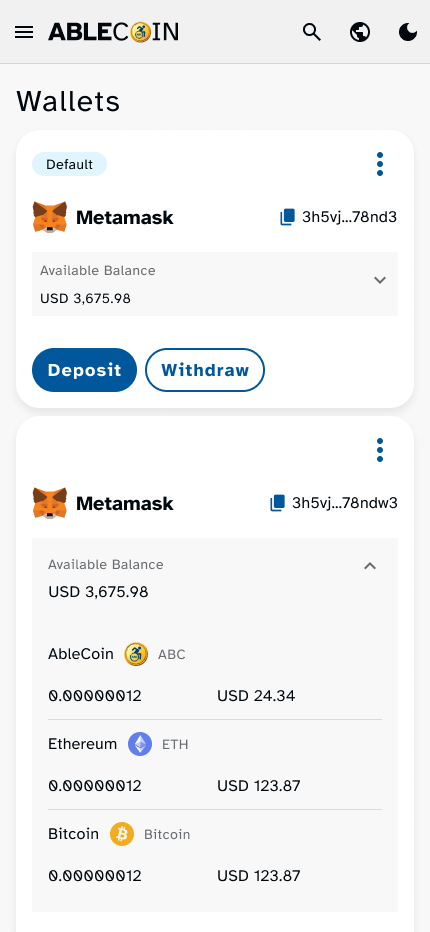
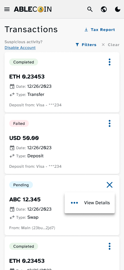
- Financial & Transaction Management: A suite of features on the user’s dashboard to manage their digital assets, including detailed transaction history, wallets, and a dedicated search functionality.
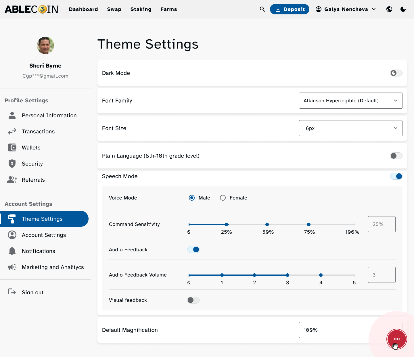
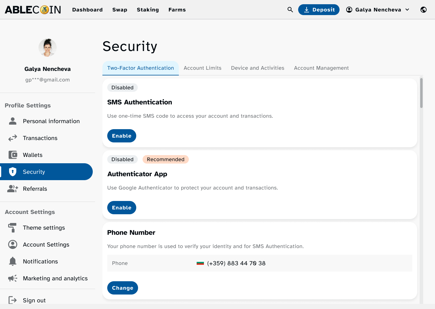
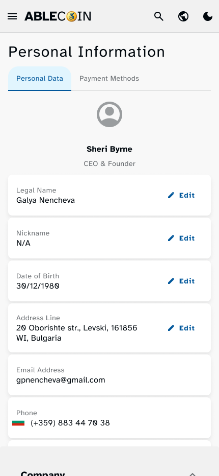
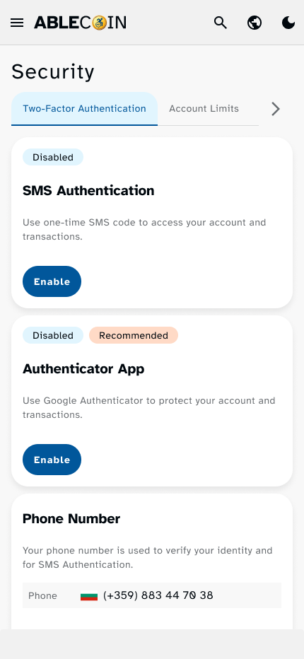
- Profile & Account Settings: Comprehensive profile management flows, covering personal information, referral programs, security settings, and personalized theme settings.
- Donation Selection: A new flow added to allow users to easily choose which pre-vetted non-governmental organization they would like their transaction percentage to be donated to.
Supporting Ecosystem Flows
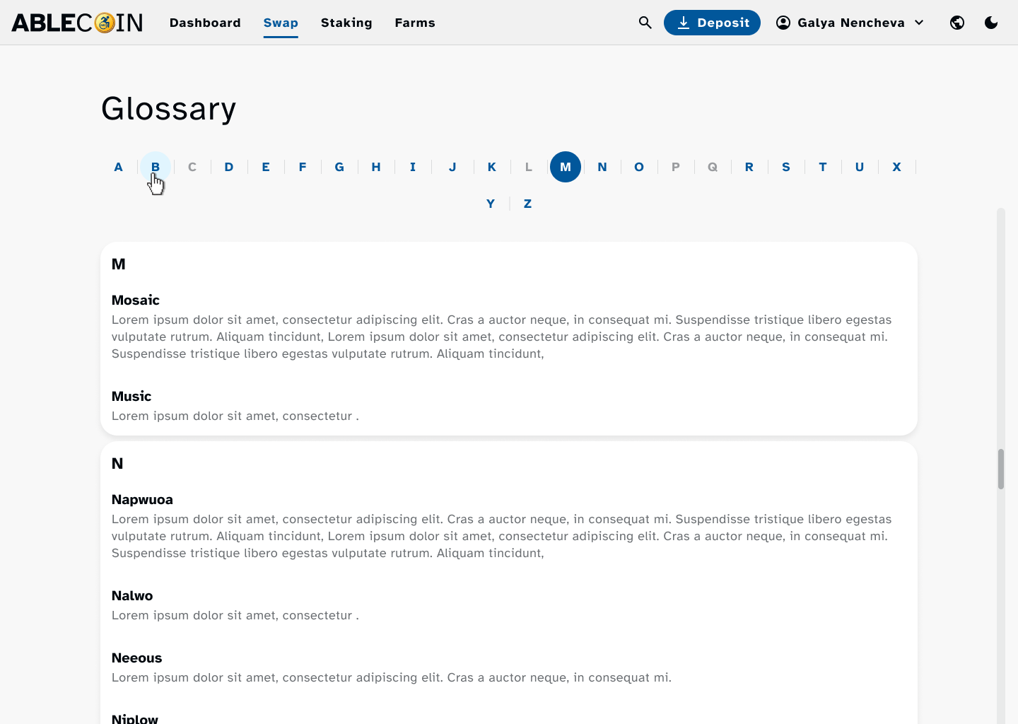
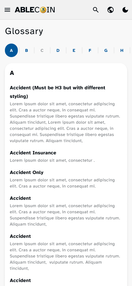
- Glossary Page: A dedicated flow for accessing a clear, plain-language glossary of Web3 and crypto terms, aiding users with cognitive impairments.
- Zendesk Support: A direct link and accessible flow to our support website, ensuring users can get assistance easily.
Design system
Accessibility consideration
Design Accessibility Documentation
Design system
Our solution was a design system built with accessibility as its core principle. We chose to leverage Material UI (MUI), an open-source library known for its high-quality, pre-built components that adhere to modern accessibility standards out of the box. This provided us with a powerful starting point, which we then customized and fortified to meet and exceed Web Content Accessibility Guidelines (WCAG).
Our primary focus was on three key areas of accessibility:
Color Psychology & Palettes
We strategically chose blue as our primary brand color. In color psychology, blue is universally associated with trust, stability, and security, which is a critical psychological anchor for a financial dApp where users are managing their assets. It creates a "safe zone" for the user. To maintain visual clarity and reduce cognitive load for users with cognitive disabilities, we intentionally avoided the use of gradients, opting instead for solid color blocks that are easier to distinguish. This approach not only enhances accessibility but also contributes to a clean, professional aesthetic.
Form & Affordance
The shape of our interactive elements was designed with both function and user perception in mind. We adopted a "pill-shaped" form for all buttons and key clickable elements. This rounded form factor is psychologically perceived as friendly, approachable, and playful, which helps to mitigate the intimidating nature often associated with financial technology. This design choice contributes to a sense of comfort and familiarity, making the dApp feel like a well-known and trustworthy platform.
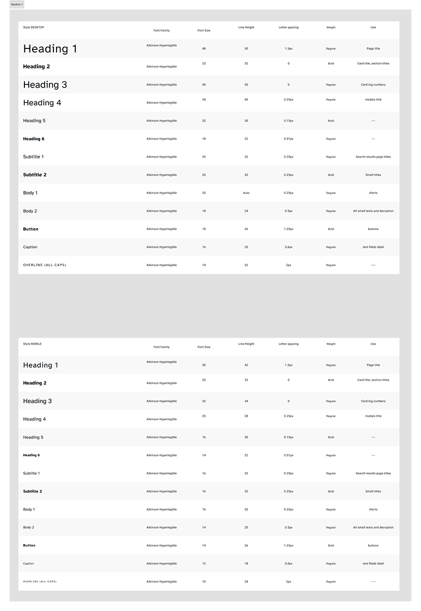
Typography
To enhance readability and cognitive accessibility, we standardized the use of the Atkinson Hyperlegible font with a minimum size of 18px. This font was specifically designed to improve character recognition and legibility for users with low vision by creating clear distinctions between commonly confused characters.
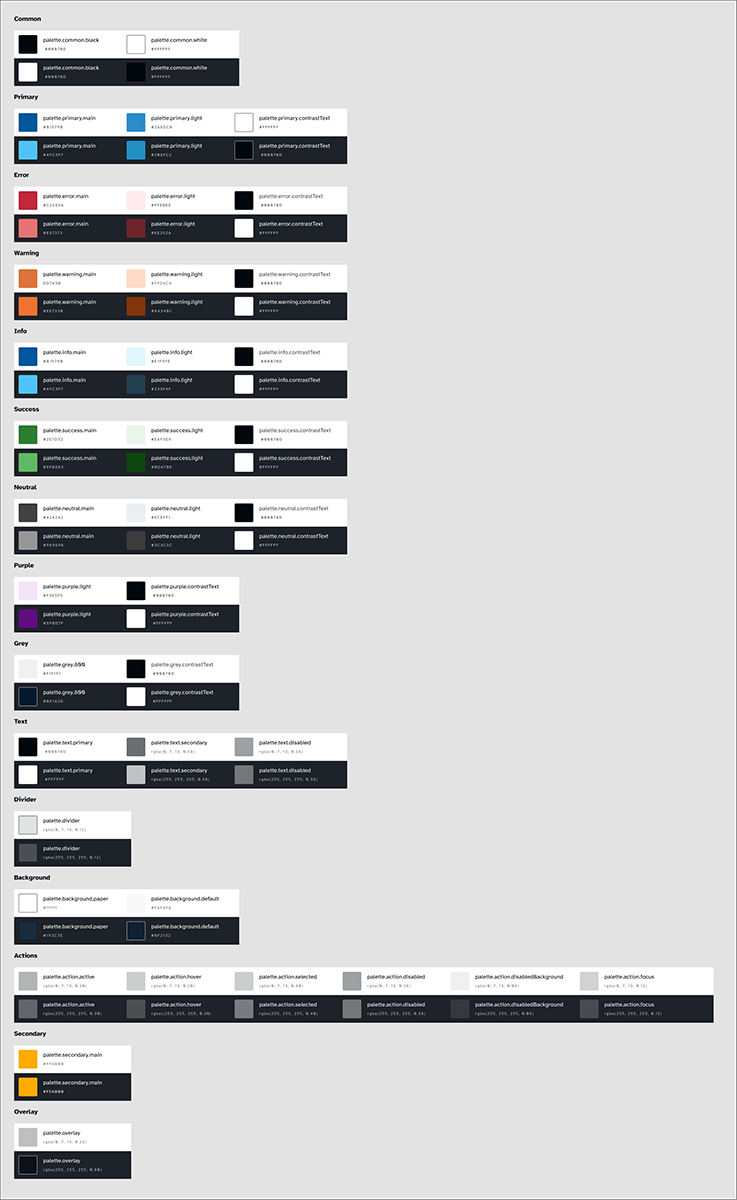
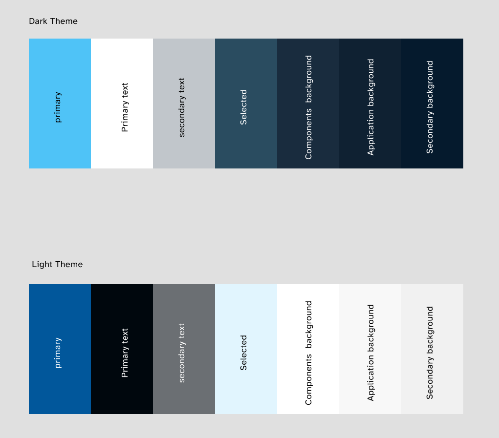
Color Contrast & Readability (AAA Standard)
We understood that poor color contrast is a significant barrier for users with low vision or color vision deficiencies. We meticulously selected and tested our color palettes for both light and dark modes to ensure they met the WCAG 2.1 Level AAA standard, which requires a contrast ratio of at least 4.5:1 for normal-sized text. This strict adherence was applied to all text, icons, and non-text visual components, guaranteeing that the interface is legible and comfortable to read for the widest possible audience.
Accessibility Considerations
Our solution was a design system built with accessibility as its core principle, going beyond standard requirements to meet and exceed Web Content Accessibility Guidelines (WCAG). Our primary focus was on ensuring a seamless and inclusive experience for all users.
Layout
We implemented a single-column layout for the main content to create a linear, predictable flow that is easier for users with cognitive disabilities to follow.
Color Contrast & Readability (AAA Standard)
We understood that poor color contrast is a significant barrier for users with low vision or color vision deficiencies. We meticulously selected and tested our color palettes for both light and dark modes to ensure they met the WCAG 2.1 Level AAA standard, which requires a contrast ratio of at least 4.5:1 for normal-sized text. This strict adherence was applied to all text, icons, and non-text visual components, guaranteeing that the interface is legible and comfortable to read for the widest possible audience.
Typography
To ensure the interface scales correctly for everyone, all sizing was defined using rem units. We also implemented a single-column layout for the main content to create a linear, predictable flow that is easier for users with cognitive disabilities to follow. We also provided users with a dedicated settings option to change font, font size, and color to match their personal preferences.
Touch Targets & Usability
To ensure a reliable and frustration-free experience for users with motor impairments or those using mobile devices, we defined strict requirements for component sizing. All interactive components, such as buttons, links, and icons, were designed to have a minimum clickable or touchable area of at least 44px or, in many cases, 56px. This was crucial for mobile use cases and for users who may have difficulty with fine motor control, reducing accidental taps and improving overall usability.
Screen Reader Optimization
We provided clear guidance for developers on using semantic HTML tags and appropriate ARIA attributes to correctly convey the purpose and state of each component to assistive technologies. Additionally, all icons were implemented with descriptive alt text or an understandable label for screen reader users, ensuring they are not just visual elements but a meaningful part of the user experience.
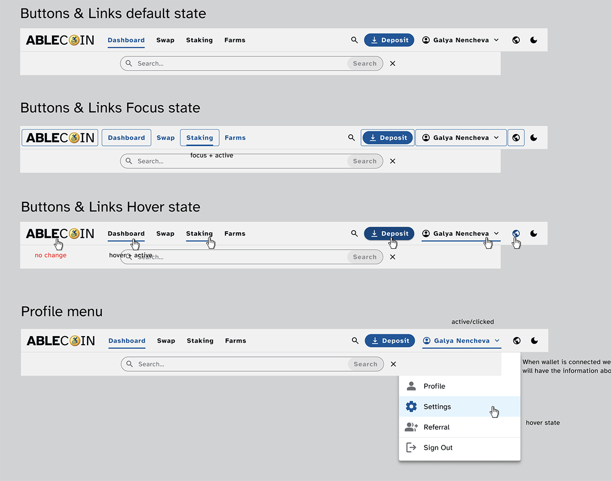
Keyboard Navigation
All components are fully navigable and operable using only a keyboard. We implemented highly visible and well-defined active, hover, and focus effects for all interactive elements to provide clear visual feedback to users navigating via keyboard. This is a critical feature for users with motor or vision impairments.
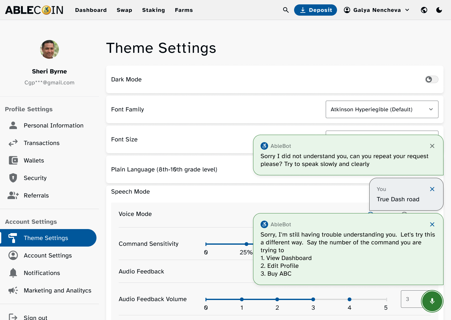
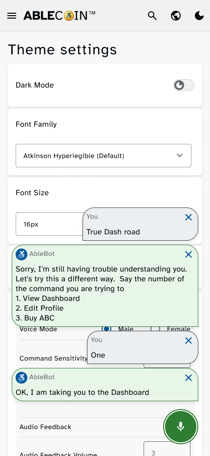
Voice-Over Commands
For users who rely on hands-free interaction, the application can be operated using voice commands. This feature allows users to navigate the interface, select options, and complete transactions without needing to physically touch the screen.
Personalization
We also provided users with a dedicated settings option to change font family, font size, turn on plain language mode, turn on voice command, etc. to match their personal preferences.
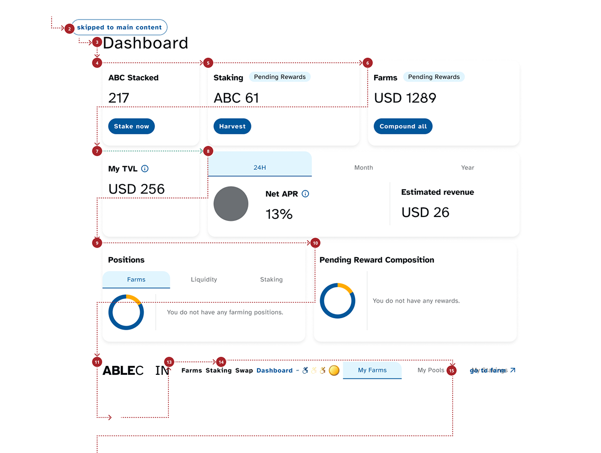
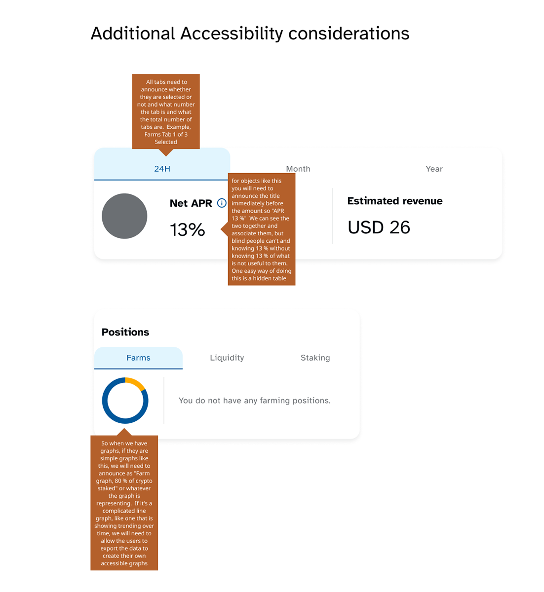
Design Accessibility Documentation
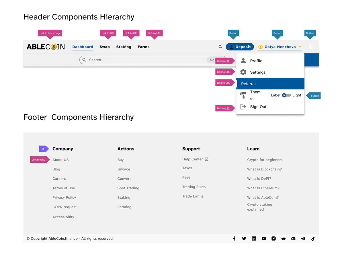
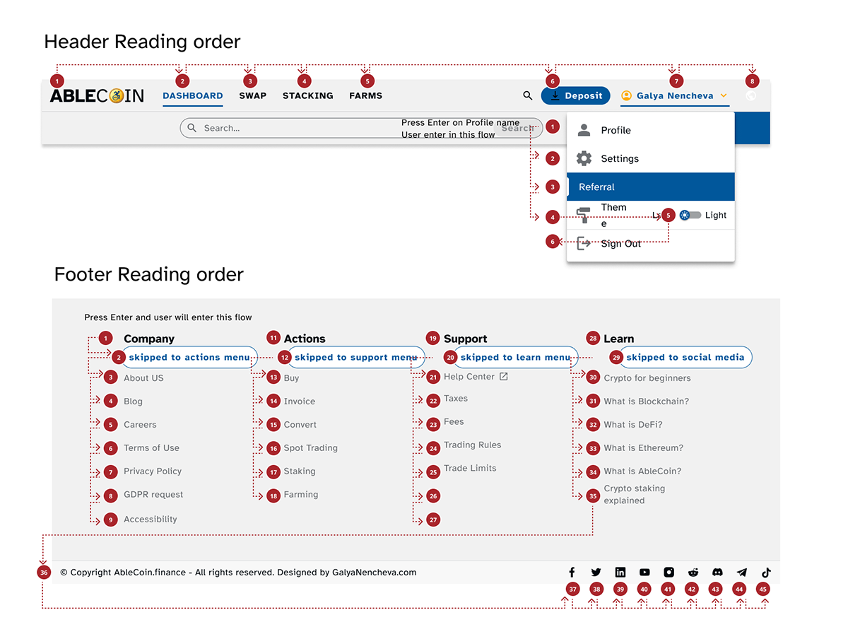
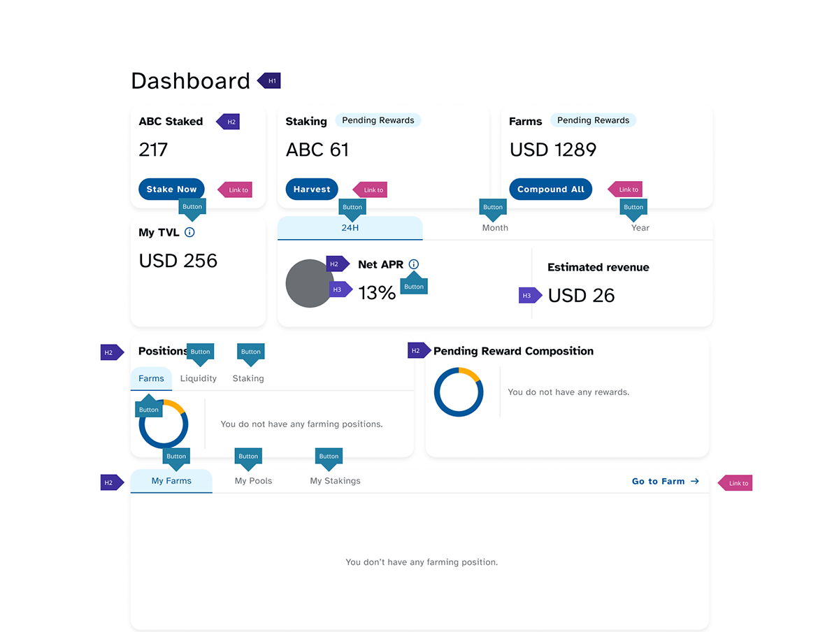
To ensure a seamless implementation of the accessibility standards, I created detailed documentation for the development team. This documentation provides a visual map of the application’s page structure and interaction flow, outlining the correct keyboard navigation order, focusable elements, and the intended behavior for screen readers and other assistive technologies. The annotations clearly define which elements are buttons versus links, and show the intended tab order for each page, from the initial point of entry to the end of the content. This visual guide prevents common implementation errors and guarantees a consistent, accessible experience for all users.
Mockups
High-fidelity prototype
Connected Projects
Mockups
The design system became the single source of truth for the entire project. Once the system was complete, the process of building the application’s flows was exceptionally efficient. We were able to rapidly produce a full suite of polished pages for each user flow, delivered in both a light and a dark theme. Several prototypes were also built to demonstrate core interactions and test the user experience, ensuring the dApp was not only visually consistent but also logically intuitive.
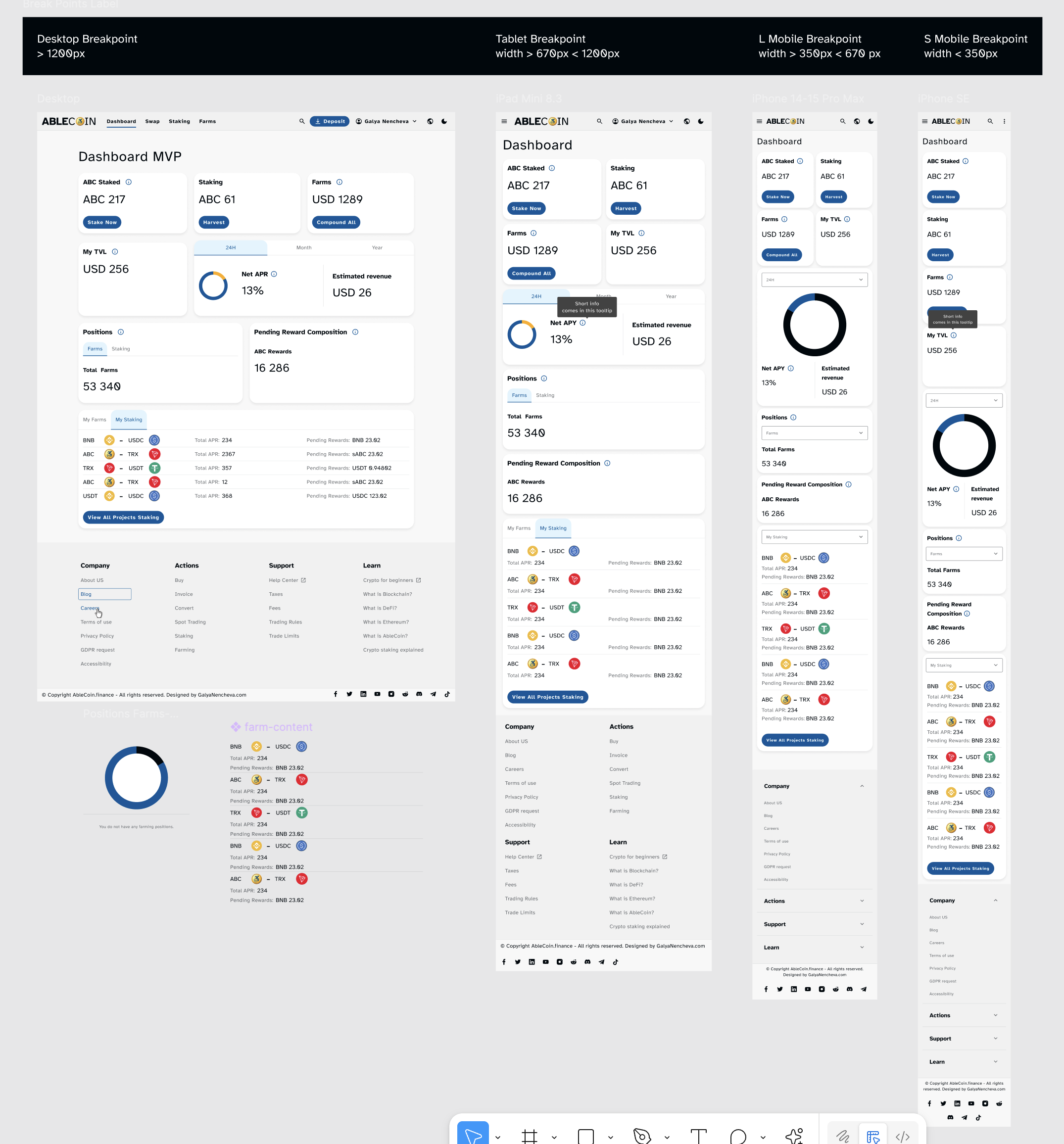
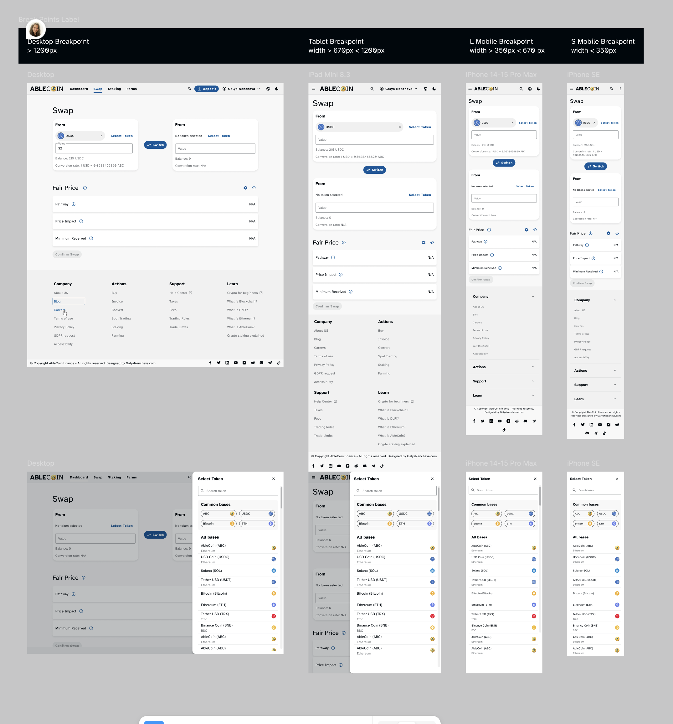
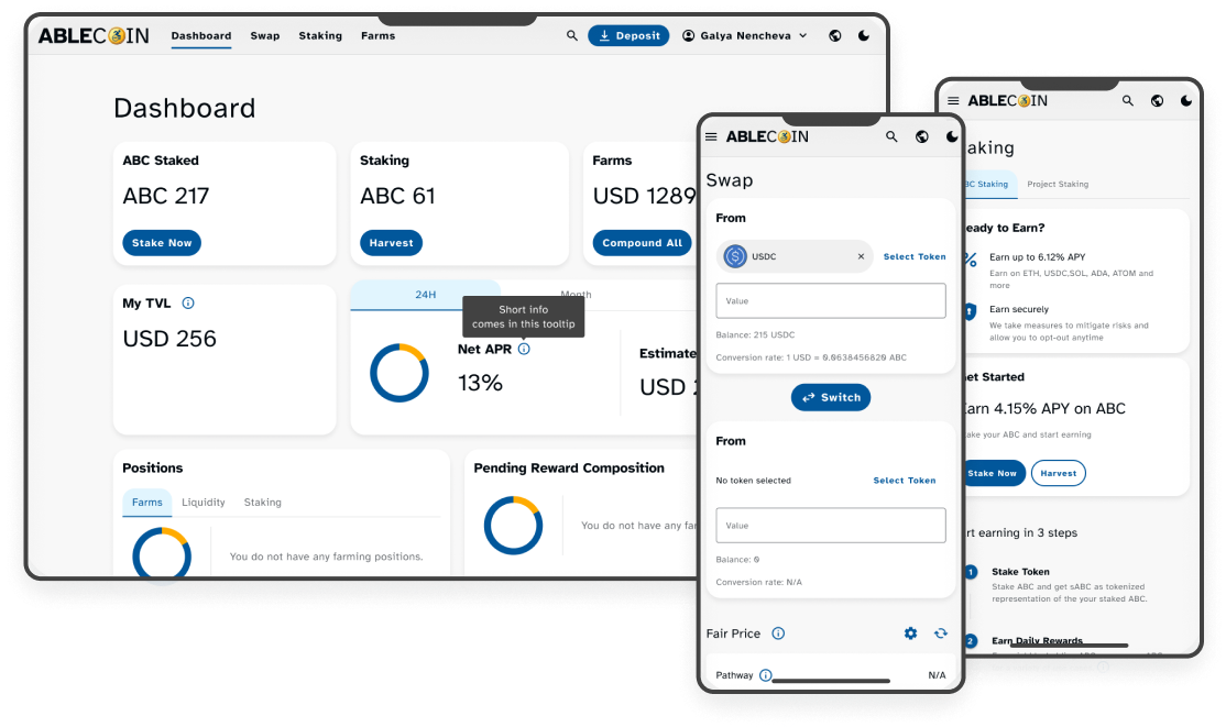
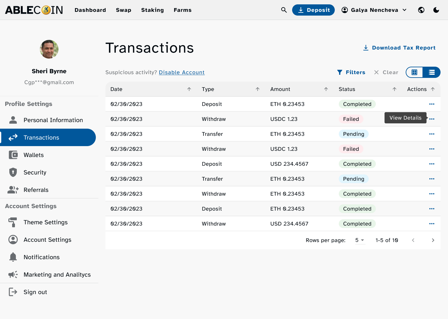
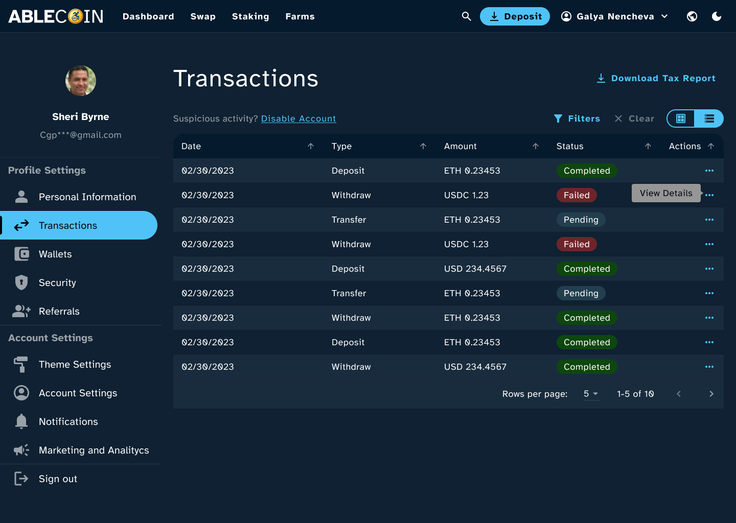
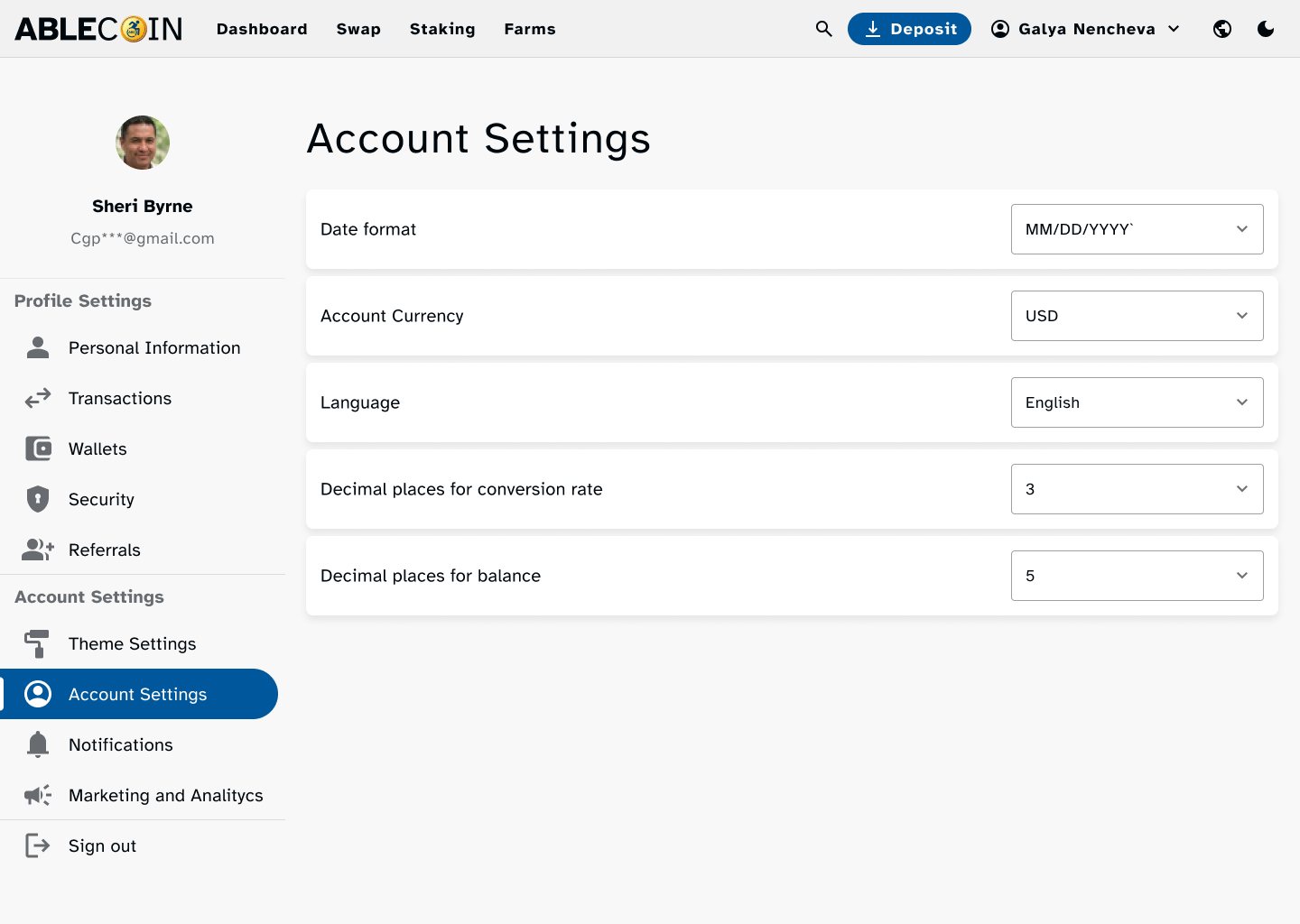
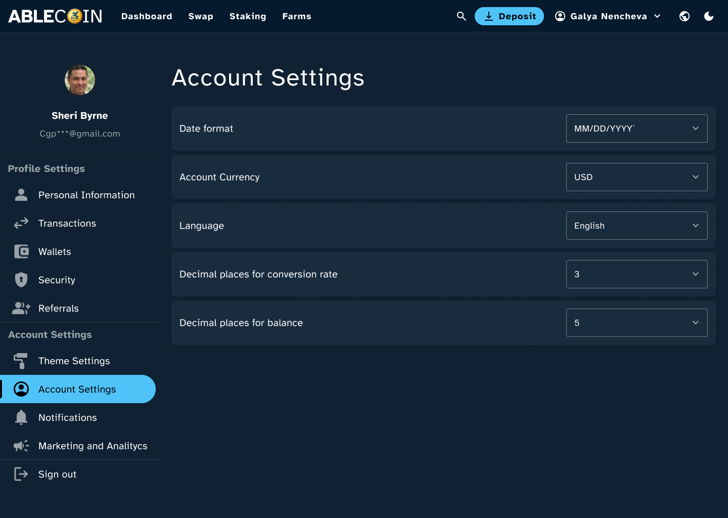
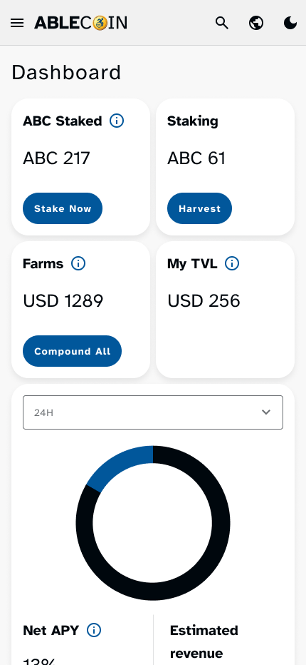
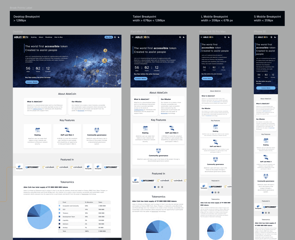
Desktop Mockups
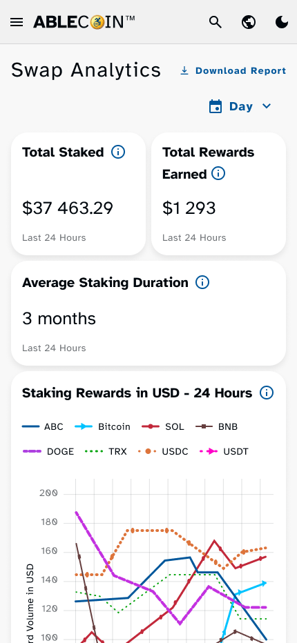
On desktop, the dApp’s design retains its integrity and accessibility. The larger viewport allows for clear presentation of complex data, while the consistent tab order and well-defined focus states ensure full keyboard navigability. This focus on structured navigation and high-contrast visuals provides a predictable and efficient experience for users who rely on keyboards or screen readers.
Light & Dark Theme on mobile
Recognizing that user preference and environmental factors affect readability, we delivered the entire application in both a light and a dark theme. Both themes were designed with a minimum contrast ratio of 4.5:1 to meet WCAG AAA standards, drastically reducing eye strain and improving text legibility. This duality empowers users to choose the visual mode that best suits their needs, making the application more comfortable and accessible for extended use.
Mobile Mockups
The mobile views demonstrate our commitment to a seamless experience on the go. The single-column layout ensures a predictable flow, while rem units guarantee fluid scaling of all elements. We meticulously implemented a minimum touch target size of 44px for all interactive components, ensuring a frustration-free experience for users with motor impairments or those using touch-based devices. The interface remains clean, scannable, and highly intuitive.
High-fidelity Prototype
To provide the development team with a clear vision of page transitions and component interactions, I created detailed Figma prototypes. However, the true test of our design system was its implementation in a live, high-fidelity prototype. This was not a static design file, but a real application built and deployed, allowing for true-to-life testing of all user flows, components, and core accessibility features. I rigorously audited the prototype to ensure that every implemented design element, from keyboard navigation to screen reader compatibility, met the exact requirements outlined in our documentation. This hands-on validation ensured that the final product was not only visually consistent but also a truly accessible and functional experience.
Connected Projects
To ensure the success of the app, we extended our design system and accessibility principles to a suite of related projects.
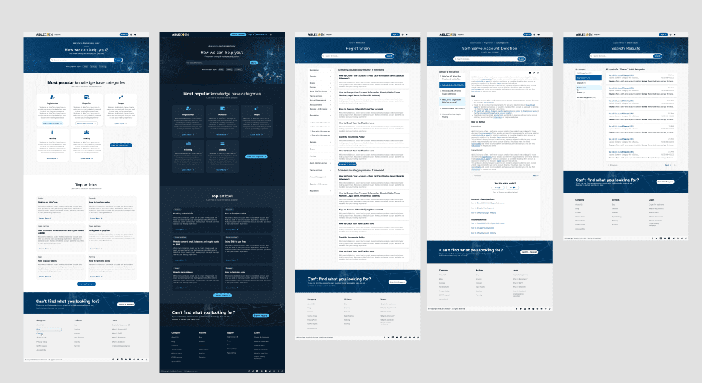
Zendesk Support Website
Based on a Zendesk template, I designed a complete support page, including a knowledge base with inner article pages and a glossary. The goal was to extend the same accessibility standards to our user support experience, ensuring that users with disabilities could easily find answers and navigate help articles with the same ease as the main application.
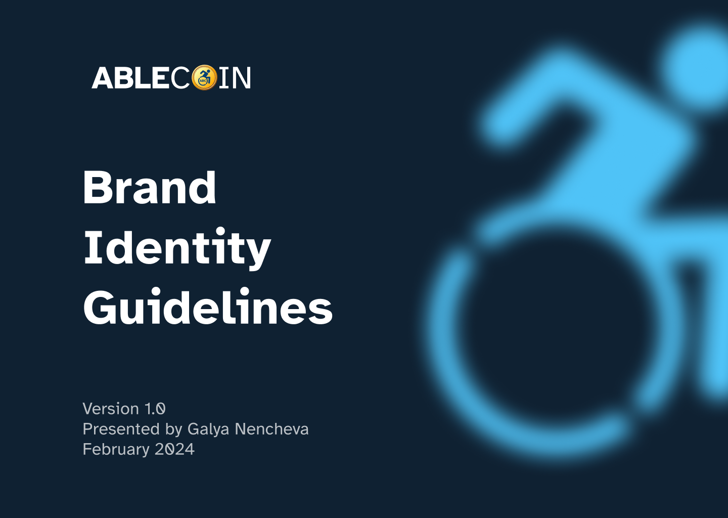
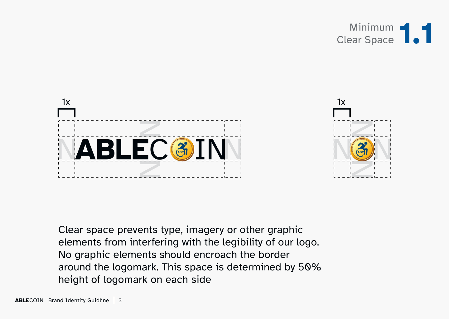
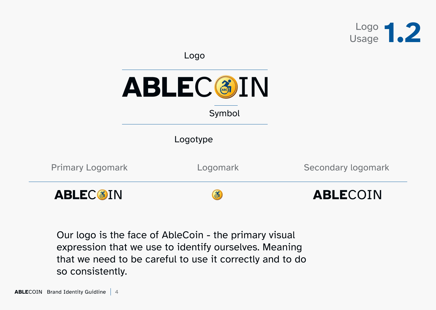
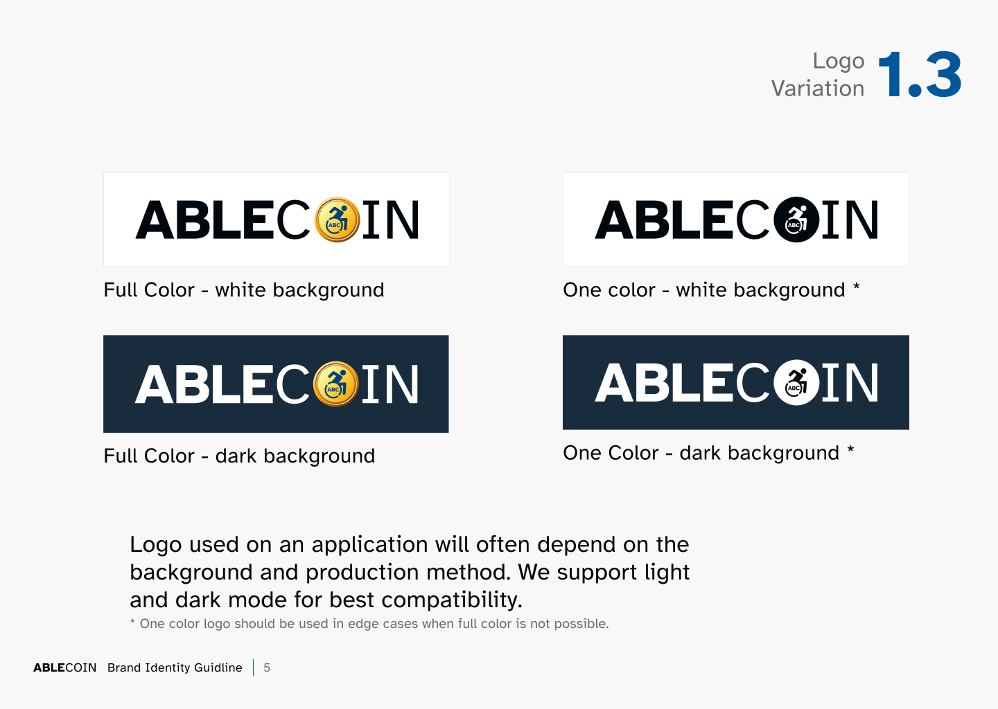
Logo and Brand Guide
I also created a comprehensive brand guide to be distributed to third-party marketing and content creators. This guide provides a clear set of rules and guidelines on typography, color usage, tone of voice, and visual style. The primary purpose was to protect the brand’s identity and ensure that all external communications are consistent and align with our accessibility principles.
Marketing Materials
To maintain brand consistency, I developed a set of marketing materials, including a landing page, email templates and various banners. These assets were designed to visually align with the core dApp’s design language, ensuring that the brand’s trustworthy and professional feel was communicated consistently across all touchpoints.
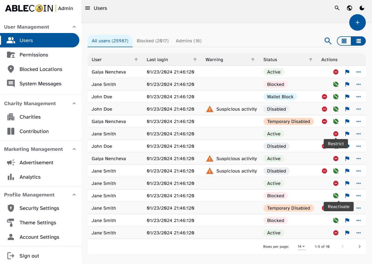
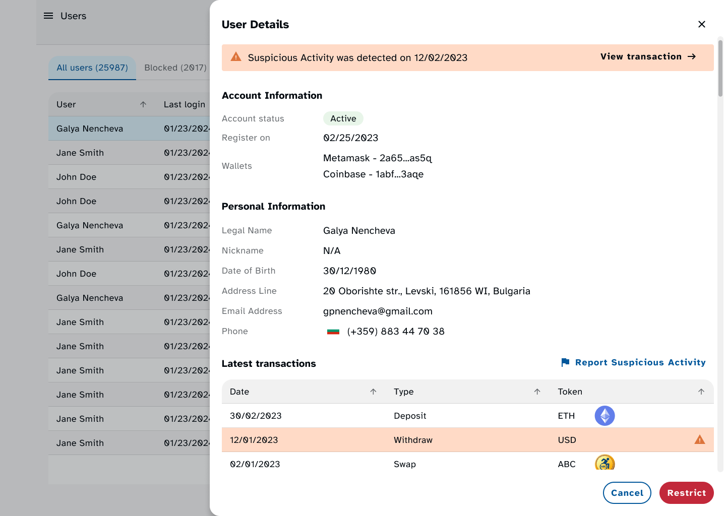
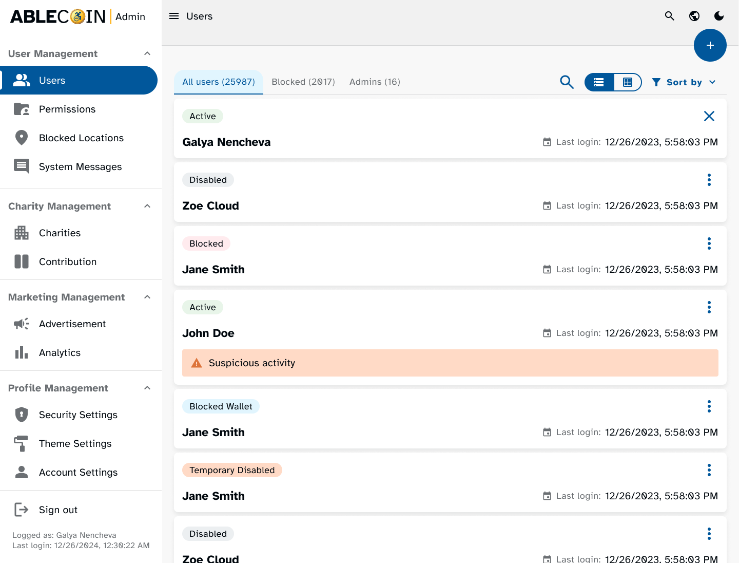
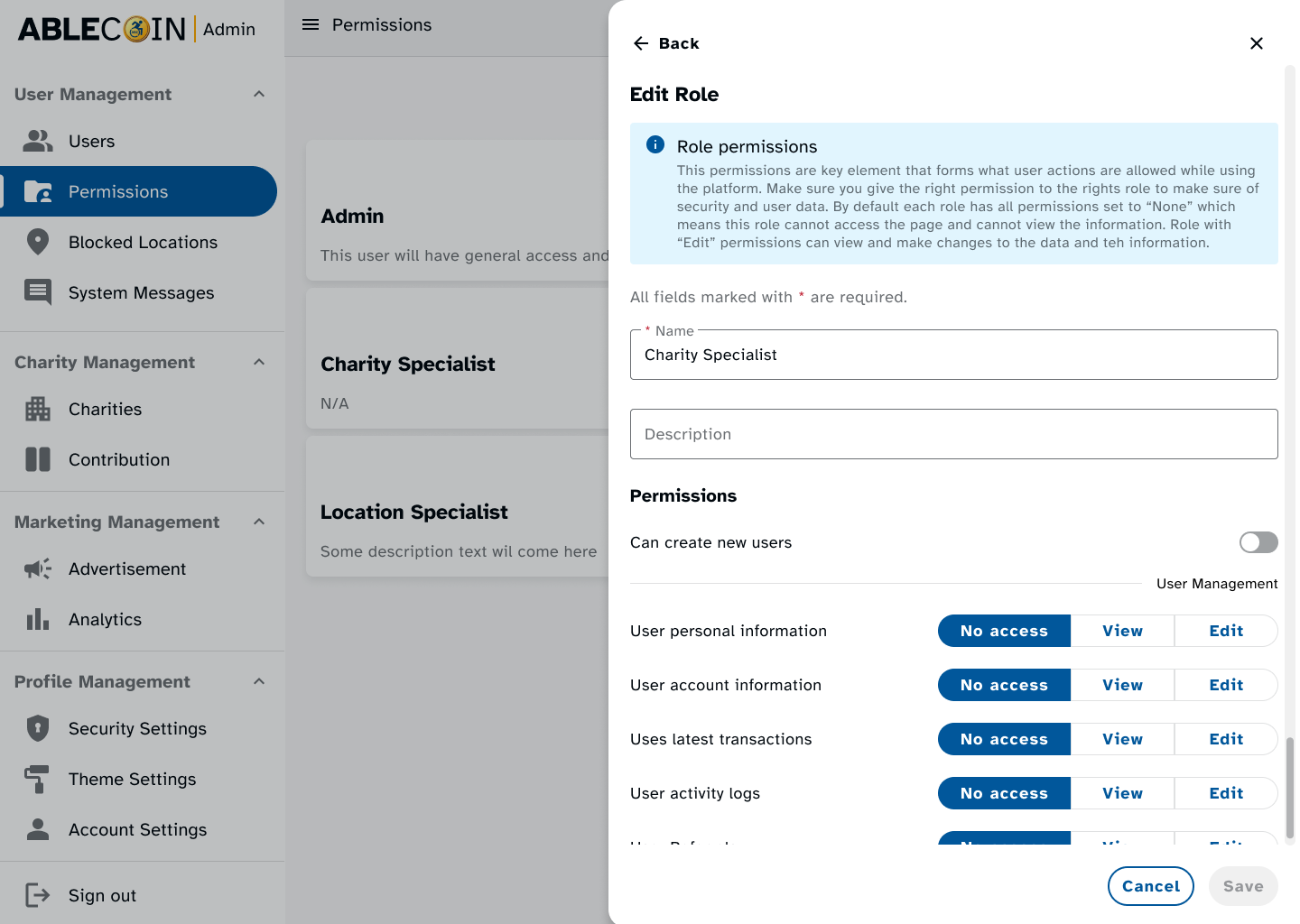
AbleCoin Admin Panel
I designed a fully accessible admin panel for the platform, which will be used by operations team to track users, behavior, income, and marketing data. A key part of the project was to ensure this panel was built with the same high accessibility standards as the main application, as it is planned to hire individuals with disabilities to manage it. This project will be detailed in its own separate case study.
Takeaways
Next Steps
Takeaways
Impact
By prioritizing the creation of a robust, accessibility-focused design system, we were able to overcome the challenge of a tight deadline and deliver a superior product. This approach proved to be a powerful accelerator, enabling our team to build complex user flows with unprecedented speed and consistency. The project’s success is a testament to the fact that building with accessibility in mind from the start is not just a moral obligation, but a strategic advantage that leads to a more usable, reliable, and scalable product for all users.
What I learned
his project marked my first venture into designing a 100% accessible digital product. It was a profound learning experience that allowed me to move beyond standard guidelines and implement more nuanced accessibility considerations, particularly for users of assistive technologies. I gained a deeper understanding of how to translate theoretical principles into practical solutions that genuinely enhance the user experience for everyone.
Next Steps
The project is currently seeking a second round of investors. My future work will focus on:
Conducting detailed usability testing sessions with new user groups to identify any friction points in the existing user flows.
Extending the design system with new components and templates to support the introduction of new features outlined in the business plan.
Support product owner in pursuing third-party accessibility certifications to formally validate the dApp's compliance with global standards, which will be a key selling point for investors.
Thank you!
Thank you for your time reviewing my work on the AbleCoin dApp! If you’d like to see more or get in touch, my contact information is provided below.