Sfery – Redefining knowledge sharing with AI
Project overview
The Product - MVP Concept Validation
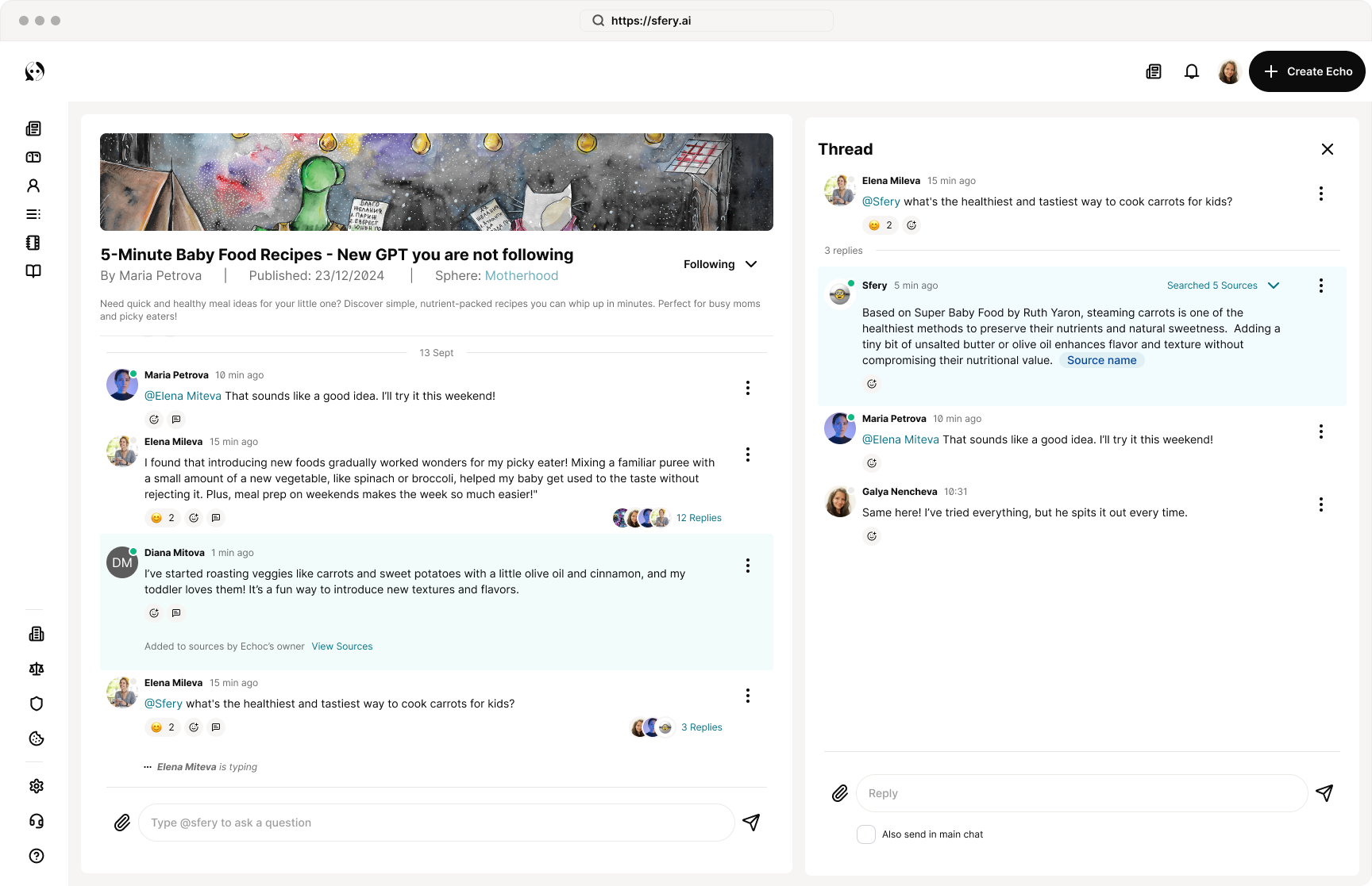
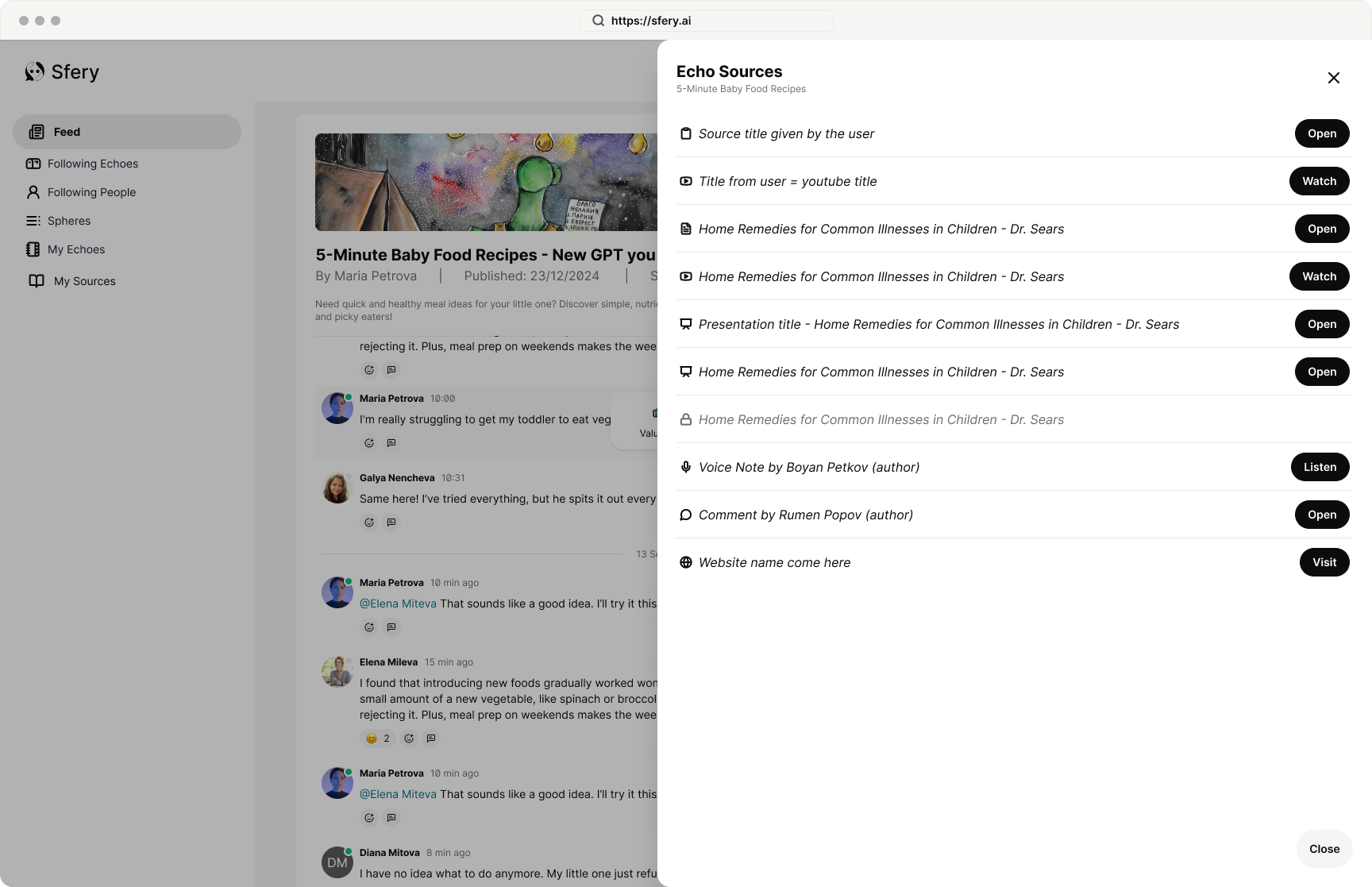
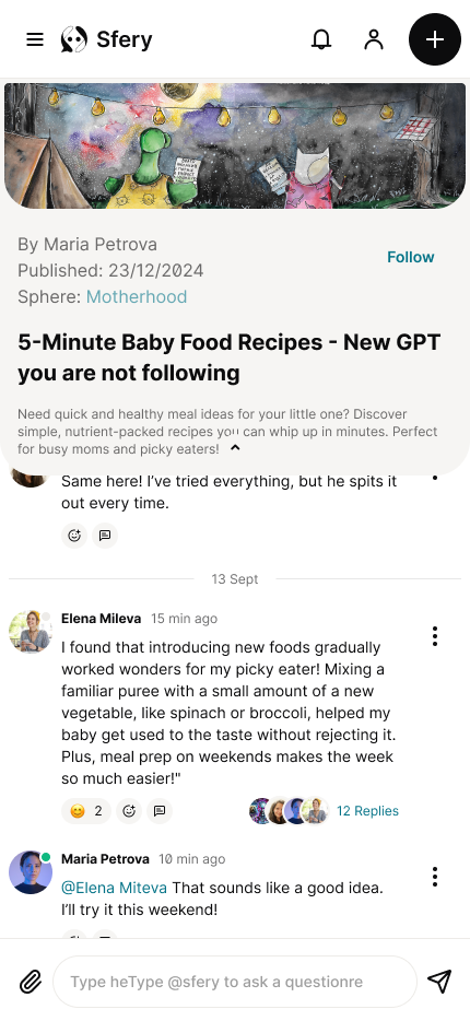
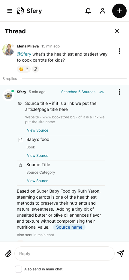
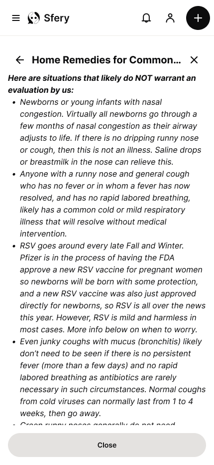
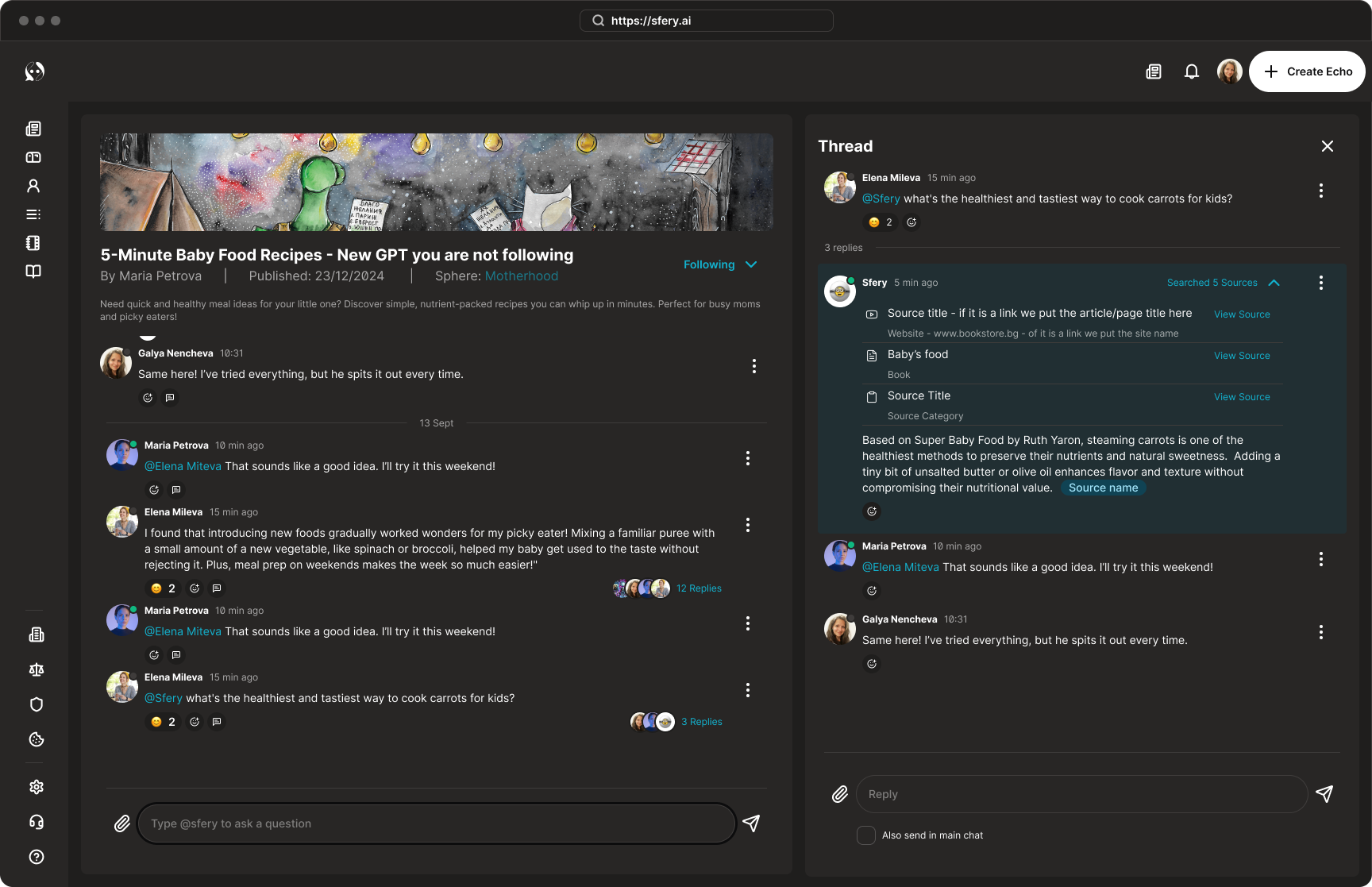
Sfery is a lightweight social platform designed for the Bulgarian market. Its core concept is to solve the problem of "information overload" by making knowledge sharing easier. The platform allows users to create and share AI-driven knowledge posts called "echos." Each echo synthesizes information from multiple sources (links, text snippets) with user notes and AI commentary. Similar echos are grouped into "spheres," and users can follow people, echos, and spheres. Additionally, a community forum allows people and an AI (based on the echo owner's knowledge base) to answer questions, with the knowledge base being updated by valuable comments from the community.
Project Duration
December 2024 - 2 weeks challenge
The problem
In a world saturated with content, users in the target market are facing knowledge fatigue. They struggle to keep up with the vast amount of information from their professional and personal interests. Existing social media platforms are often too noisy and unstructured for meaningful knowledge sharing, making it difficult to find high-quality, synthesized content.
The Goal
The main goal of the Sfery project was to make knowledge sharing easy and efficient. The design focused on creating a platform where content is central, using an AI-driven tool to curate and condense knowledge into digestible "echos." A key objective was also to harness the power of the community through a forum format, ensuring that user contributions could enrich the knowledge base. My core objective was to prioritize clarity and simplicity, making the main interactions-consuming, liking, commenting, and creating content-feel intuitive and frictionless for users.
My Role
UX designer, UX Researcher, UI designer, Design system designer, Brand designer
User Research Summary
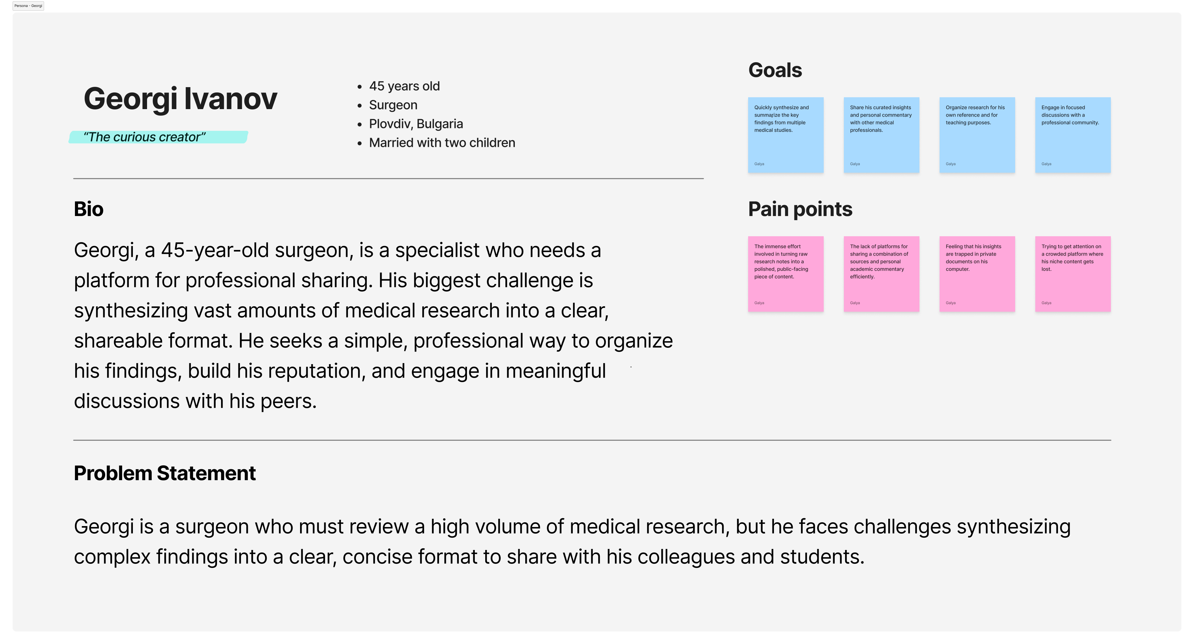
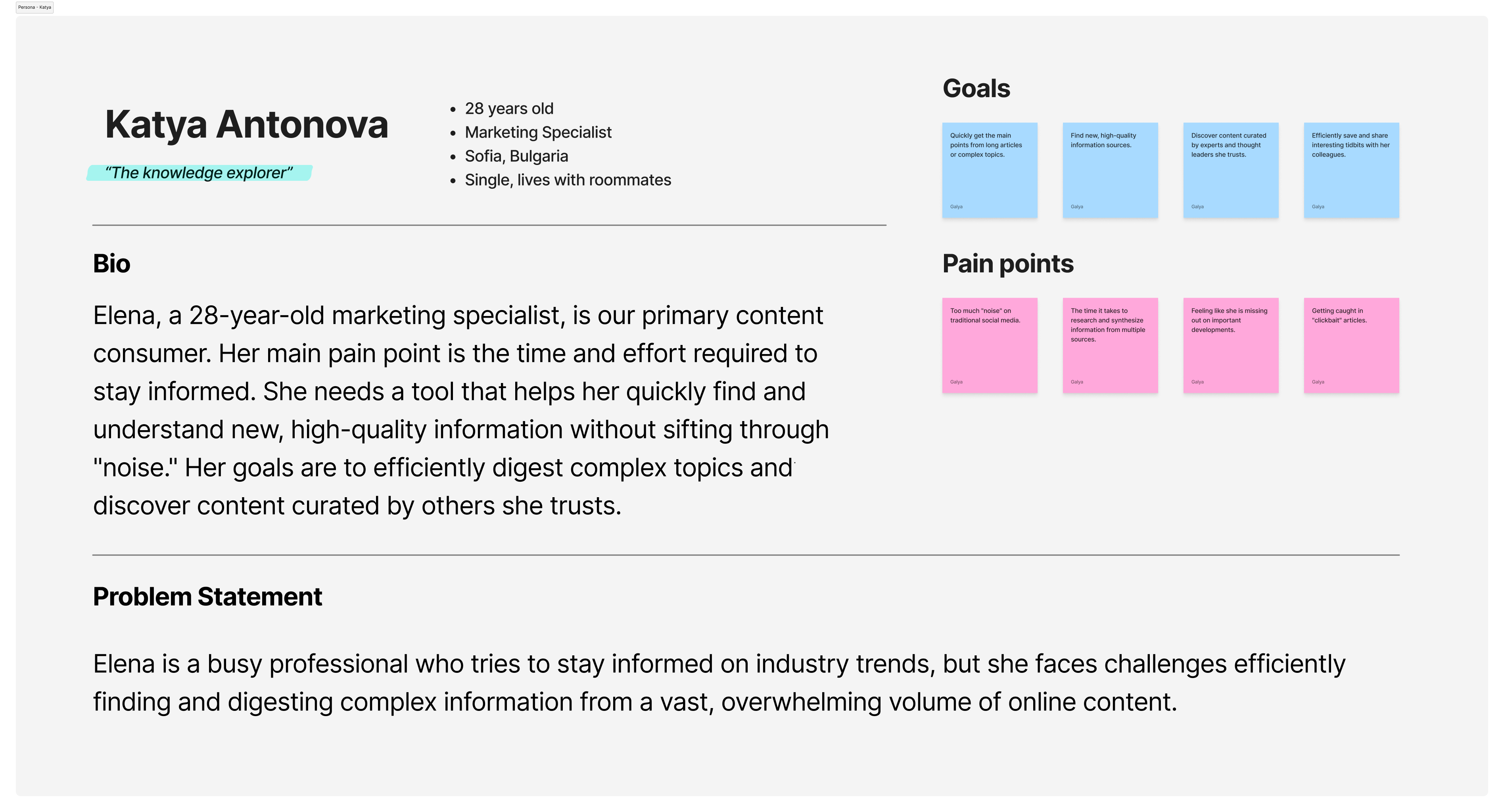
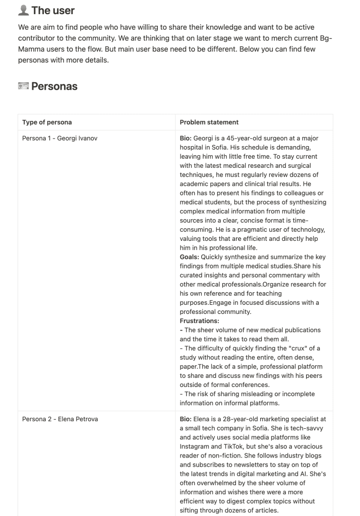
To ensure the product’s design was grounded in real user needs, I began by defining two key user personas. This process allowed me to understand the motivations, goals, and frustrations of our target audience and align the product’s features with their behaviors.
Information Overload
Users feel overwhelmed by the sheer volume of online information, making it difficult to stay informed without significant time investment.
Unstructured Content
Existing platforms lack the structure to present complex, source-backed information in a way that is both clear and trustworthy.
Time & Efficiency
Both creators and consumers of knowledge have limited time and need an efficient way to either digest information or produce content without a complex workflow.
Trust & Sourcing
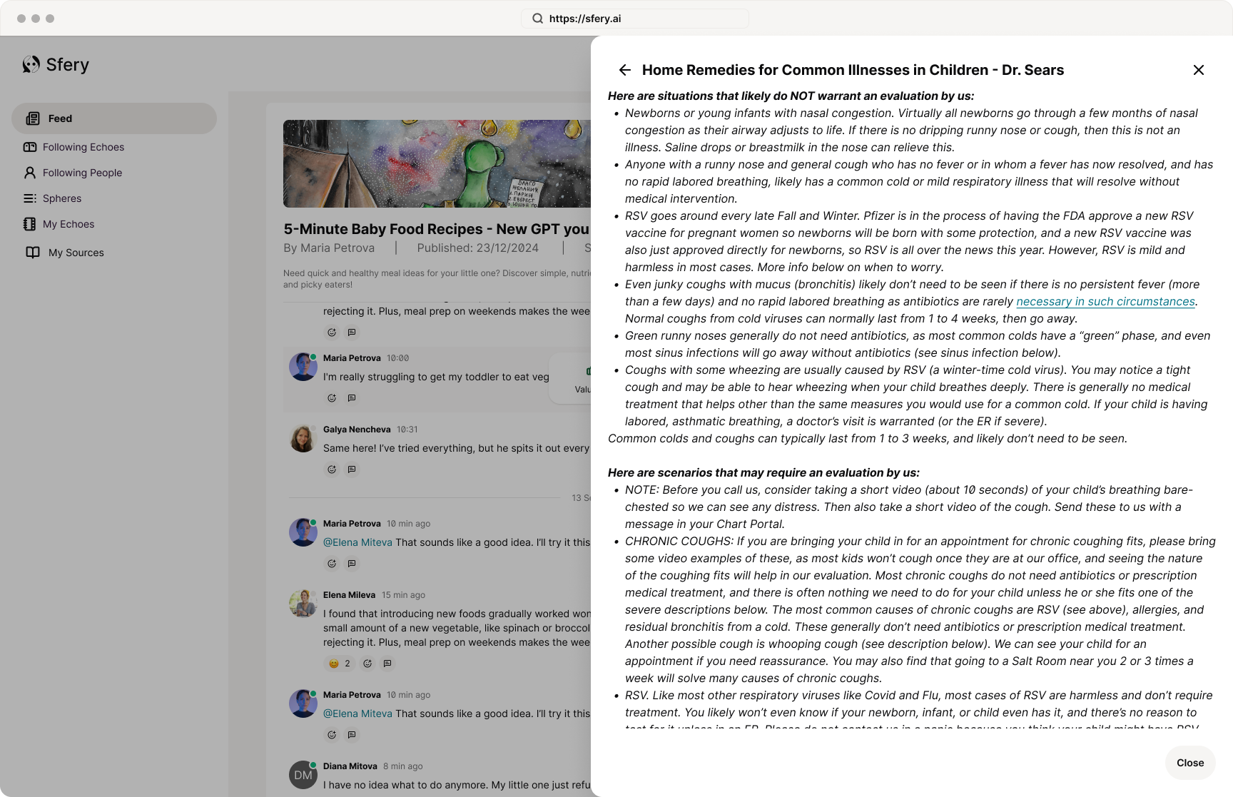
Users want to see the original sources of information and trust that the content is accurate and transparent.
Personas
To ensure the product’s design was grounded in real user needs, I began by defining two key user personas. This process allowed me to understand the motivations, goals, and frustrations of our target audience and align the product’s features with their behaviors.
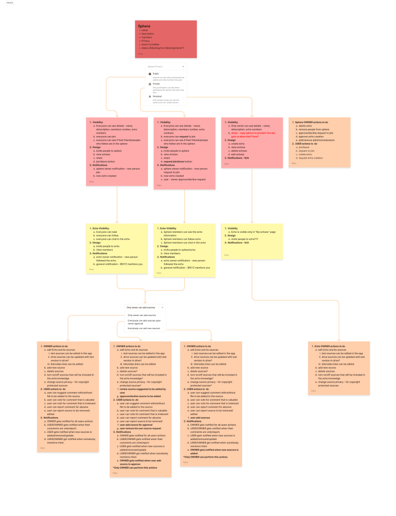
User flows
Based on the personas, I designed the core user flows to be as simple and intuitive as possible, with a mobile-first approach. I created detailed user journey maps to visualize the path a user would take, from onboarding to daily use.
Main user flows are:
Onboarding Flow
Main feed flow
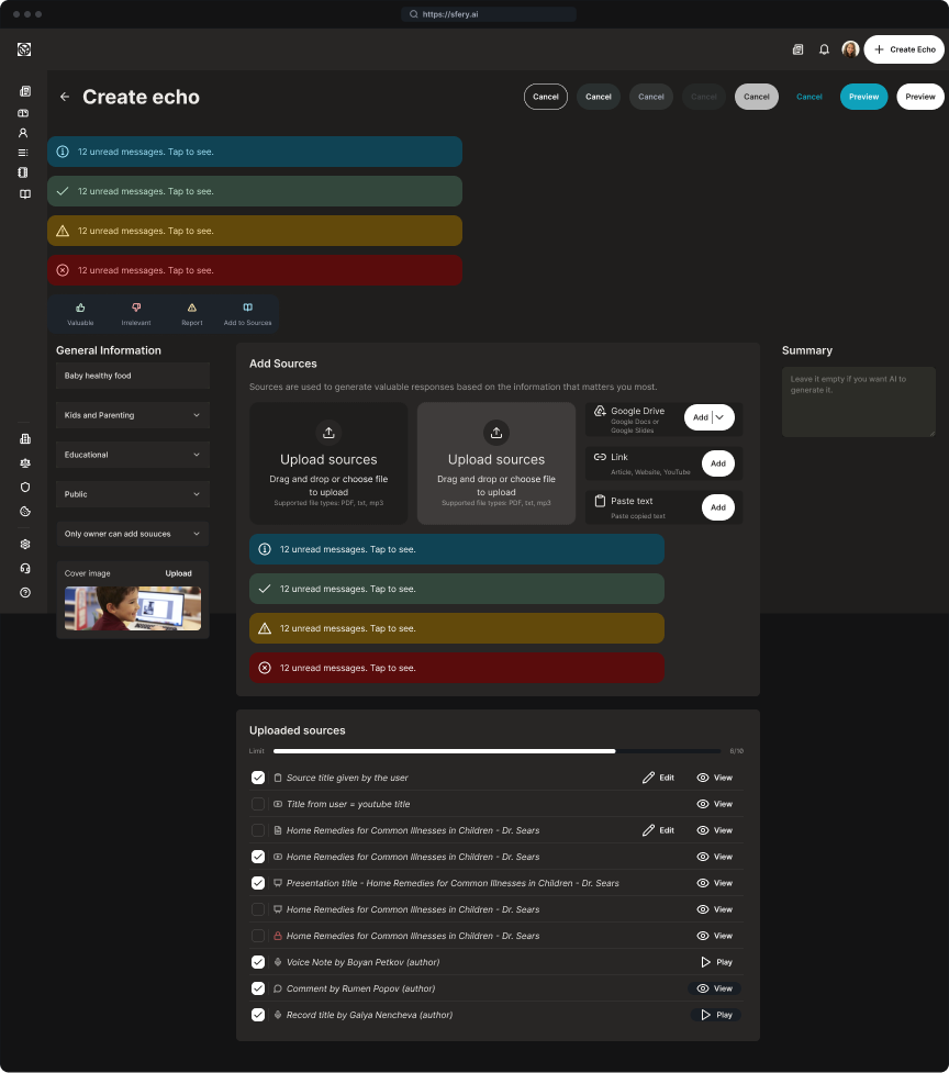
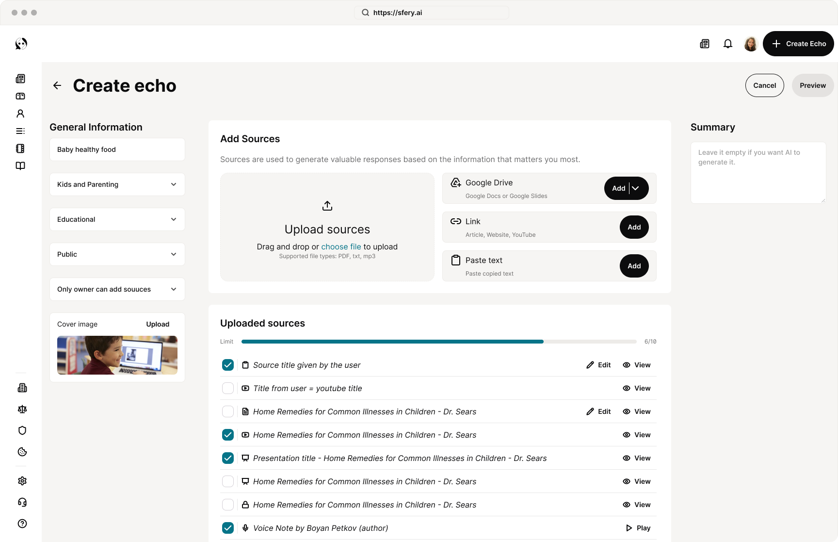
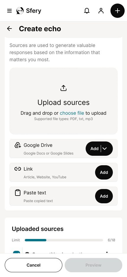
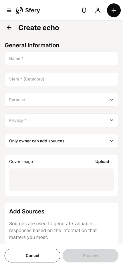
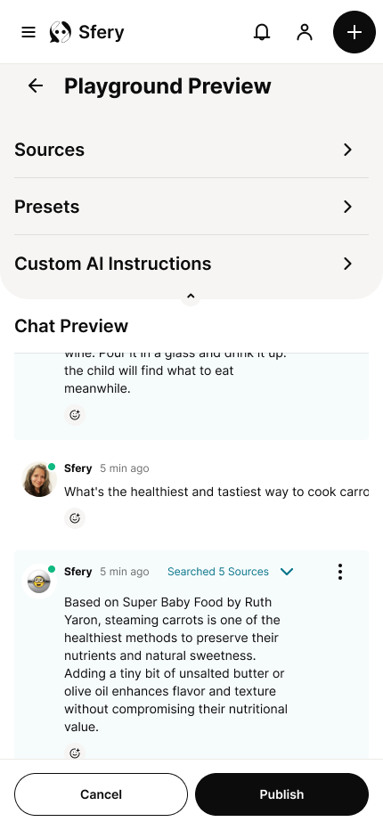
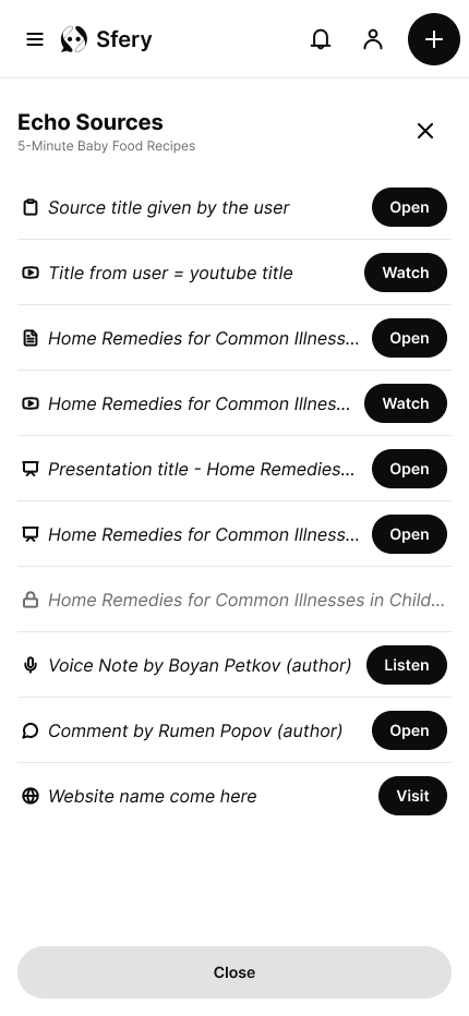
Echo creation and resource upload flow
Echo chat and tread
Design System
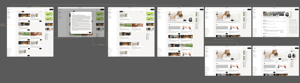
Digital wireframes
High-fidelity prototype
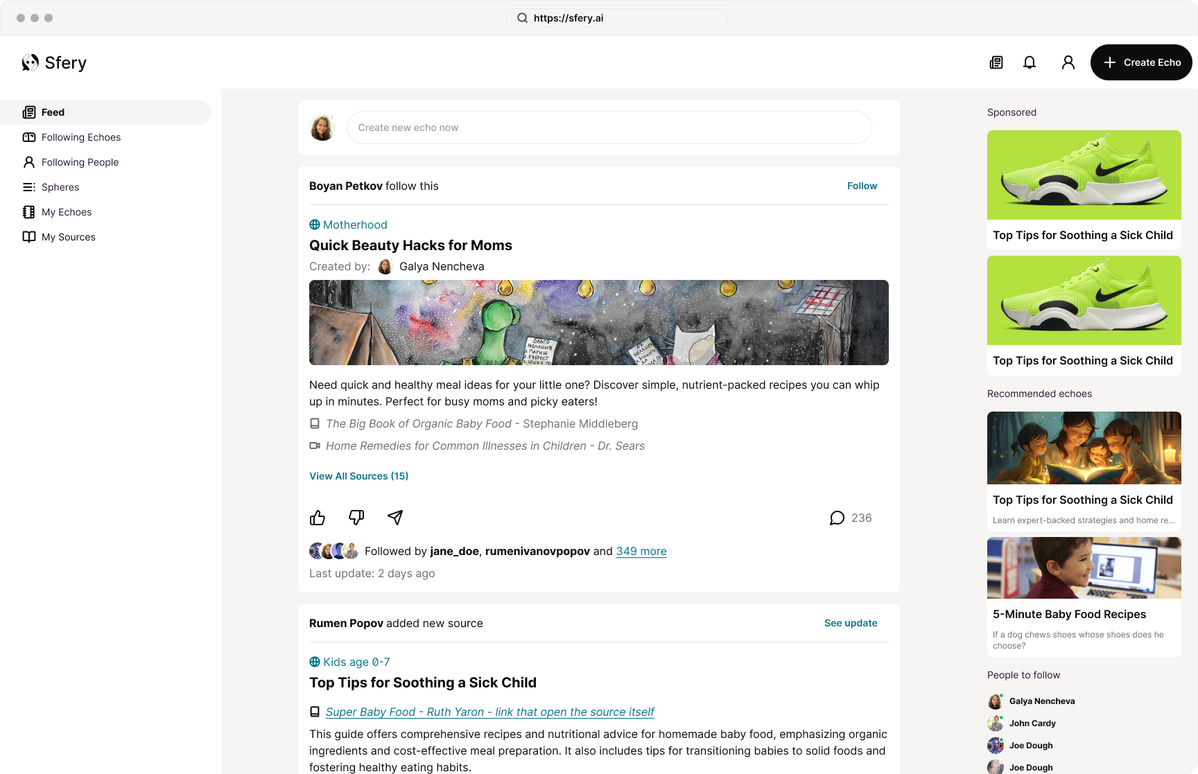
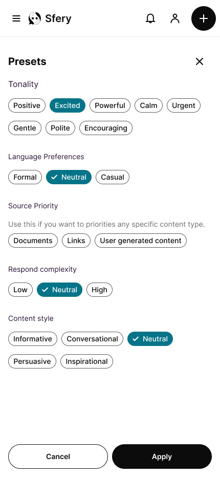
For the visual design, I focused on a clean, modern aesthetic with a minimal look and feel. The goal was to let the content stand out, avoiding any visual clutter. I used a neutral color palette with a single, subtle accent color to draw attention to key actions. Due to a tight two-week timeline for the MVP, the developer and I strategically decided to use a design system we were both already familiar with, which allowed us to build quickly and efficiently using pre-existing templates.
Design system & Design Language
After defining our user personas, we established a design language to represent our users’ needs and preferences. Based on the insights from our quick research of competitive social platforms, we decided to follow a modern aesthetic with a focus on trust and clarity. To achieve this, we used the following components.
Color Scheme
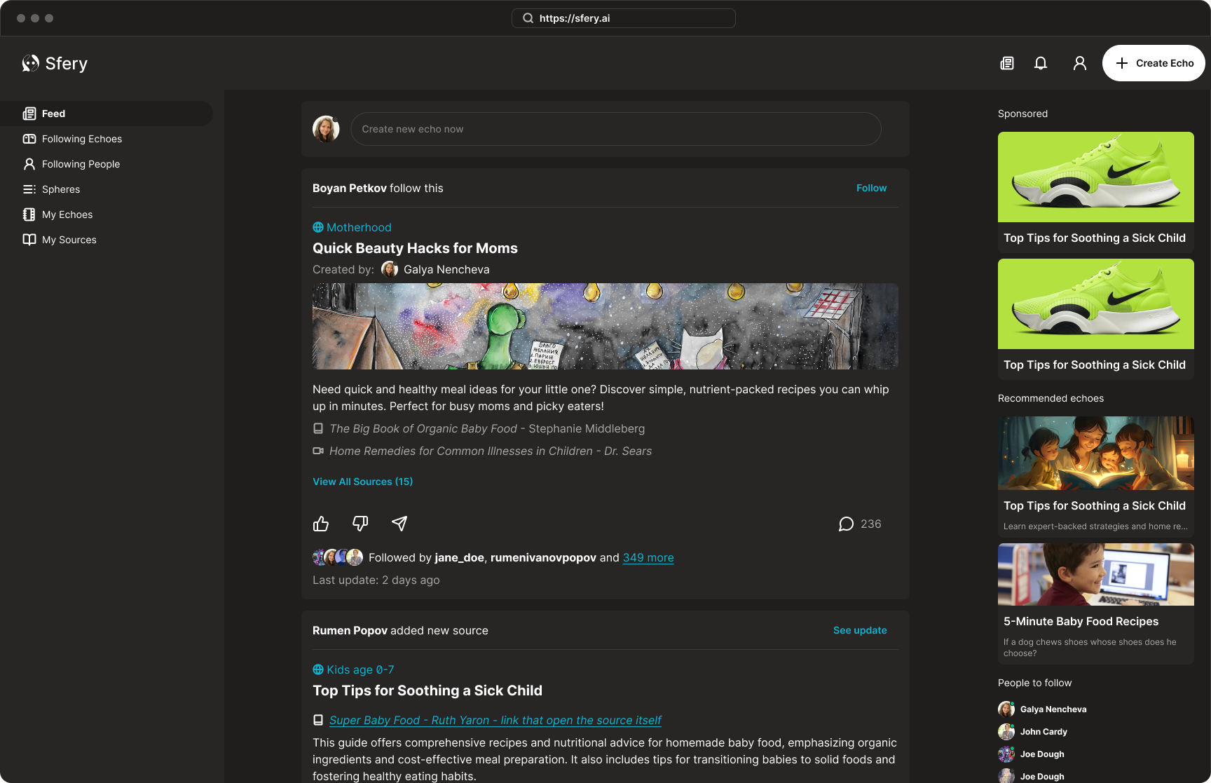
We opted for a sophisticated black and white theme, complemented by a secondary bluish accent color for key elements. This approach creates a modern and sleek look, while also supporting both a light and dark theme.
Component Library
To meet our tight two-week deadline, we chose to work with the DaisyUI component library. This decision was based on our familiarity with the framework and the availability of pre-built templates that allowed us to move quickly from ideation to implementation without sacrificing quality.
Design Language
Our design language prioritizes a clean, social feel. We used a "pills" style for buttons and components with a big border radius to create a friendly soft and yet professional look. This approach allows us to use well-known UI patterns and components, ensuring user familiarity and a short learning curve.
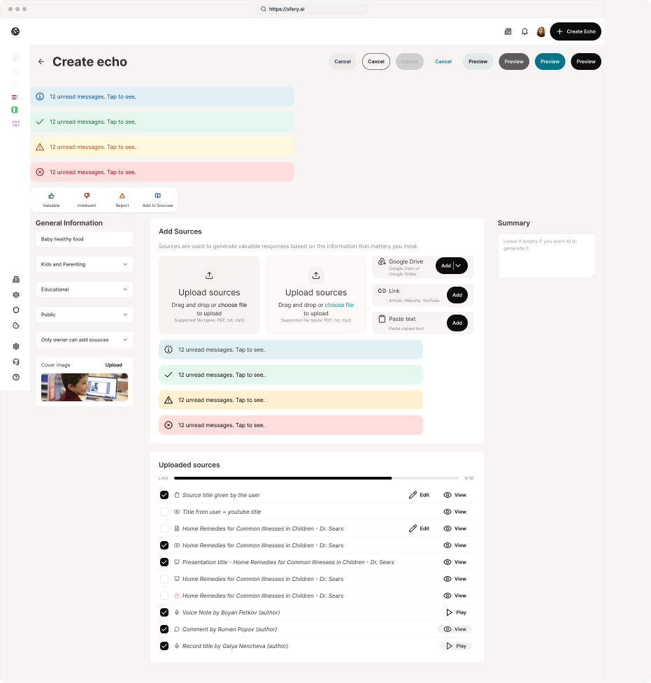
Wireframes & Mockups
To meet the tight deadline, I began the wireframing process directly using our established component library. This allowed for rapid iteration on the layout and hierarchy of key screens, such as the feed cards and the creation button. From there, I transitioned to the final high-fidelity mockups, where my primary focus was adjusting the color palette to achieve the final look and feel. The designs were optimized for a responsive experience, ensuring a clean look on both desktop and mobile, though we focused on the desktop experience for content creation, as managing multiple sources is more easily done on a larger screen.
Responsive Design

Light & Dark Theme
A key part of our design system was the implementation of both a light and dark theme. This feature provides users with control over their viewing experience, reducing eye strain and allowing for a more personalized feel. The dark theme, in particular, enhances the minimalist aesthetic and allows the bluish accent color to pop, drawing focus to important interactions and content. This decision supports our goal of creating a comfortable and intuitive experience for all users.
High-fidelity Prototype
Accessibility
Documentation
Accessibility Considerations
Color Contrast
I ensured that all text and key UI elements met WCAG AAA contrast ratio to guarantee readability against both the light and dark backgrounds.
Readability and Typography
I selected a clean, sans-serif font for optimal readability and used a clear visual hierarchy to guide the user's eye and help them quickly scan content.
Visual Hierarchy
I used a combination of font size, weight, and spacing to create a clear visual hierarchy, distinguishing titles, summaries, and body text to reduce cognitive load.
Iconography
All icons were chosen for their universal clarity and were designed with adequate size. They are also supported by descriptive labels or alternative text for screen readers to ensure all users can understand their purpose.
Documentation
All screens are clearly explained and each button or interaction is visually represented and connected to the event it triggers.
Additionally, the entire design is thoroughly documented in both Notion and Figma. This enables better cross-team collaboration and provides a record of decision-making and reference to the brief.
Takeaways
Next Steps
Takeaways
Impact
What I learned
Next Steps
Presenting the design solution to key stakeholders.
Talking to people to validate the core MVP concept.
Adding more core functionalities to the product.
Testing with real users to refine the user experience.
Thank you!
Thank you for your time reviewing my work on the Sfery concept project! If you’d like to see more or get in touch, my contact information is provided below.