Applicant Tracking System Guest Apply Feature
Project overview
The Product
ATS (Applicant Tracking System) is dedicated to facilitating the search for reliable, passionate and service-oriented employees. ATS is a powerful applicant tracking system tools to help managers find the best candidates that fit your brand and business needs.
Project Duration
April 2022 - October 2023
The problem
Adding new functionality for building multilevel approving process that allows the company to enter the new market. The company lacked an approval process and permission driven design, as well as lack of notification and alert flows.
The Goal
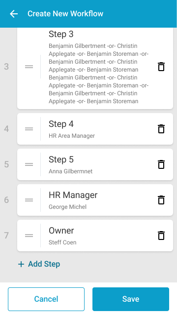
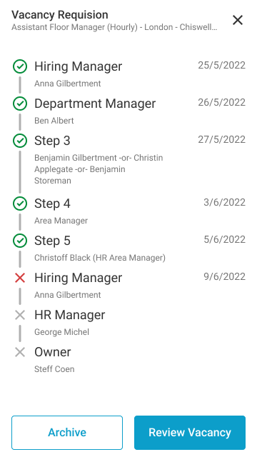
Create a quick and easy way for managers to build their own approval workflows depending on their needs and company hierarchy. Create approval workflows depending on the user's permission. Create different views depending on the role (Approval and Requester). Create design flow for notifications and alerts.
My Role
UX designer, UI designer based on Design system - development and creation of new patterns and components for the desktop environment added to the Design system.
Responsibilities
Conducting interviews, digital wireframing, low and high fidelity prototyping, conducting usability studies, accounting for accessibility, and iterating designs. Deliver final UI, designed based on the design system, create new patterns and components to add to the design system. Build it for both desktop and mobile devices. Document the project and support the development and QA teams until the final feature launch.
User Research Summary
I conducted some online interviews and created empathy maps to understand the users I am designing for and their needs. A primary user group has already been defined by the product and the market we want to enter – mid-level managers who have many tasks and want to automate some of that work. Their primary need is to have a vacancy approval workflow that represents their company hierarchy.
This user group confirmed the initial assumptions that multi-level approval is their main need, but the research also revealed that the custom approval workflow is not the only one. Managers feel they lack the time to communicate at different levels about the new opening. They also have a hard time tracking where the vacancy is in the process and what its status is.
Hierarchy
The company has a complex hierarchy that dictates the approval process.
Visibility
The status of the job offer and the step of release must be clearly visible.
Time
Managers are short on time and want quickly to request new position opening.
Accessibility
The current view of the application did not meet the standards for color contrast.
Personas

Molly's Problem Statement
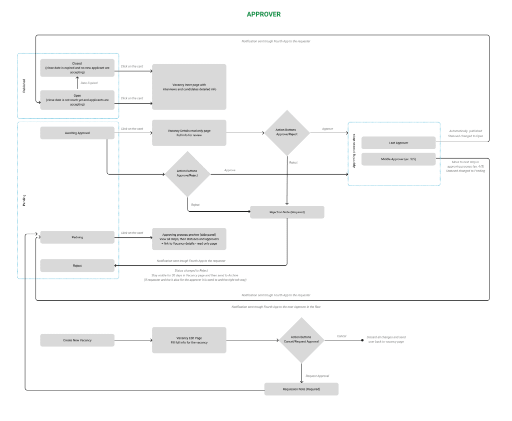
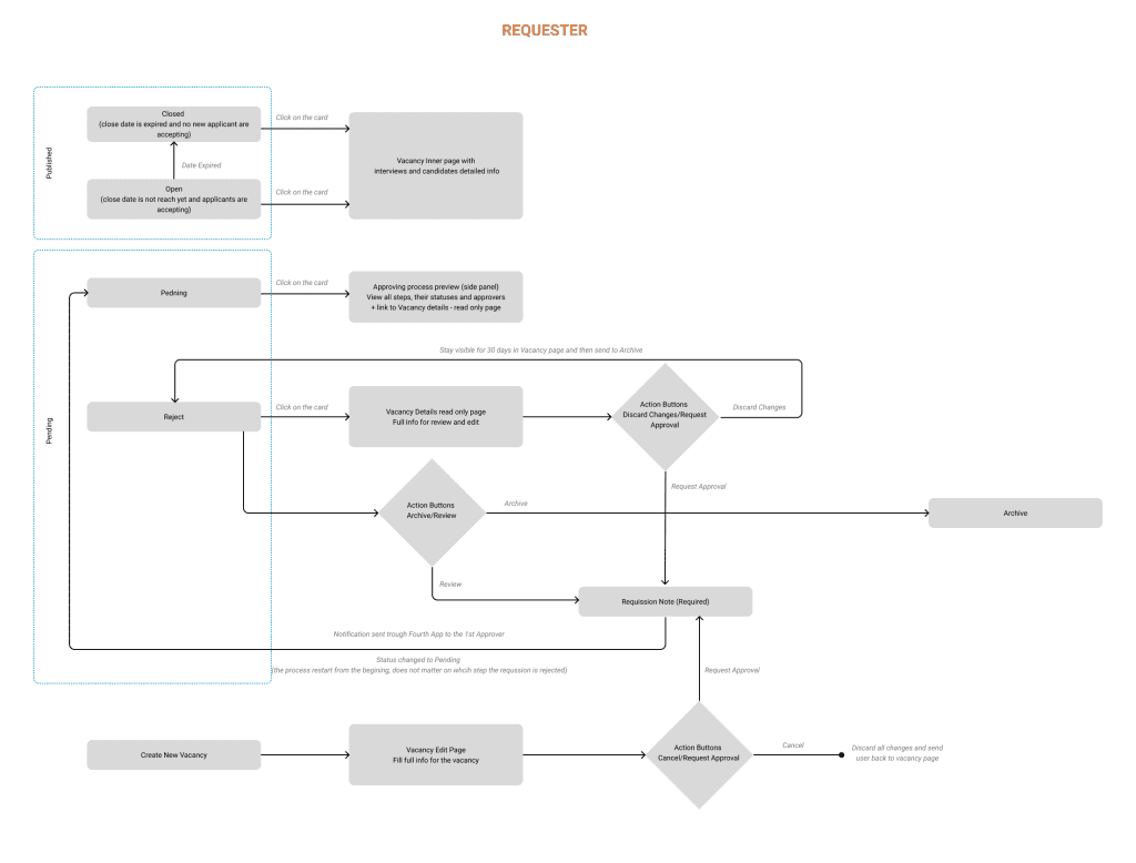
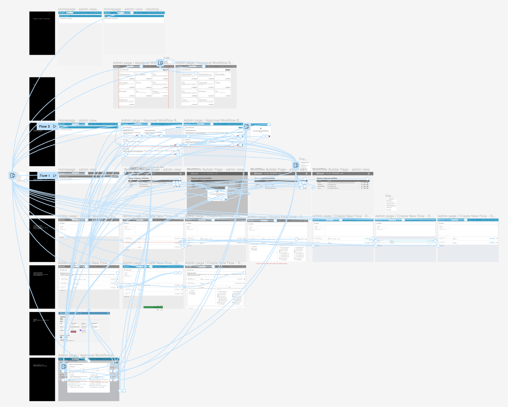
User flows
Digital wireframes
Low-fidelity prototype
Usability studies
Digital Wireframes

As the initial design phase continued, I made sure to base screen designs on feedback and findings from the user research.
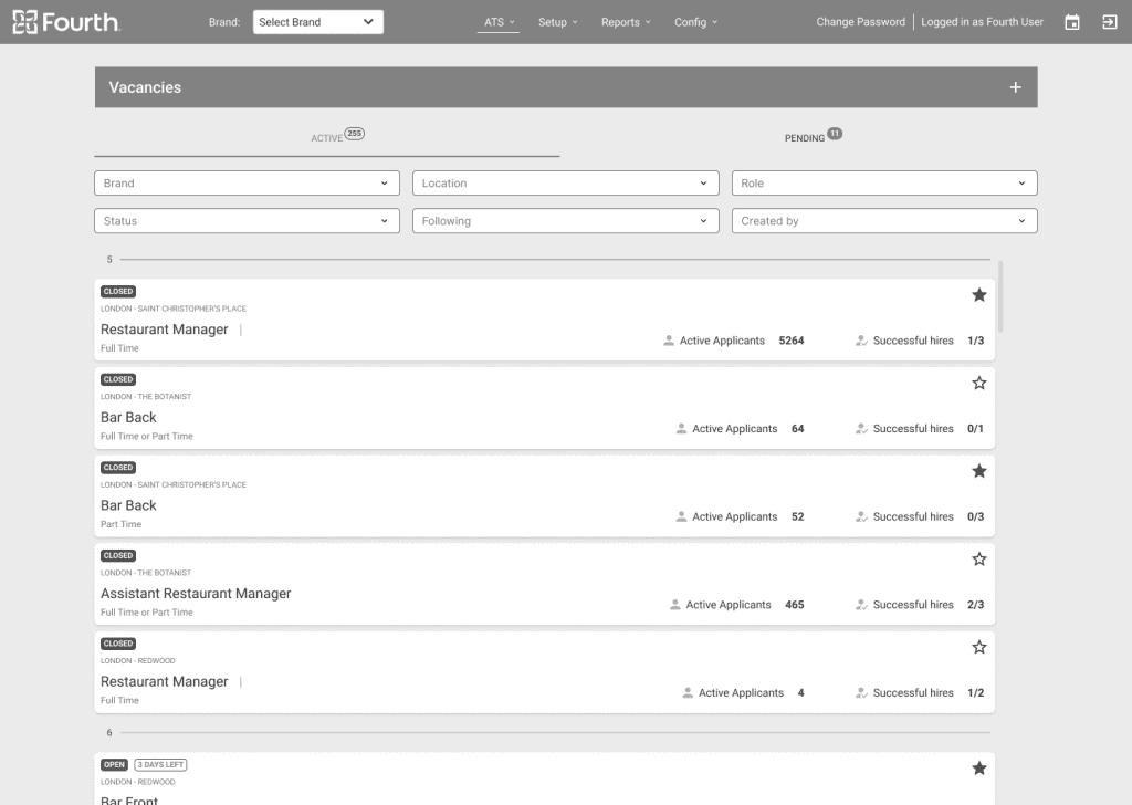
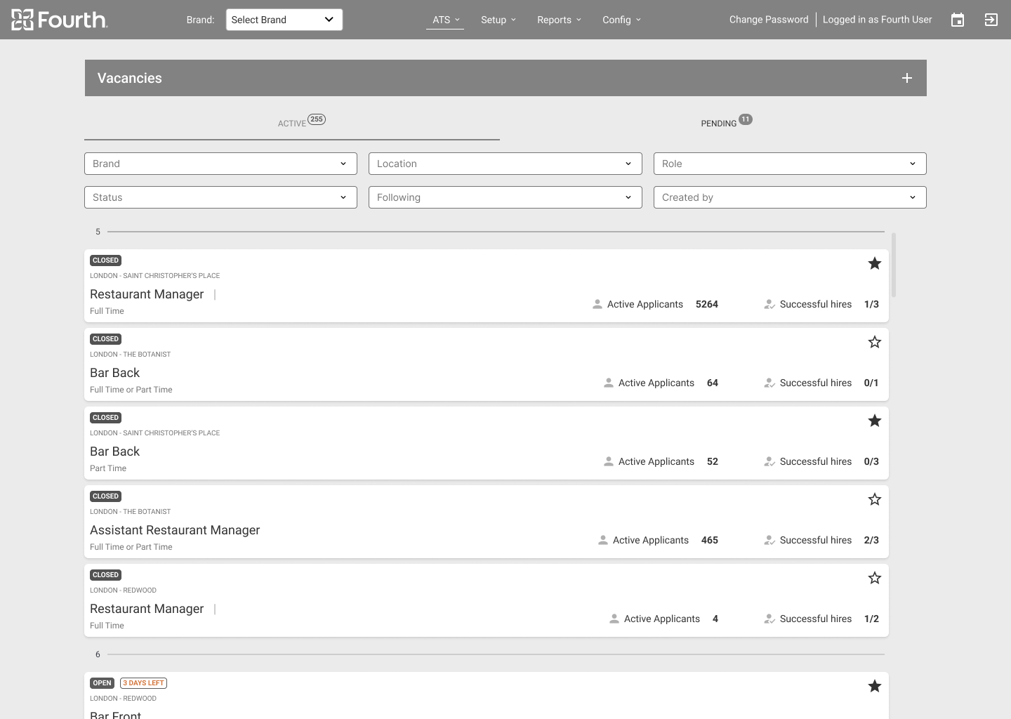
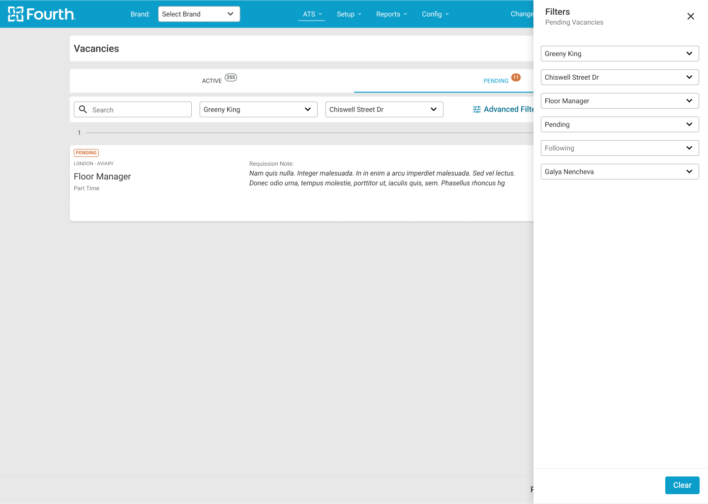
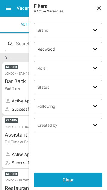
Easy filtration and section with statuses was a important part of the managers feedback for easier orientation in the screen.
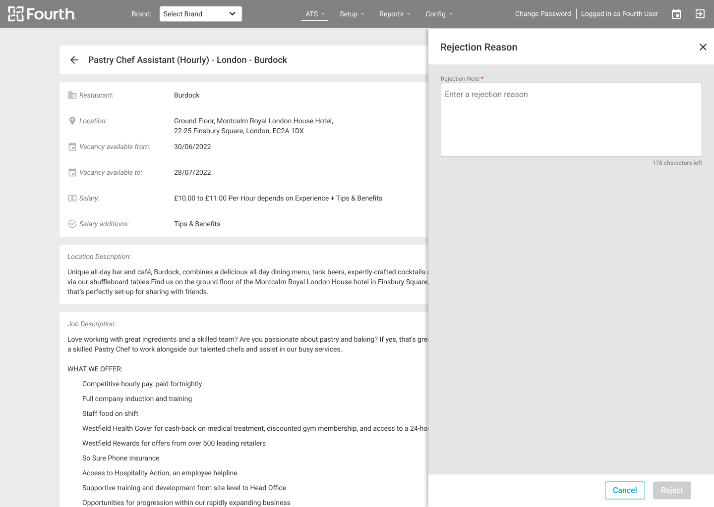
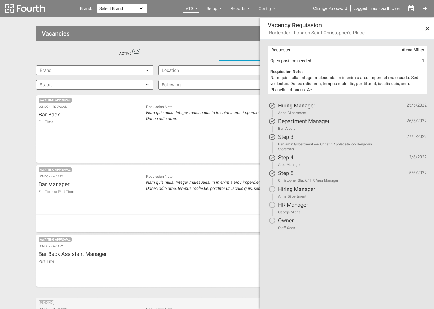
Low-fidelity Prototype
Usability Study Parameters
Study Type
Unmoderated usability study
Location
USA and UK
Participant
10 participants
Duration
20-30 minutes
Usability Study Findings
Round 1 findings
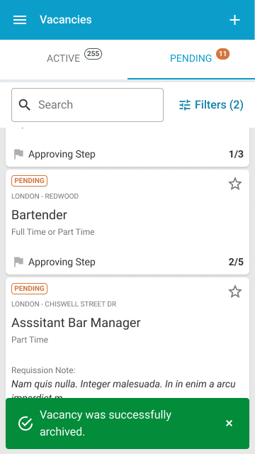
Users need a better separation between live oppenings and vacancies that are still in the process of approving.
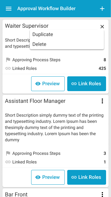
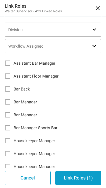
The user needs a way to assign roles to the approval workflow without editing this flow.
Round 2 findings
The user needs to be able to be approver and requester in the same time.
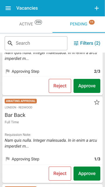
The user needs a way to give a quick approval or rejection from the vacancy page without having to go to the vacancy detail page.
Mockups
High-fidelity prototype
Accessibility
Hi-fi Mockups Desktop
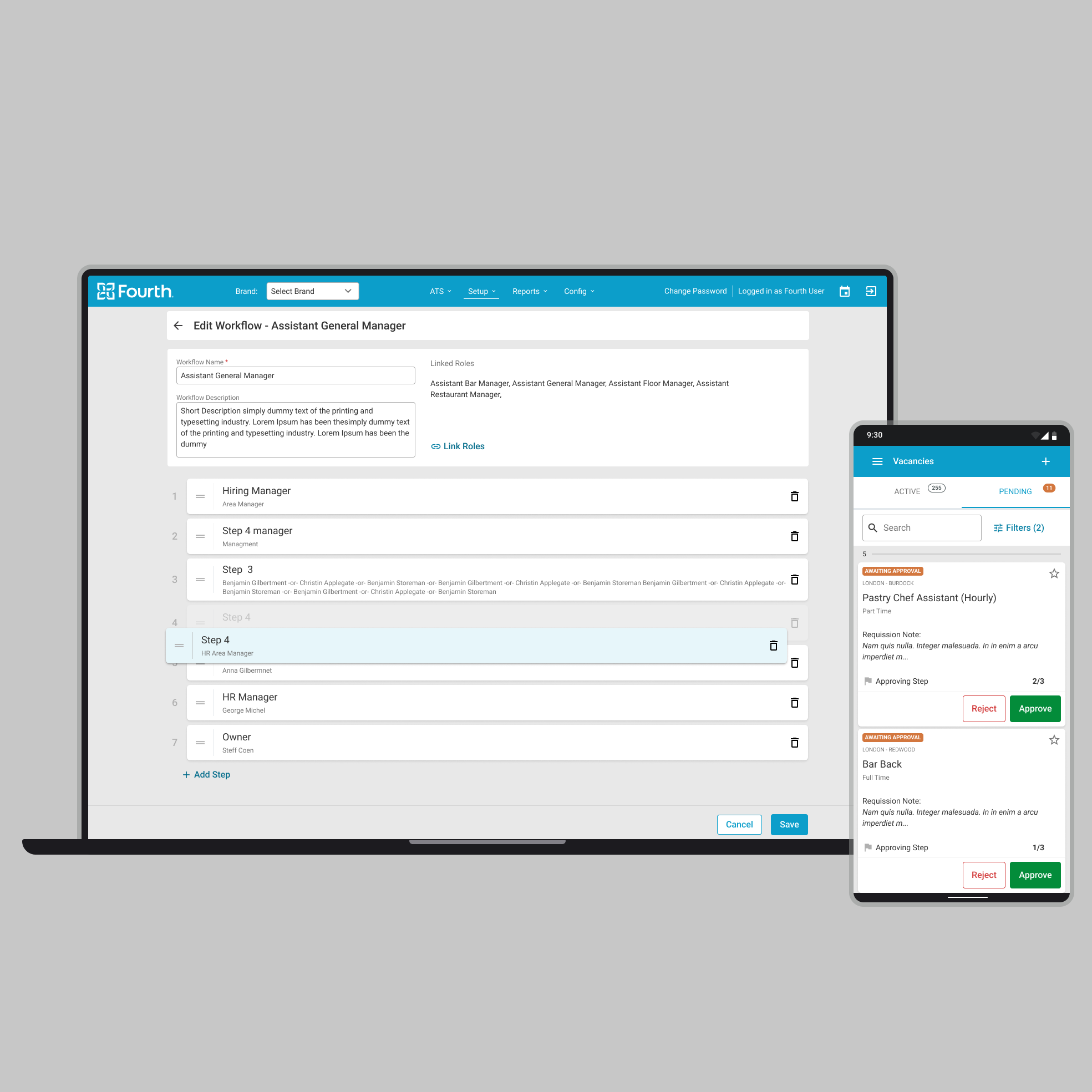
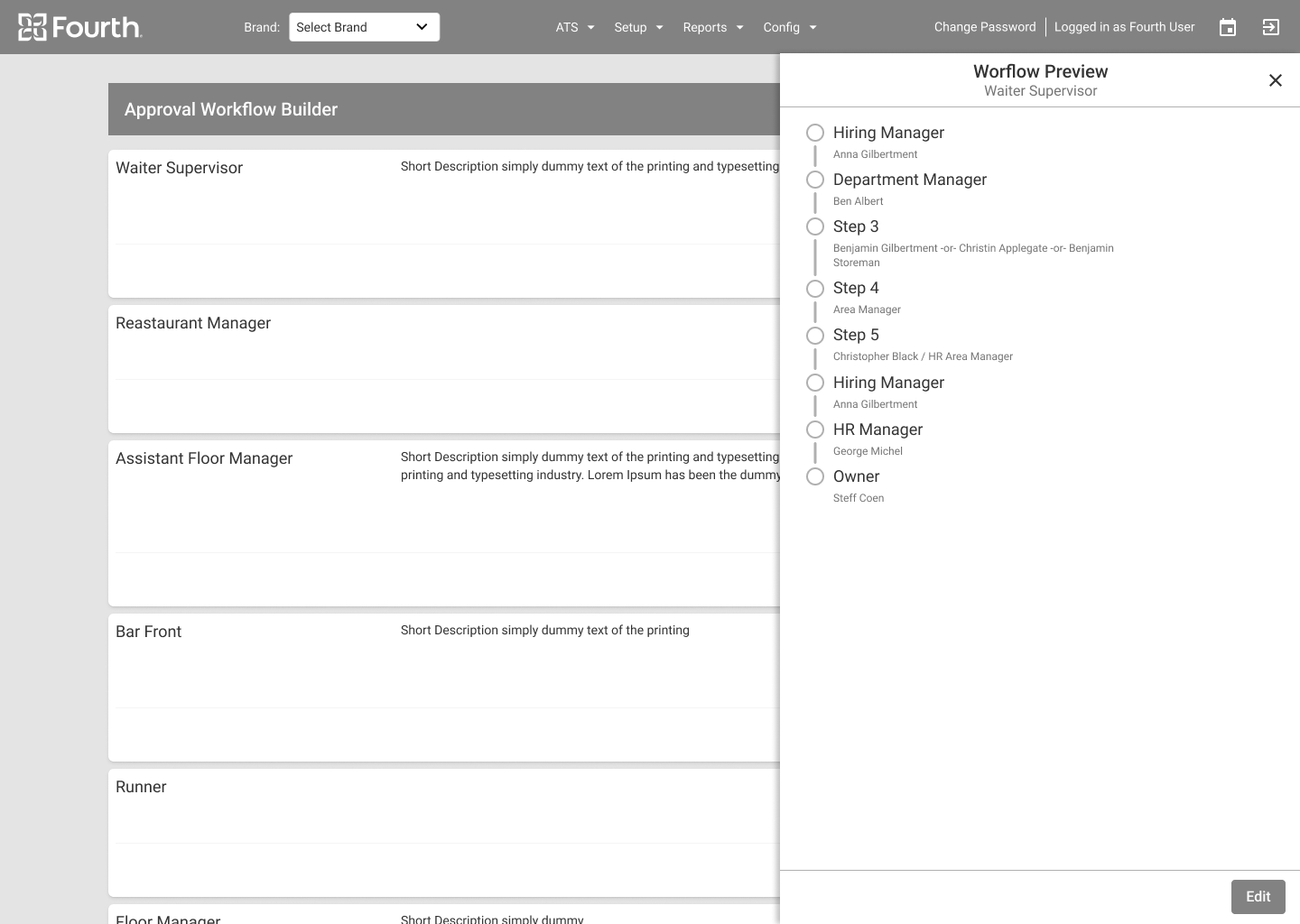
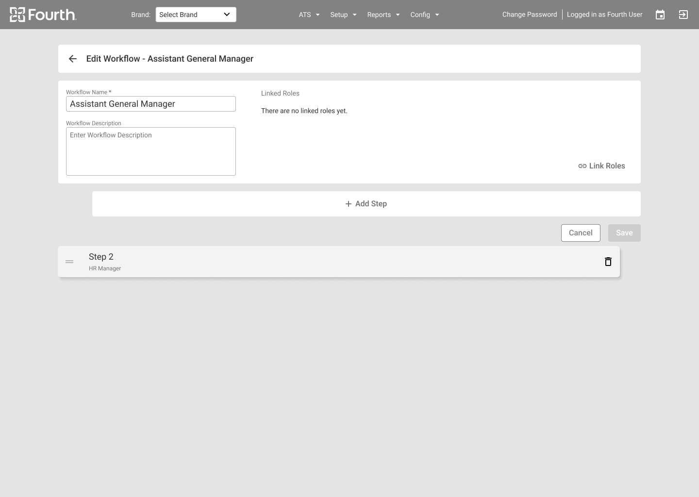
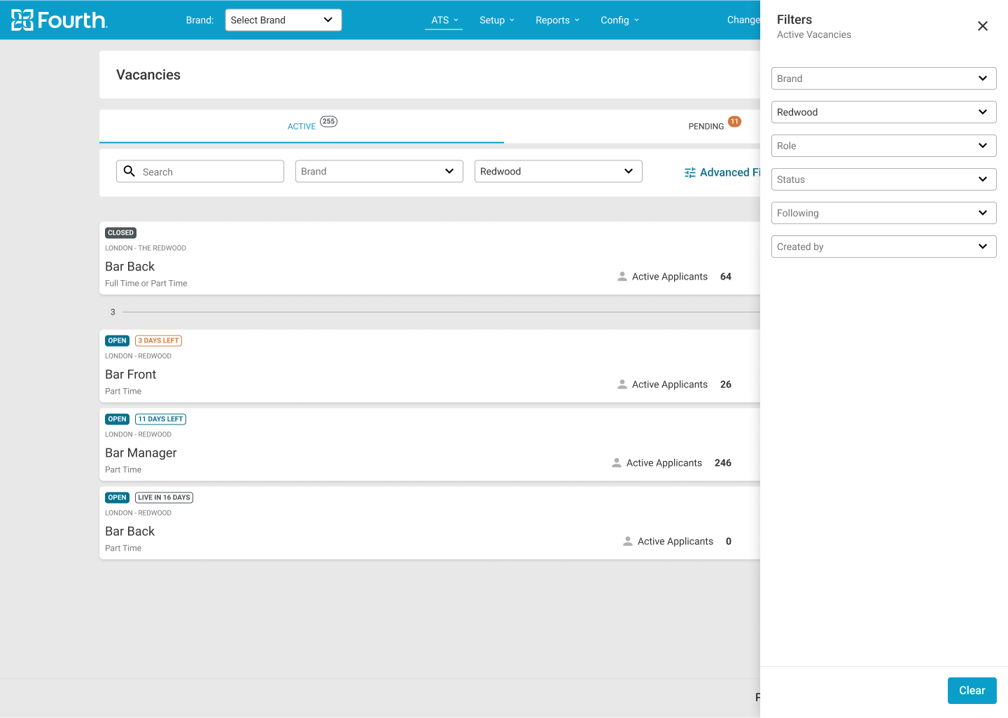
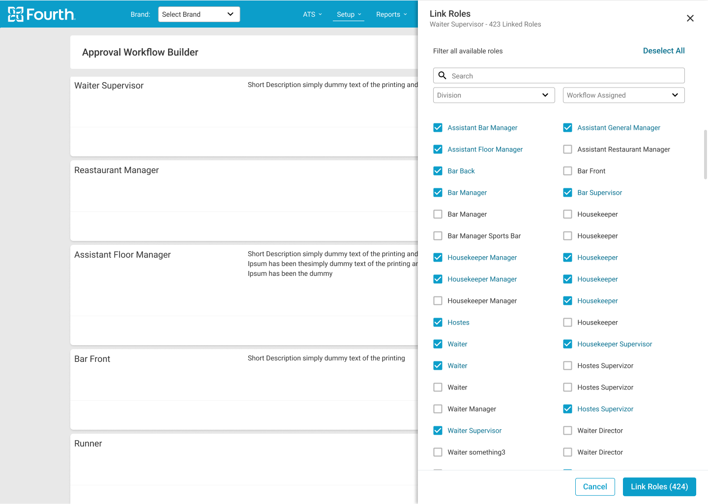
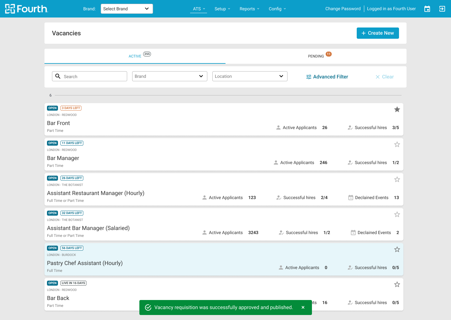
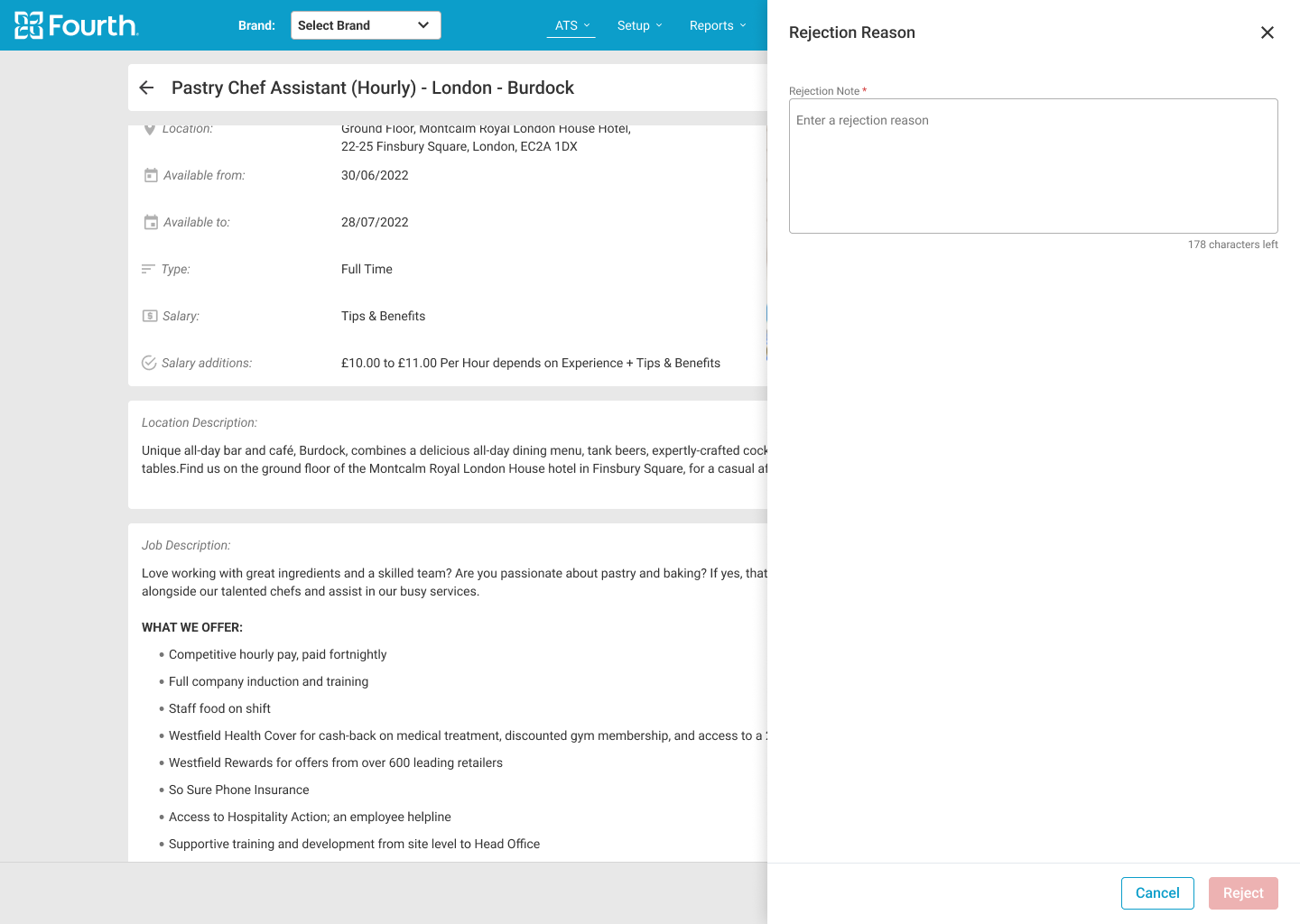
The initial designs allowed for some customization, and after usability studies, I added an additional tab to distinguish between “live” and unapproved vacancies. I also reworked the builder design so that managers can now assign roles inside and outside the workflow edit page.
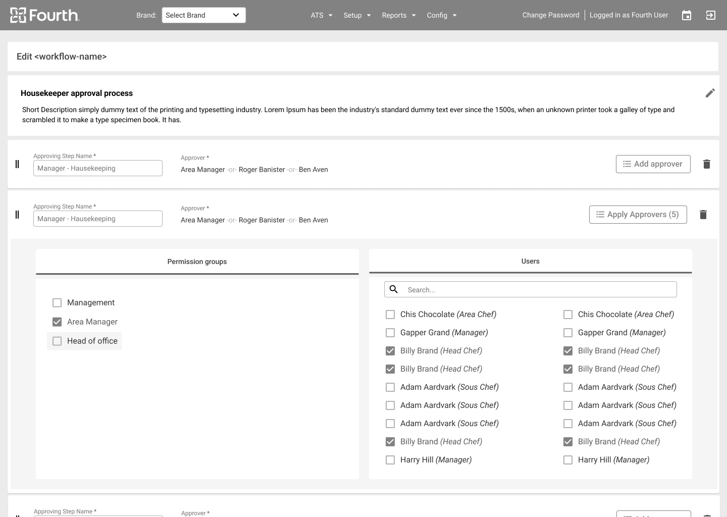
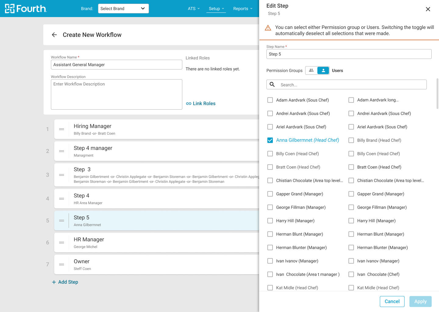
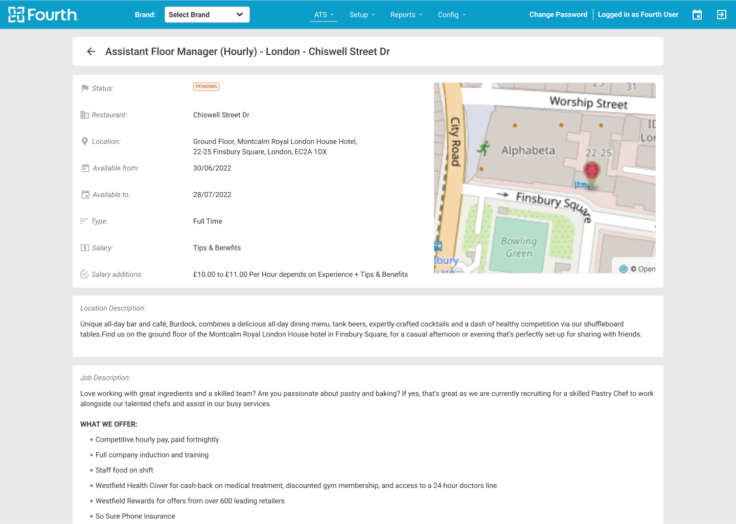
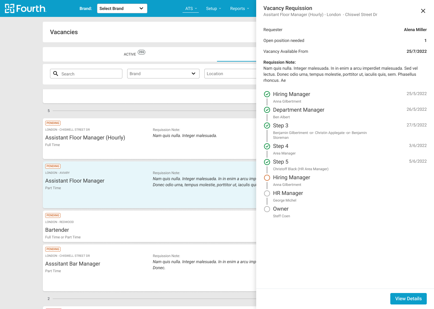
After the usability study, I reworked the design and gave the managers the ability to approve the vacancies from the main card in the vacancies page, but also have the ability to review the vacancy details and approve it from there.

Key Mockups



Hi-fi Mockups Mobile
High-fidelity Prototype
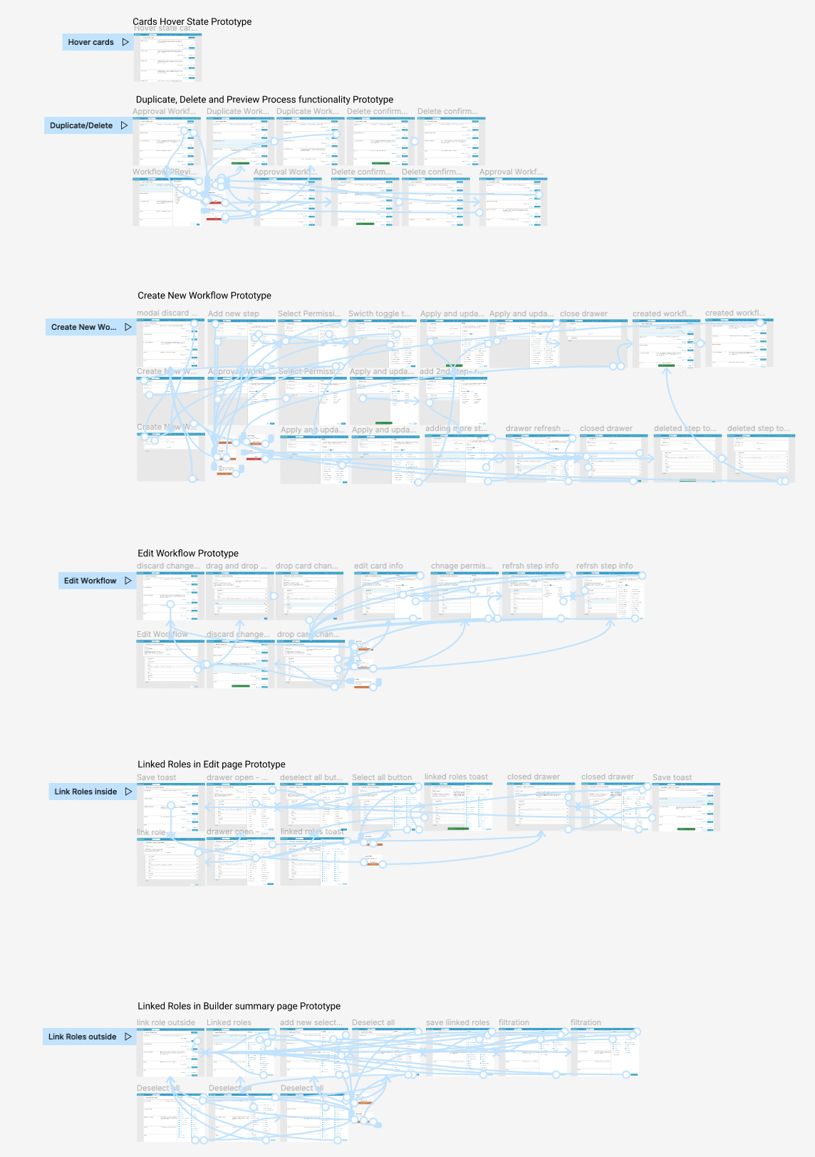
Brandable Solution
The final product must be brandable with the client company’s colors. To this end, strict rules have been established for what can and cannot be branded. The ATS internal branding tool was also revised to ensure that all rules were followed and that all colors used complied with contrast standards.


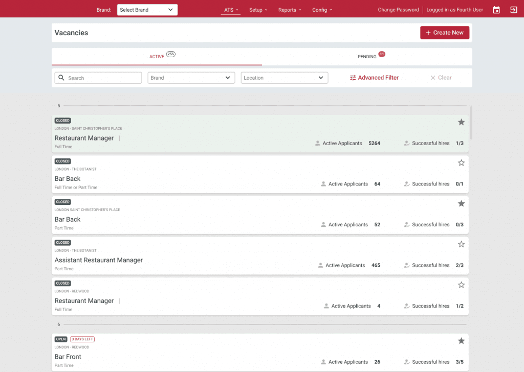
Accessibility Considerations
Facilitating access for visually impaired users by adding alt text to images for screen readers.
Icons used to make navigation easier to use.
Refine the color to make sure we cover the contrast standards.
Add color coding for statuses to make it easier for people with low vision to quickly scan the information.
Documentation
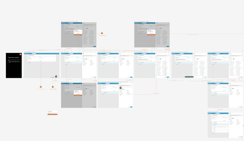
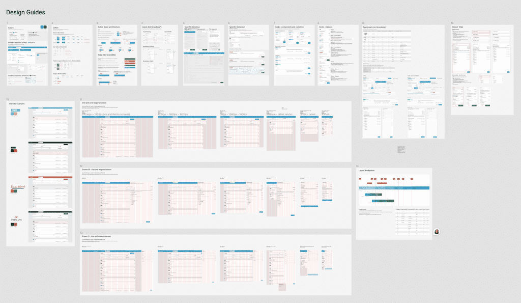
All screens are well explained, each button or iteration is visually represented and associated with the event that triggers it. In addition, the entire design is well documented in both Confluence and Figma.
This contributes to better cross-team collaboration and allows decisions to be track and referenced back to the brief.
Takeaways
Next Steps
Takeaways
Impact
What I learned
The new UI of the vacancies page makes it much easier to see which vacancies need my attention and where I need to get involved.
Next Steps
Get feedback from real users who have been using this feature for more than 4 months and note improvement opportunities.
Conduct further user research to identify new areas for improvement.
Continue to redesign the application, especially the applicant process, to make the entire journey seamless.
Thank you!
Thank you for taking the time to review my work on the ATS app! If you’d like to see more or get in touch, you can find my contact information below.
