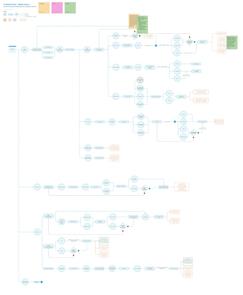
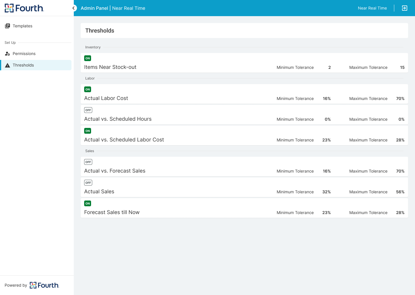
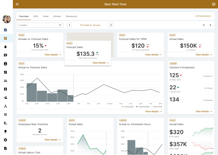
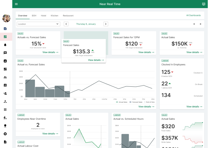
Real Time Data Dashboard
Project overview
The Product
Real Time Data Product is the missing piece of the company portfolio that gives managers real-time insights into the current state of the business. They get a real-time comparison between schedule and forecast and can take action and make informative decisions based on this data.
Project Duration
November 2022 - February 2023
The problem
Managers need real-time data to make informed decisions (ex. to call out workers to minimise losses), but most of them use separate applications for scheduling, inventory and/or clock in, with no collaboration or metrics between them. Manager need to go over more than one appliciation to decide what action they need to take. Also different hierarchical levels may have limited information and applications access, but still need key numbers to make decisions right the way.
The Goal
Develop a permission-driven, customisable dashboard solution that provides real-time insights for managers facing the challenge of scattered applications and limited access to information. The solution should allow managers to select and arrange relevant metrics according to their preferences, enabling them to make informed decisions in a timely manner. The solution will also include an admin panel for rule creation, including permission levels, available metrics for specific locations, threshold settings, and a central global template builder for consistency across all locations.
My Role
UX designer, UX Researcher, UI designer (adding new components and patterns to the existing design system)
Responsibilities
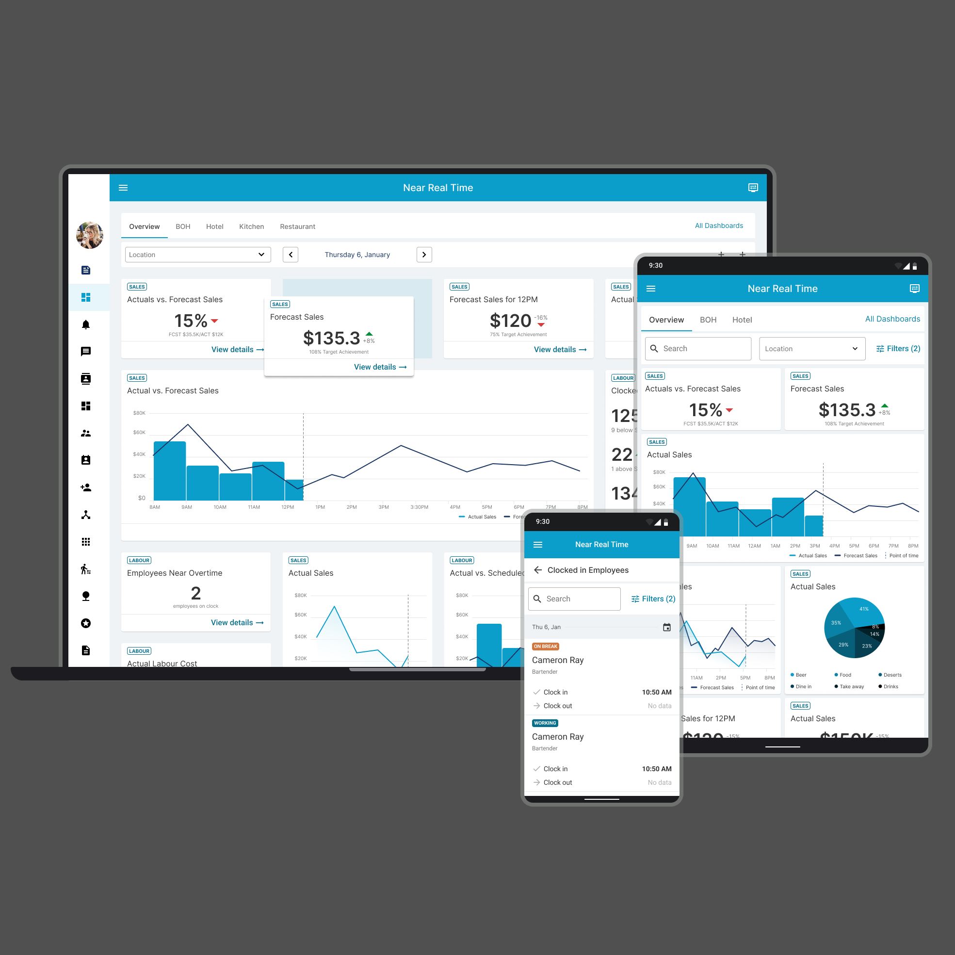
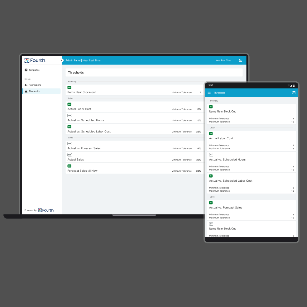
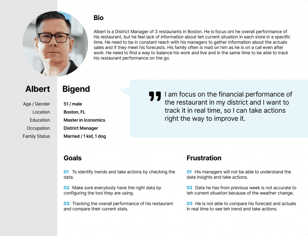
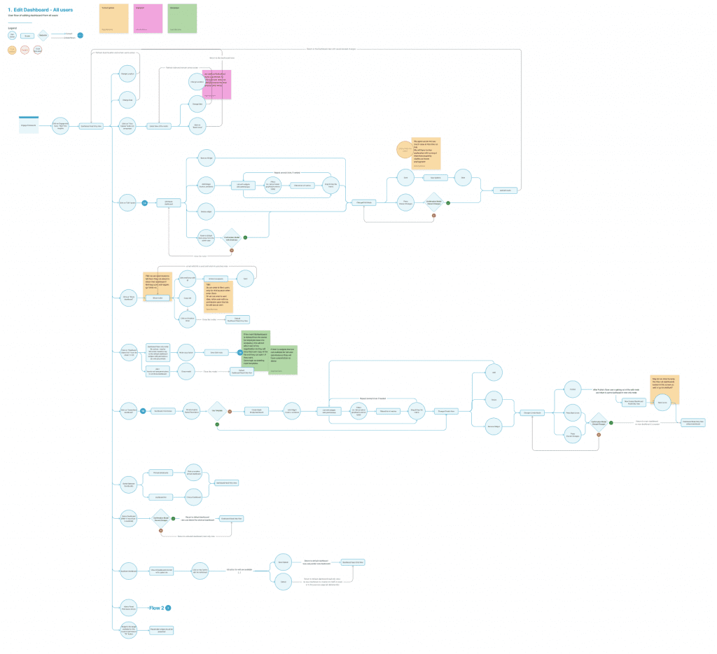
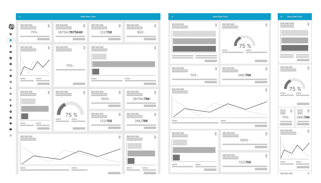
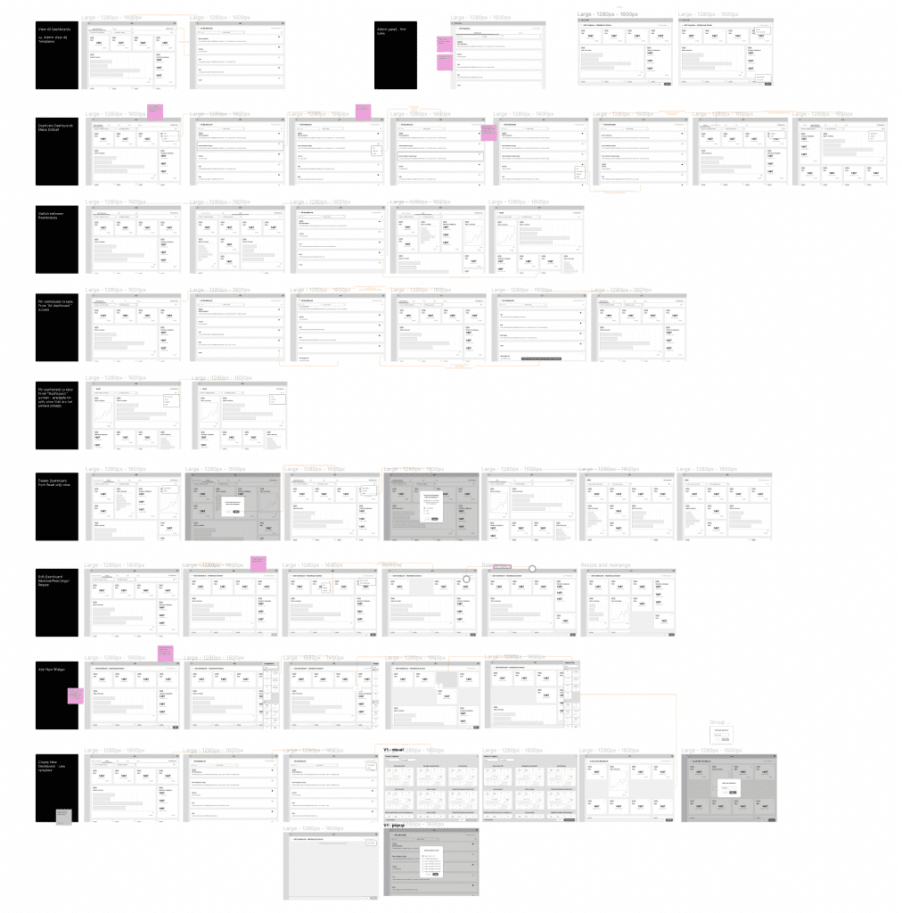
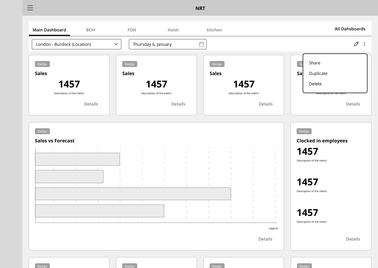
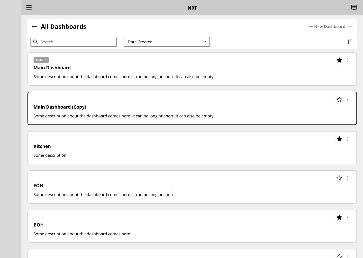
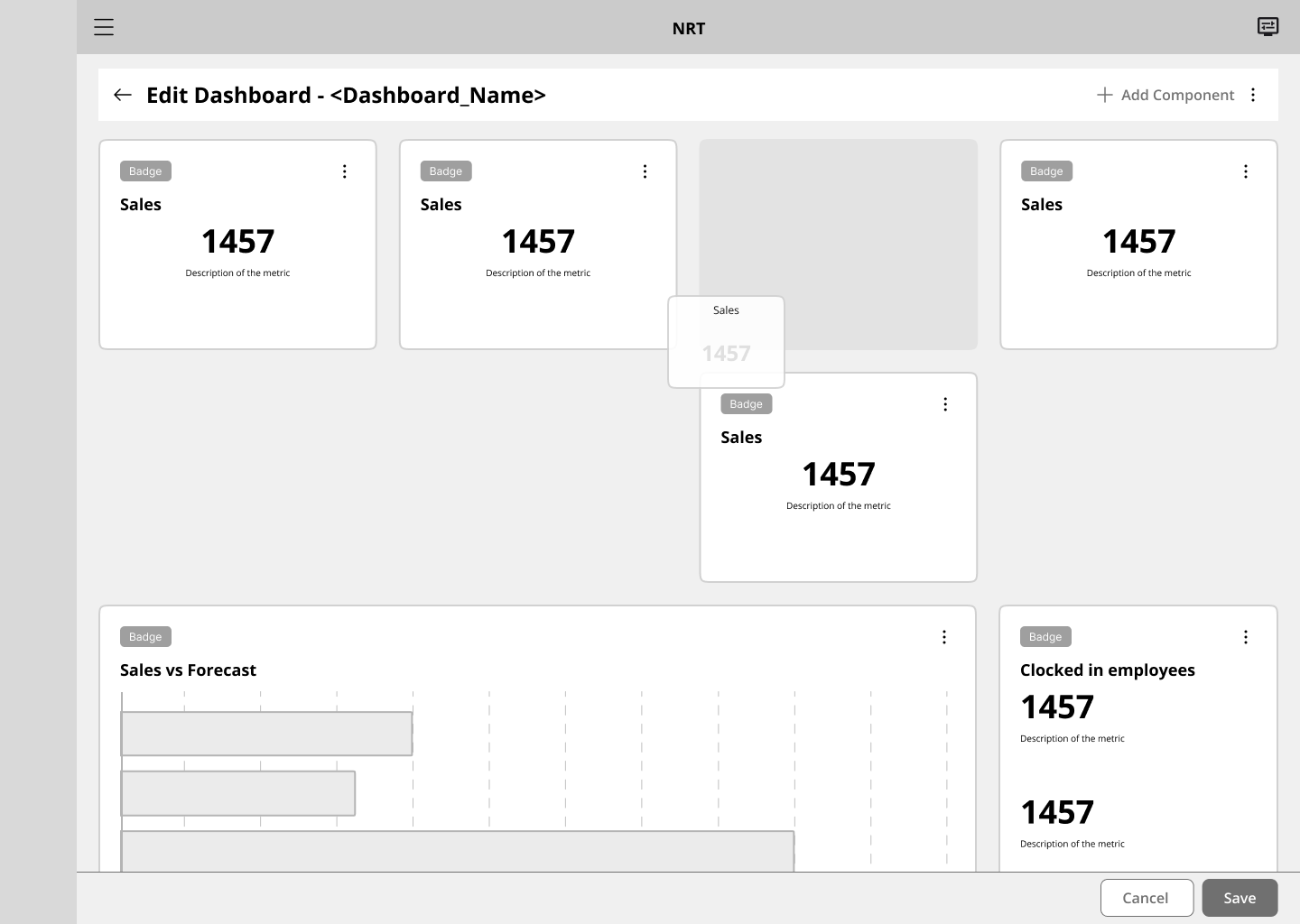
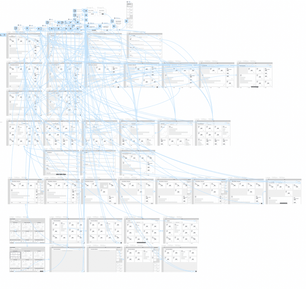
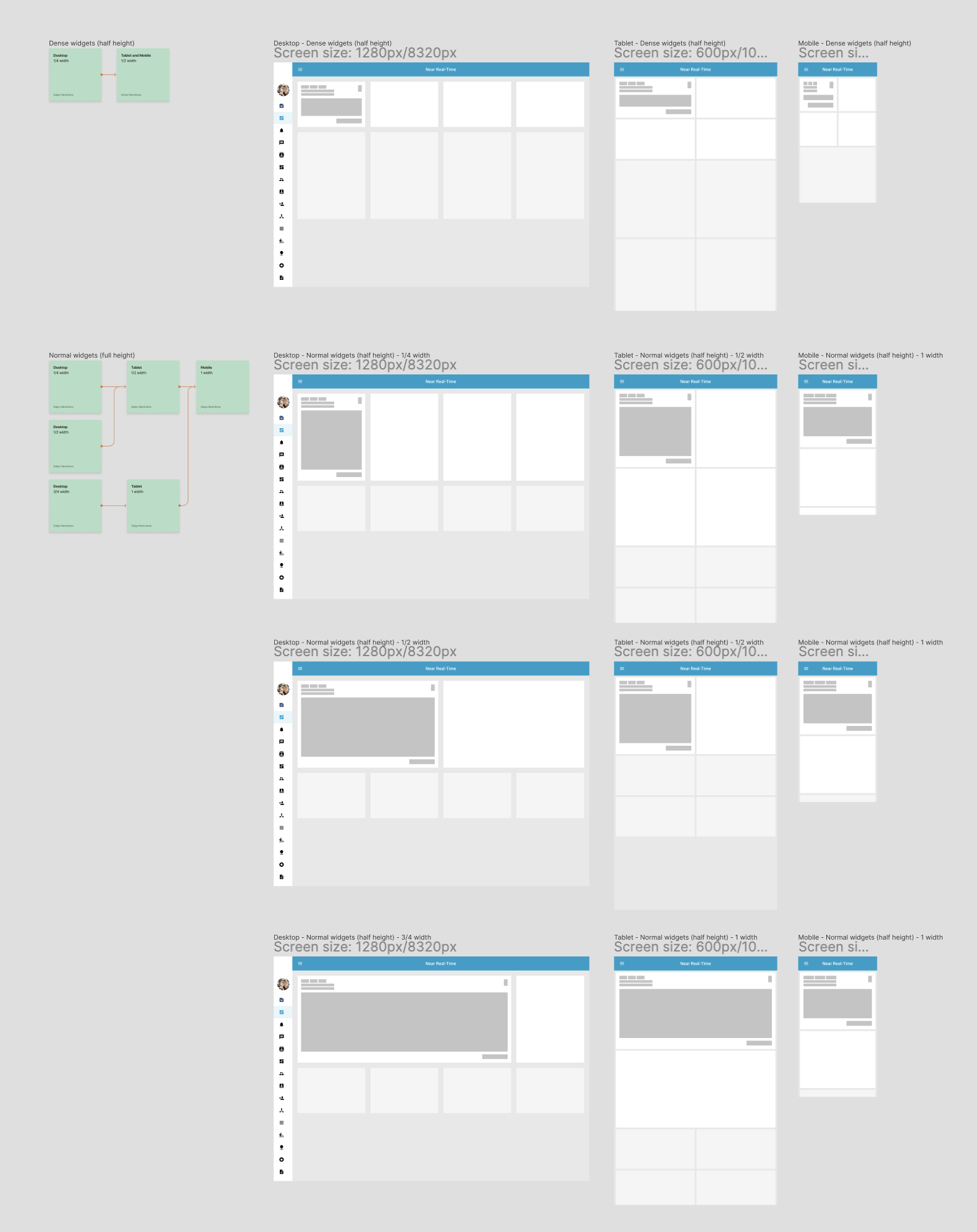
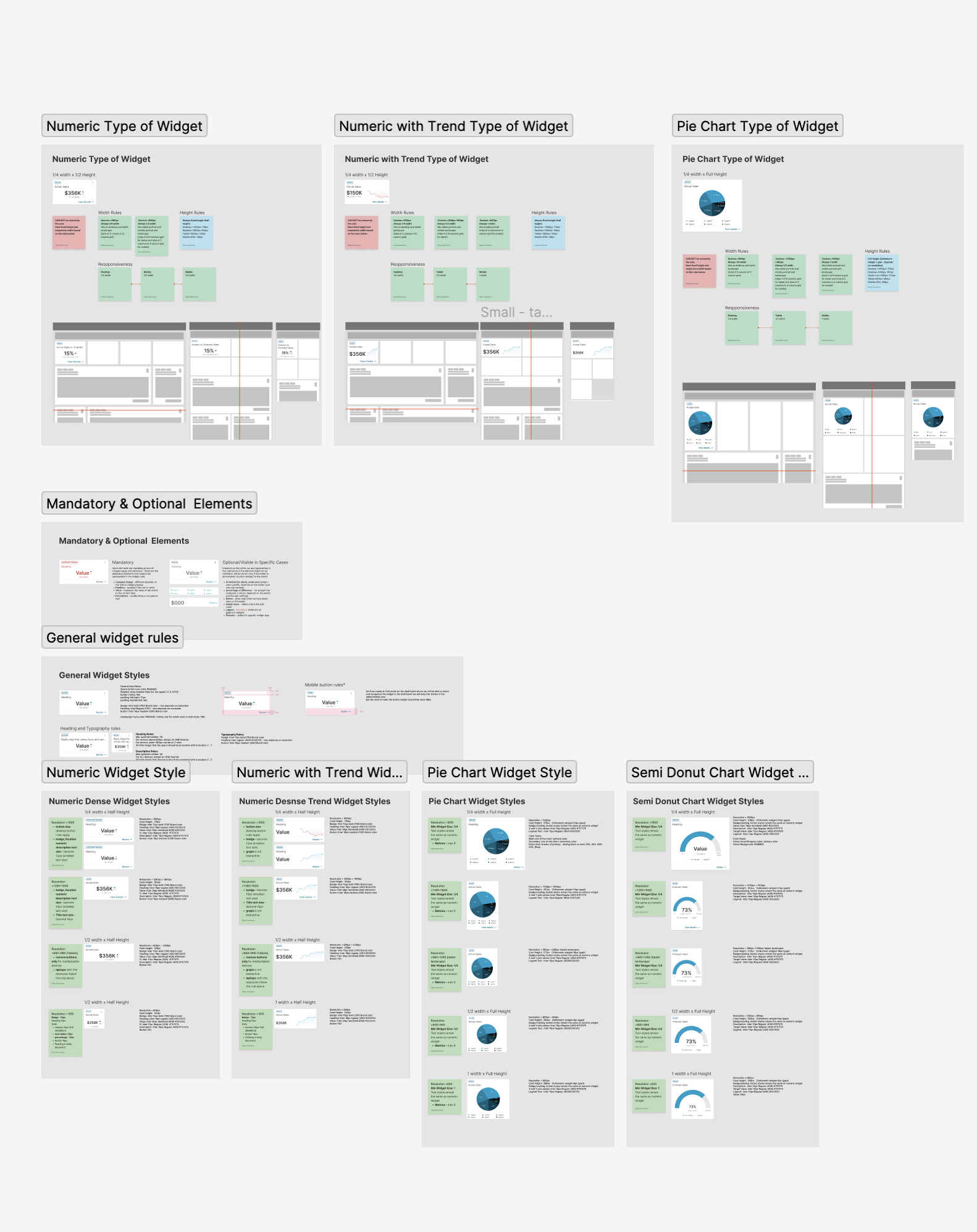
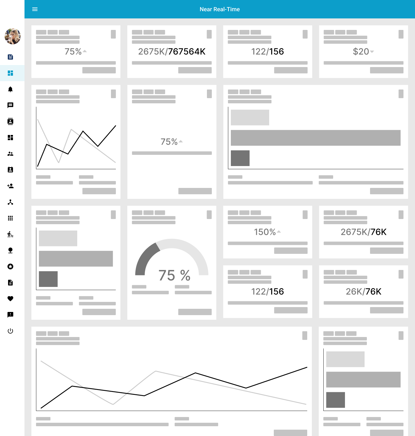
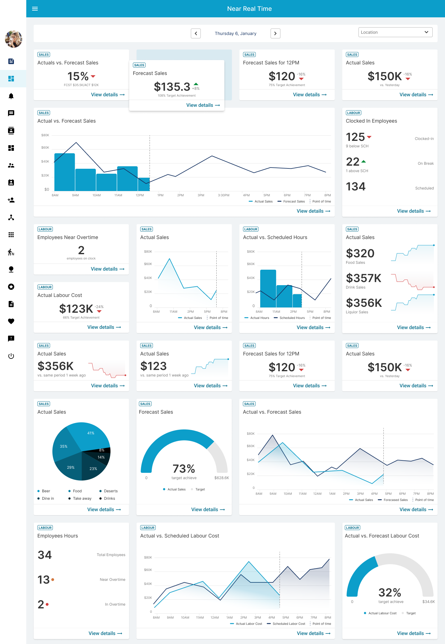
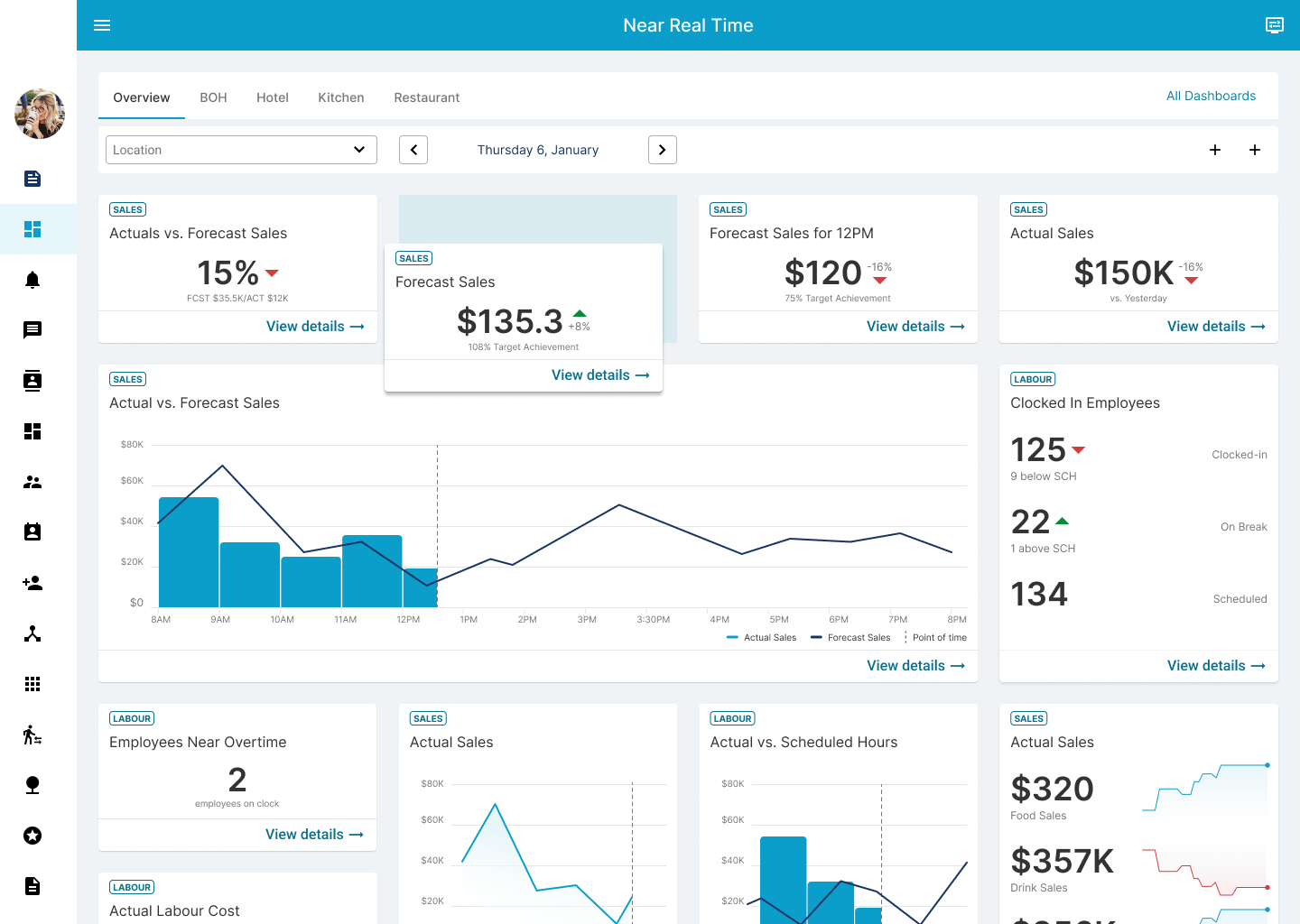
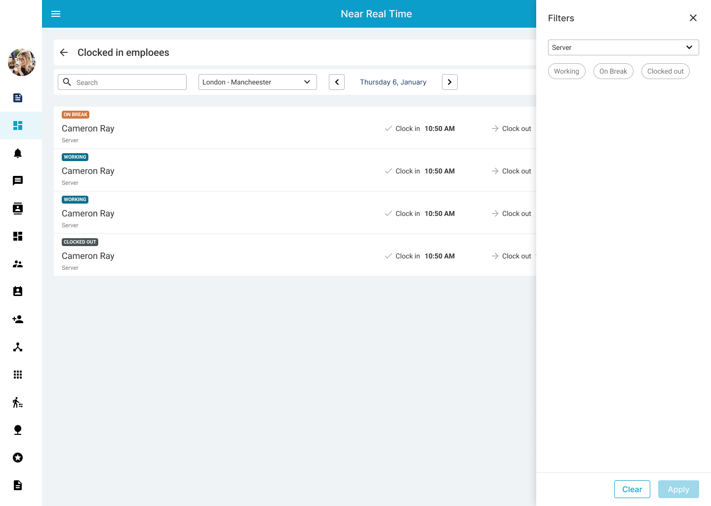
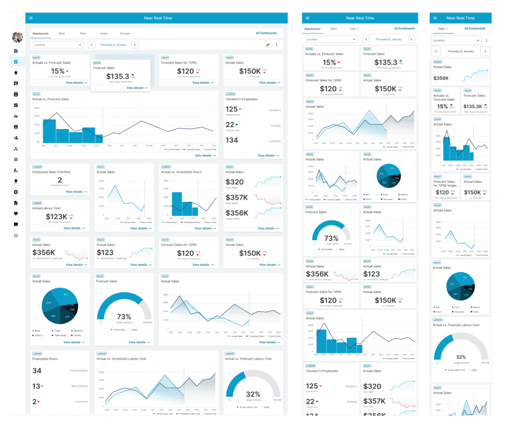
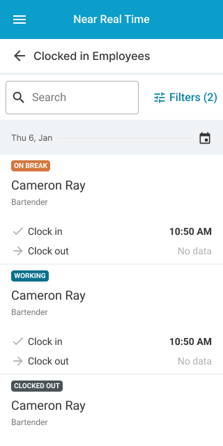
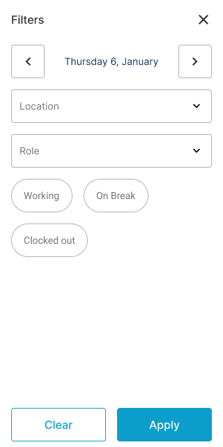
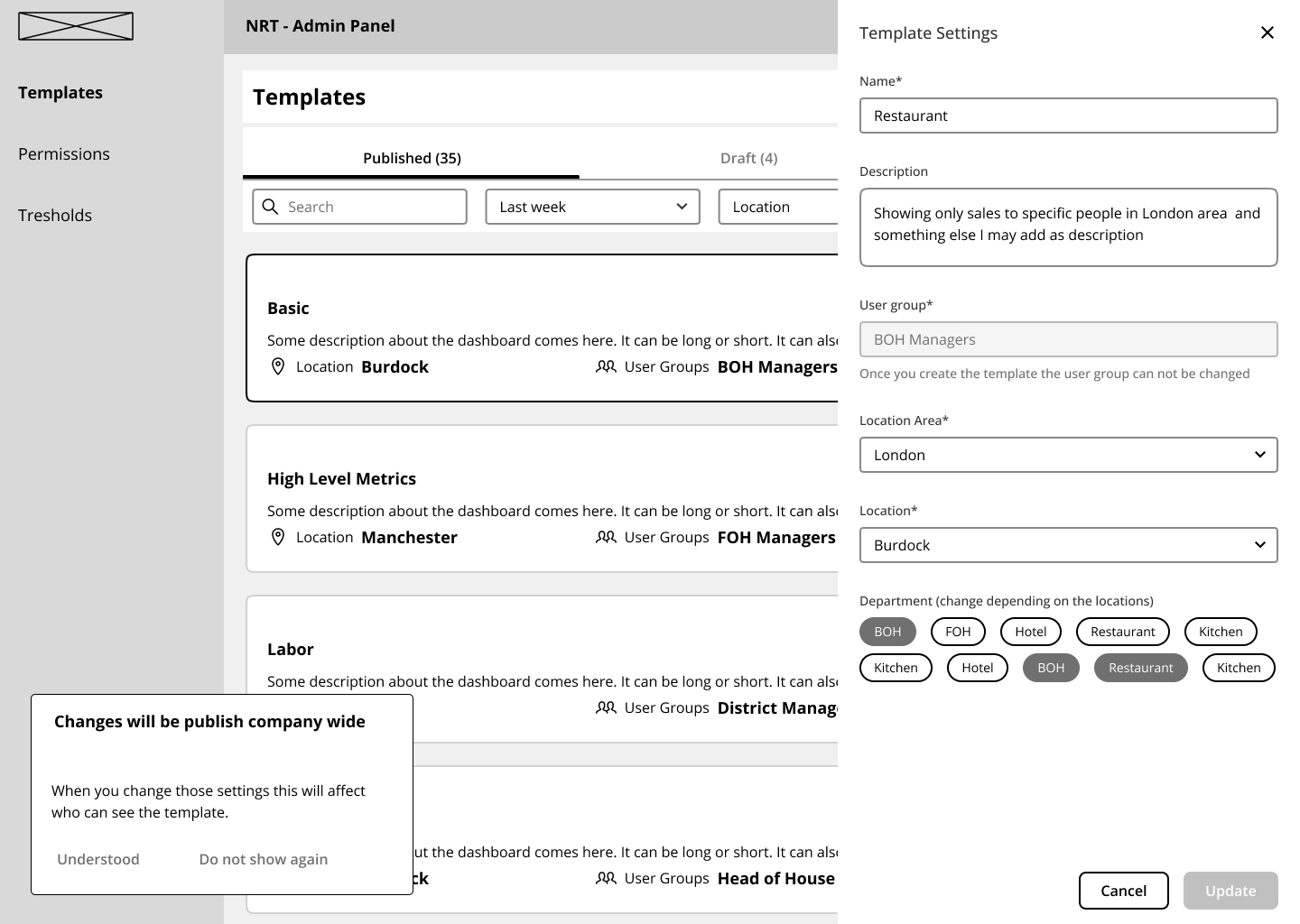
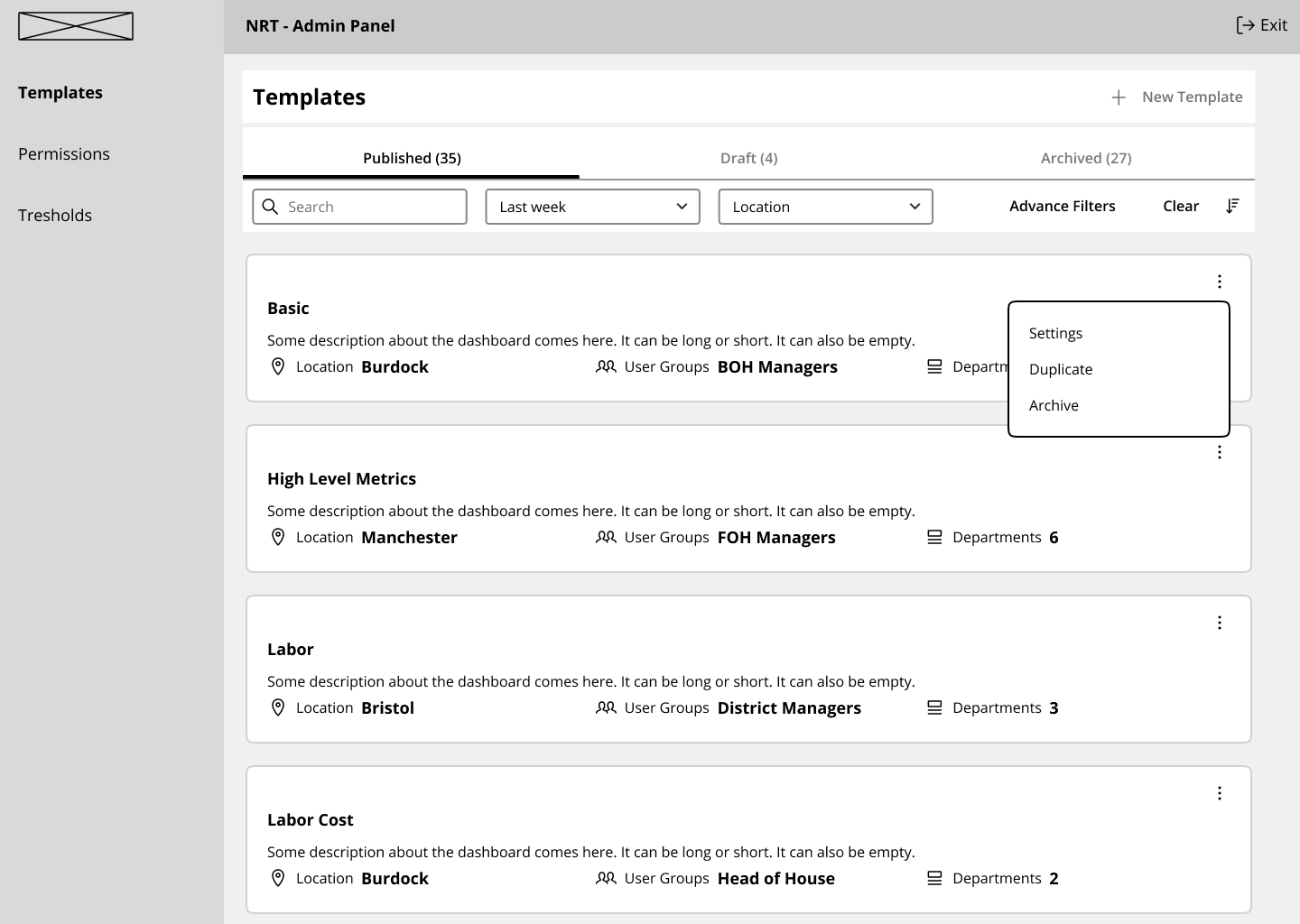
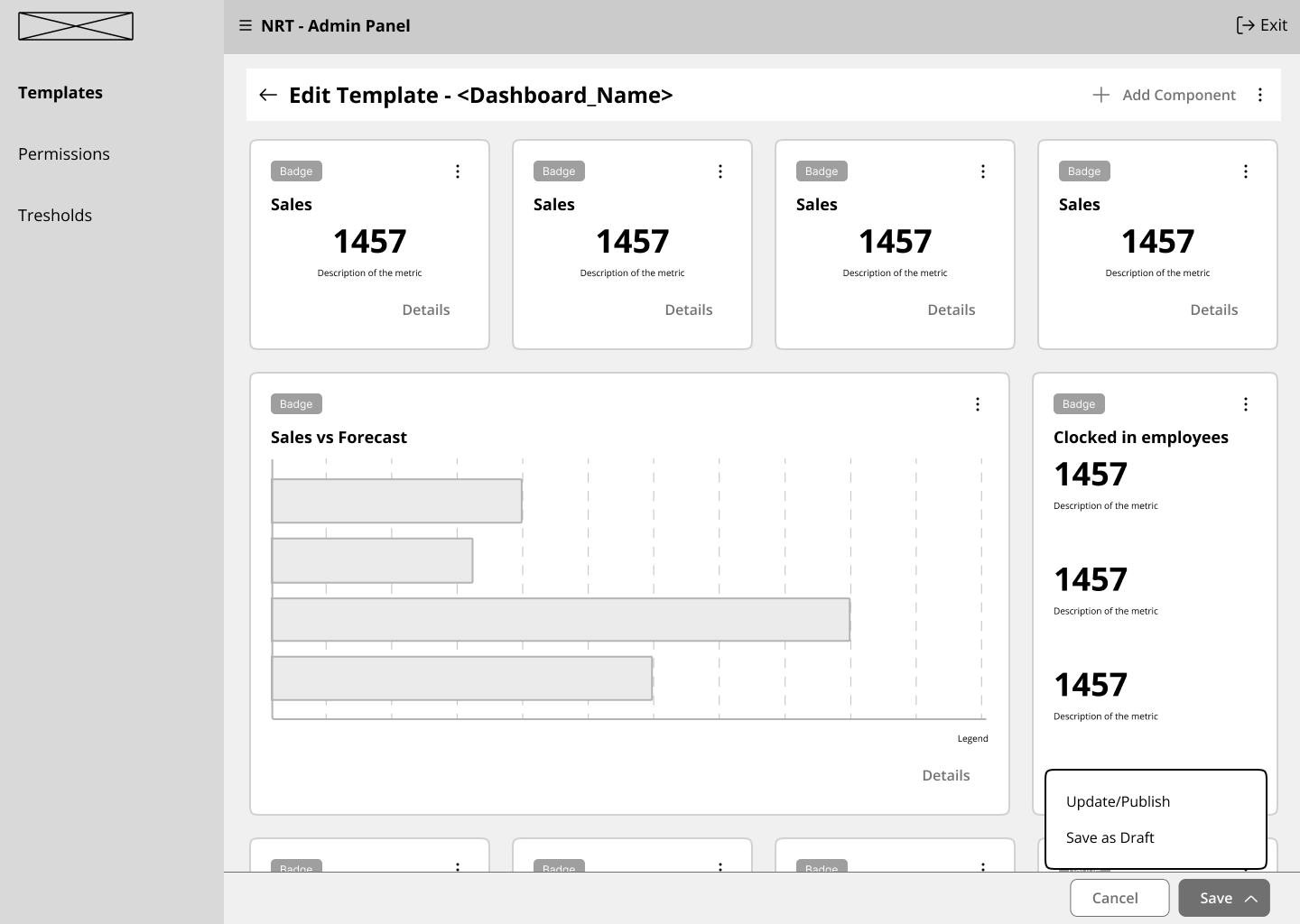
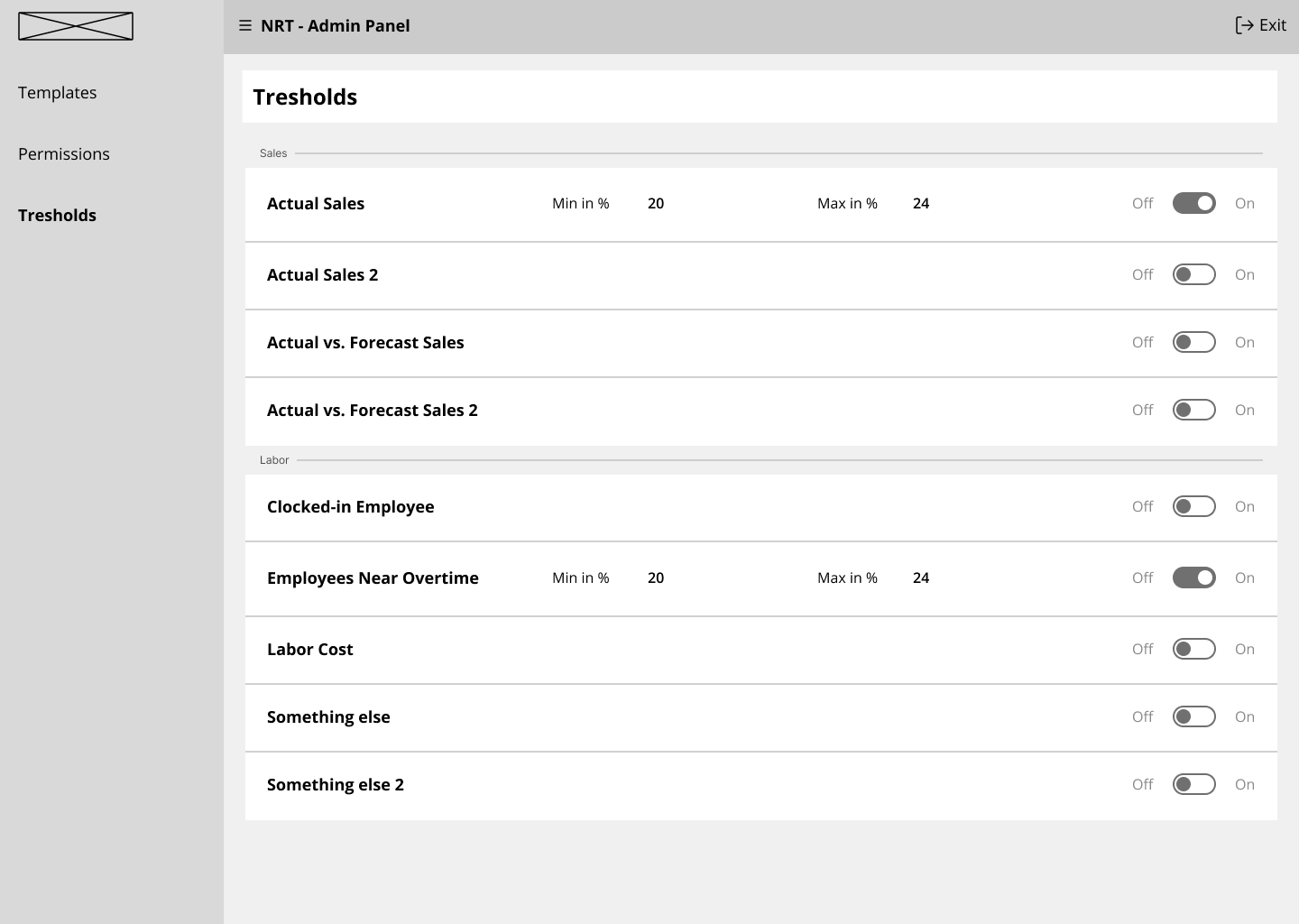
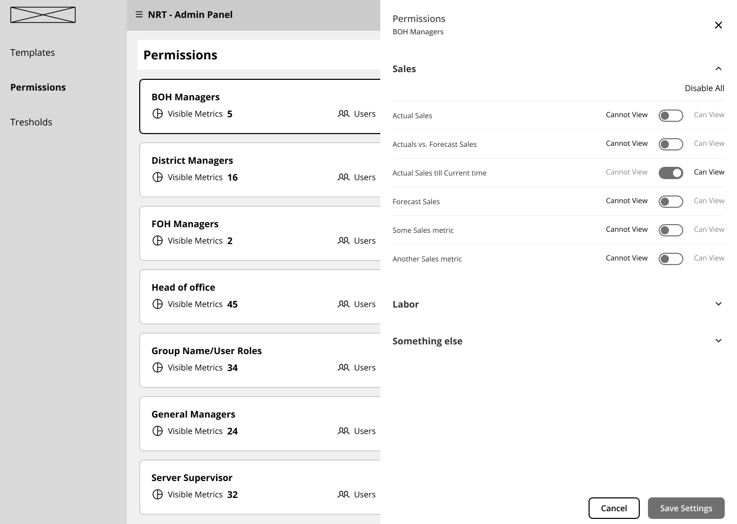
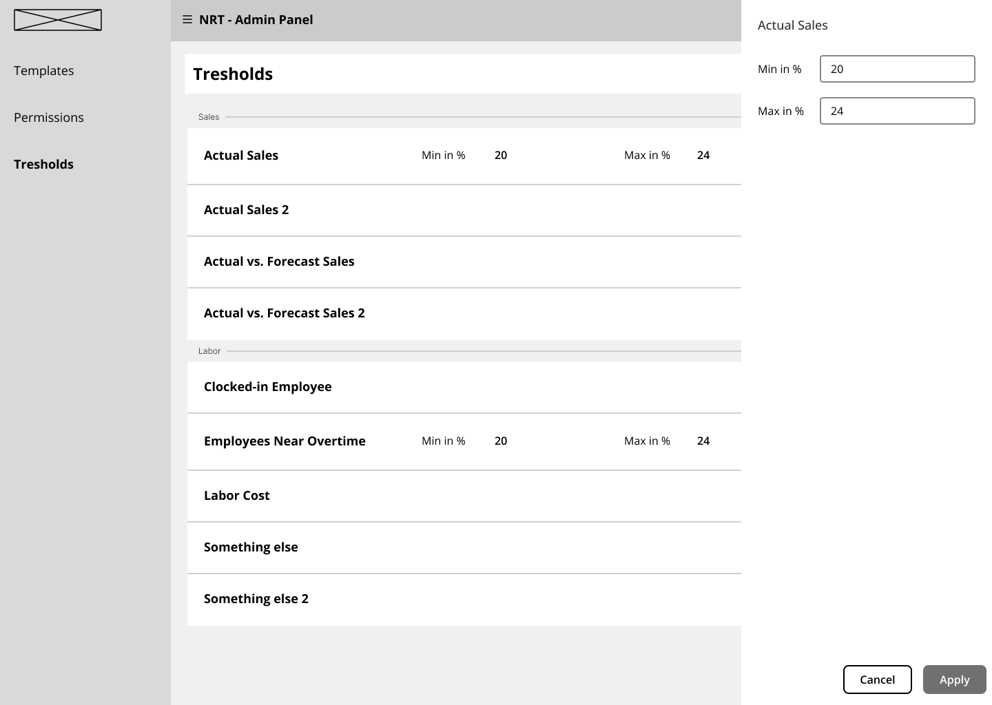
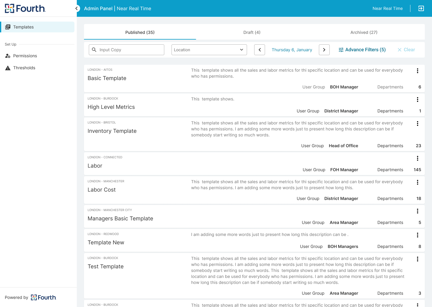
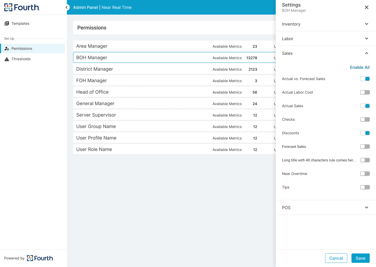
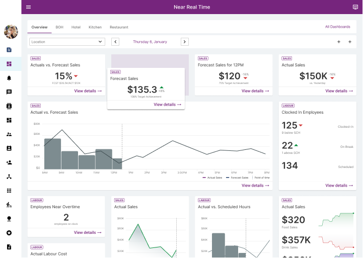
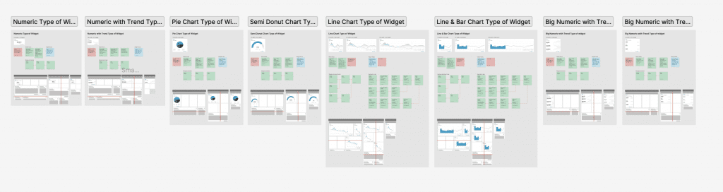
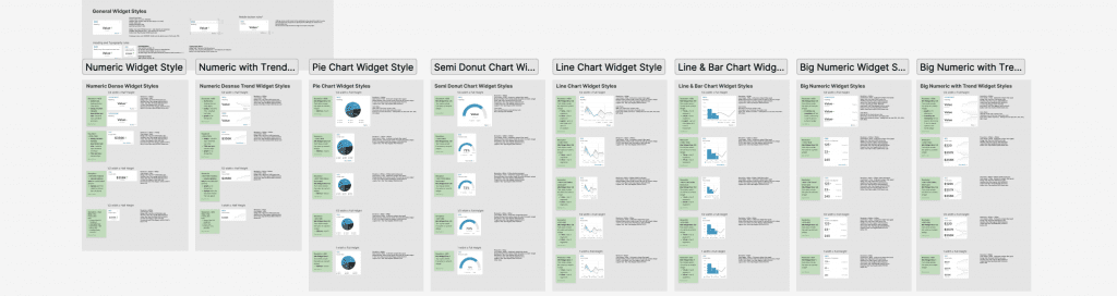
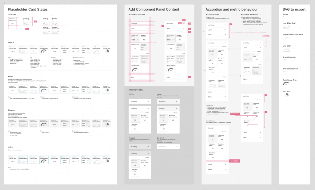
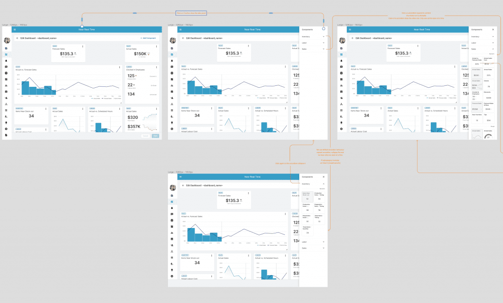
Conduct secondary research, explore best practices, conduct competitor audits, digital wireframing, low and high fidelity prototyping, conduct usability studies, consider accessibility, and iterate designs. Deliver final UI, designed based on design system, create new samples and components to add to design system. Create the website for all device sizes - desktop, tablet and mobile. Create two different views - admin and view only. Ensure that the product is fully brandable. Document the project and support the development and QA teams until the final feature launch.
User Research Summary
I conducted some online interviews and created empathy maps to understand the users I am designing for and their needs. A primary user group was already defined by the product and the company’s current customer. This product will be part of the overall end-to-end solution, and the managers’ primary need is to get real-time data insights so they can quickly take informative resolution and action.
According to the interviews and a survey, this user group confirmed the initial assumptions about the lack of real-time data, but the research also showed that this is not the only requirement. Managers also need data presented and organized in different ways depending on location and department. They also want to drill down into insights so they have a deeper understanding of the data. All of this needs to be company branded and permission driven to fully meet their needs.
Real Time Data
Managers need real-time insights into their restaurant's bottom line.
Customization
Managers need to be able to customize their dashboard to focus on the information that is most important to them.
Details
Managers need a way to drill down into the insights to make sure where the data came from.
Permissions
Managers need to provide specific information to the different levels of management.
Personas
Hubertus's Problem Statement
Hubertus is a district manager who needs to quickly check the current status of his restaurant by phone because he is out of his office most of the time.
User flows
Since the project is based on approvals, different flows have been created for different approval levels.
Digital wireframes
Low-fidelity prototype
Usability studies
Digital Wireframes
Skeleton UI
The first iteration of the design begins by examining the layout and how components will react and resize depending on widget type and device resolution. This was used as a starting point for developing the template components and the mandatory parts of the layout.
The next step was to create digital wireframes that covered all of the user’s main flows in creating and customizing the dashboard. These wireframes were linked together and a prototype was created.


Lo-fidelity Prototype
A low-fidelity prototype was developed to showcase the primary actions that users can perform on the dashboard. This prototype was used in a usability study to test the early concept of the dashboard.
Usability Study Parameters
I have conducted two rounds of usability studies. One was internal with participants who were our customers and had previously worked as restaurateurs, and one was with our customers’ managers – the future users of the application. Both of these results helped us refine the main flows of the application and finalize the overall functionality. They also helped me guide the designs from wireframes to mockups. After the second round of the study, we added additional features to precisely meet the needs of our future customers.
Study Type
Unmoderated usability study
Location
USA and UK
Participant
10 participants
Duration
20 minutes
Usability Study Findings
As I previously mentioned, we conducted two rounds of usability studies. The first one was focused on the customization functionality, where we aimed to ensure that we covered all aspects of customization that our customers will need, while also making sure that it was easy to understand and use. We tested the functionality with five internal and five external users who were representative of our target audience. In the second round, we tested the high-fidelity prototype to validate the findings from the first round and identify any potential areas for improvement.
Round 1 findings
Users need a quick way to switch between their most frequently used dashboards.
Users need a method to restore their dashboard settings to the default view.
Round 2 findings
Users need the ability to share their customized dashboard setup with other managers within the same location.
Users should be able to create their own dashboard quickly by utilizing templates.
Widgets Type & Rules
Mockups
High-fidelity prototype
Accessibility
Widgets Types & Rules
The primary objective of the project was to identify the various metrics that managers track and determine the preferred mode of representation, whether it be numerical or through graphs and charts. After extensive testing, the results were compiled into a comprehensive catalog, which includes detailed documentation outlining rules for behavior, sizing, and responsiveness.
Hi-fi Mockups Desktop
Refinements
I added a 'pinned dashboards' feature, presented as tabs, that allows users to quickly switch between their most frequently accessed dashboards.
I also included a 'revert to default' functionality, which enables users to reset their dashboard settings to the original setup.
Round 2 findings
To make it easy for users to share their dashboard setups with other users who have similar permissions, I added a 'share' option.
To help users quickly create their own dashboard, I added a 'load templates' functionality that can be accessed when creating a new dashboard.
Once the layout structure and rules were established, we began compiling metrics and real data. One of the most important points for managers was the ability to customize their dashboard, and we gave them that option with a drag-and-drop functionality.
After the second round of usability study, we also refined the design and gave managers the option to pin their most visited dashboards for quick access.


High-fidelity Prototype
The final high-fidelity prototype showcased cleaner user flows for creating and editing workflows, as well as approving vacancies. It also addressed users’ needs for assigning roles outside of the workflow’s edit page.
Hi-fi Mockups Mobile
Admin Panel (Quick View)
This application has a second part where the top admin users can setup some permissions and publish company wide dashboard templates.
Only user with high level of permission has access to this admin and can control which user group what metrics will be able to see in their dashboards. It also allow admin to create rules and tolerance for some of the metrics which will control the alerts in the end user view.
A separated Case Study is available for this part of the project will be available soon here:
User Flow
Wireframes


Mockups


White Label Solution
This product is delivered as white-labeled and custom branded with colors that are designed to meet contrast standards. If the client branded colors does not cover this requirements we slightly changed them and inform him. The contrast is checked by a dedicated tool to ensure that the product is accessible for users with low vision.
Accessibility Considerations
I used text buttons and icons to make the action hierarchy clearer and point users to the primary actions they need to take.
To ensure that the cards and brandable components meet contrast standards after branding, we created rules.
We added color-coding for above/under statuses to make it easier for people with low vision to quickly scan the information.
Finally, we refined the font and button sizes for mobile screens.
Documentation
All screens are clearly explained and each button or interaction is visually represented and connected to the event it triggers.
Additionally, the entire design is thoroughly documented in both Confluence and Figma. This enables better cross-team collaboration and provides a record of decision-making and reference to the brief.
Takeaways
Next Steps
Takeaways
Impact
This new application provides the company with an end-to-end solution for the hospitality business and fills a gap in the overall journey. By providing managers with real-time insights, we help them be more productive and make informed decisions according to the current situation.
What I learned
I learned that a single application cannot cover all aspects of this project. There is much more to consider beyond its scope. That’s why I explored entitlement and CUP services to understand the big picture. Many factors need to be taken into account to connect this app with the rest of the company’s portfolio. It’s an exciting prospect.
This application will be a lifesaver for my restaurant. I will be able to take action right away based on the numbers! I can't wait to see it live. The prototype was exactly what I needed!
Next Steps
Conduct next round of usability study on admin functionality before move to development.
Add alerts and notification in the managers view of the dashboard for numbers outside the tolerance set up in the admin.
Integrate with the AI digital assistant who will give prompts for actions.
Expand the entitlement services and CUP flows for permission handling. Create a centralized tool for this functionality.
Expand current admin panel
Thank you!
Thank you for your time reviewing my work on the Real Time Data app! If you’d like tosee more or get in touch, my contact information is provided below.