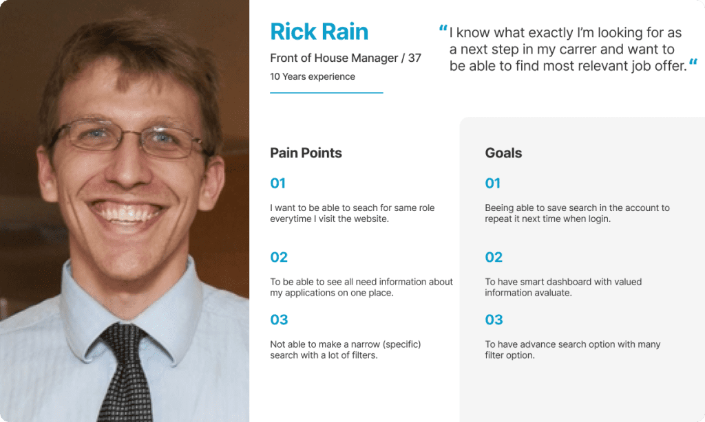
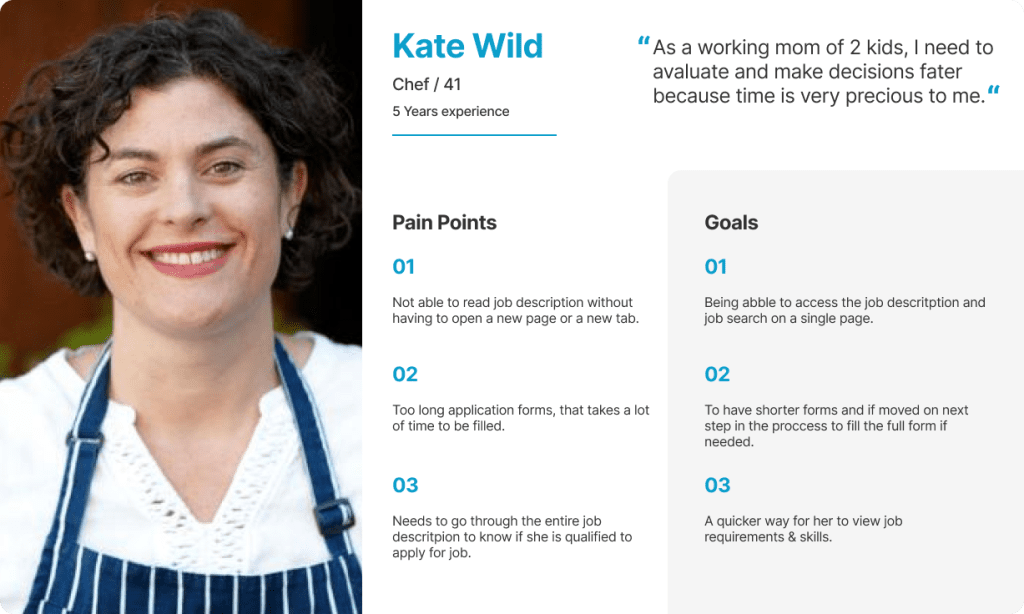
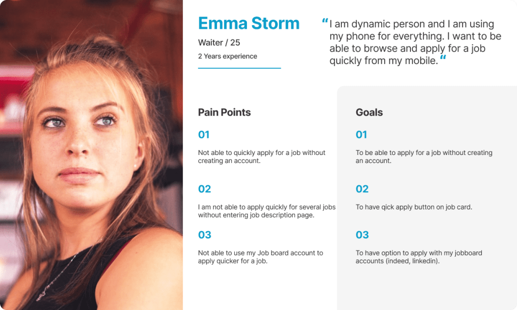
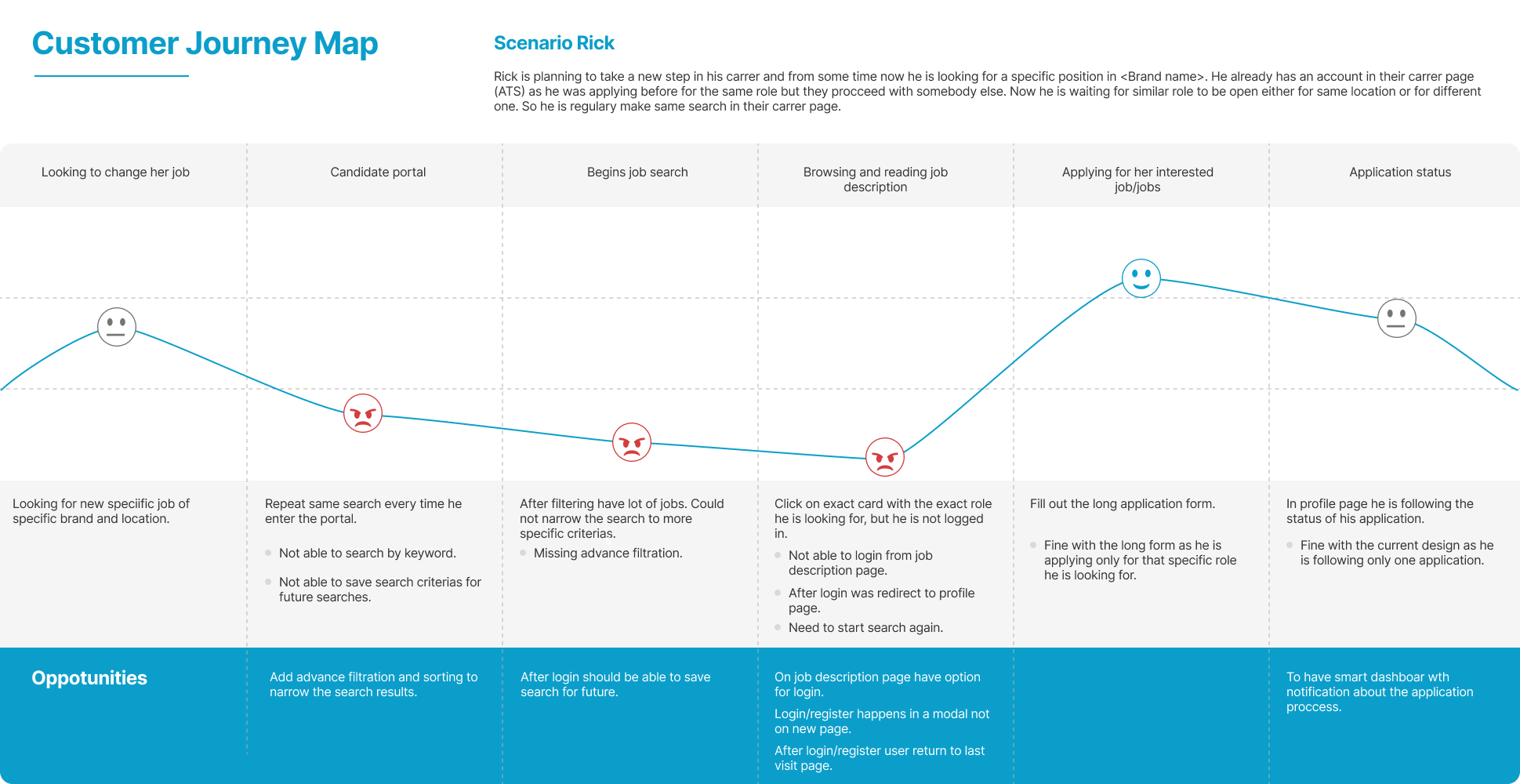
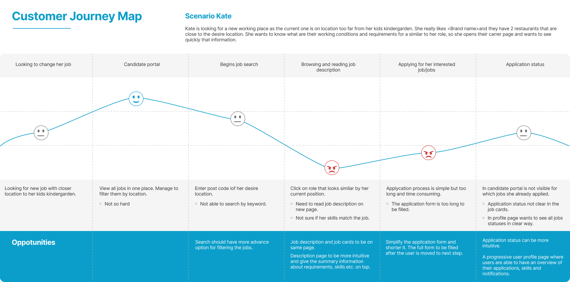
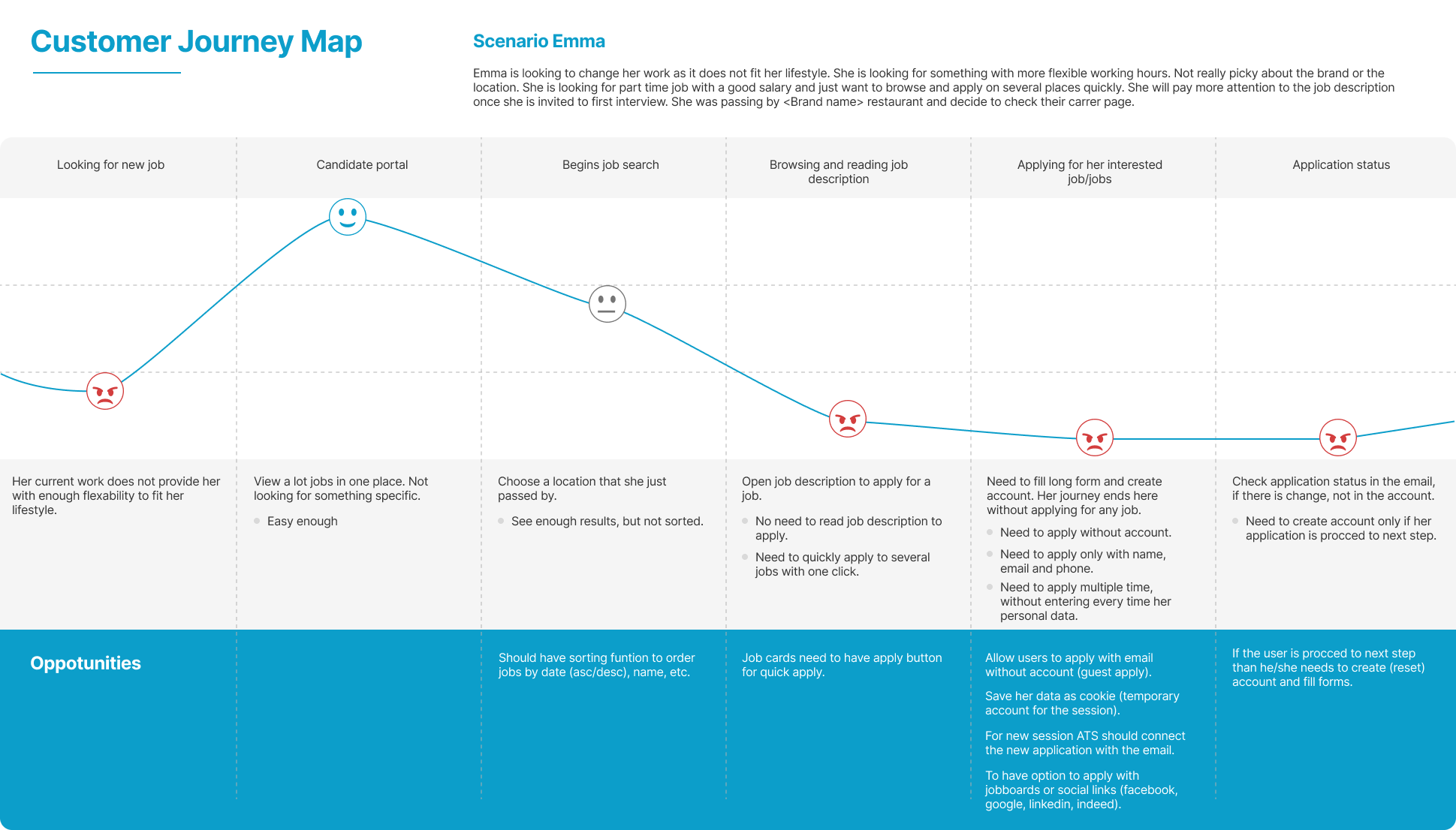
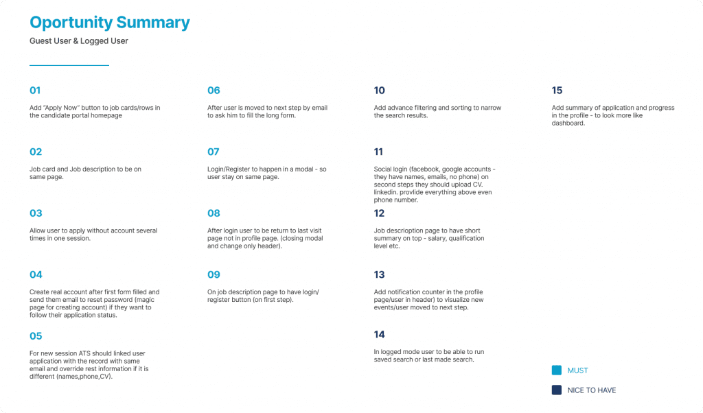
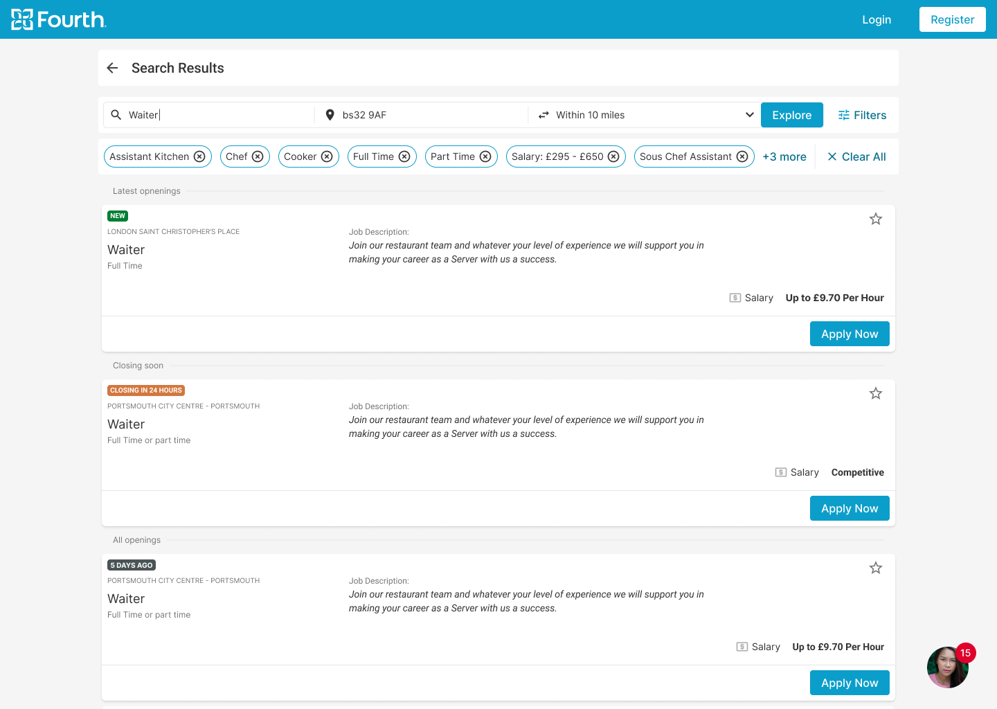
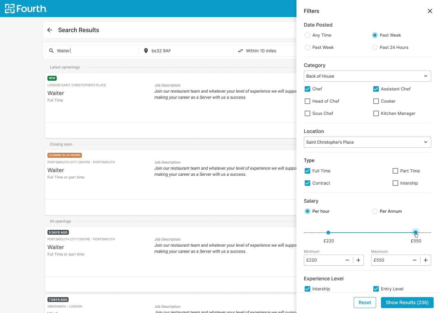
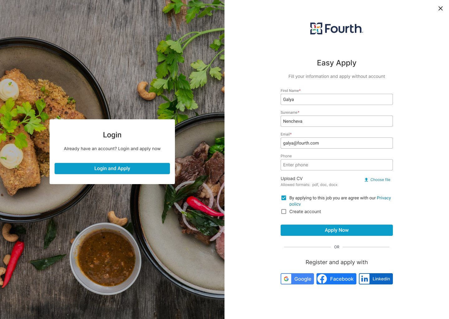
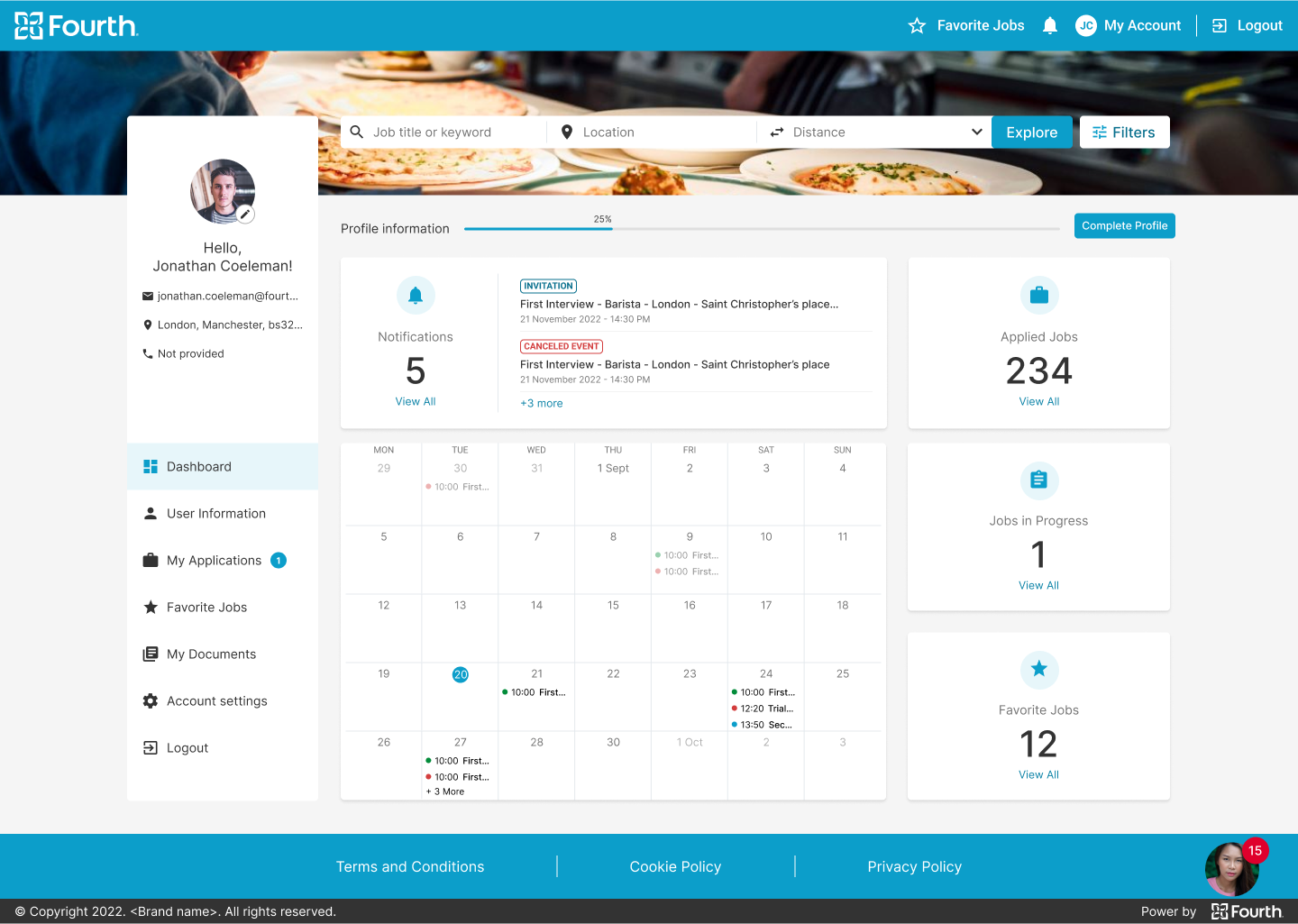
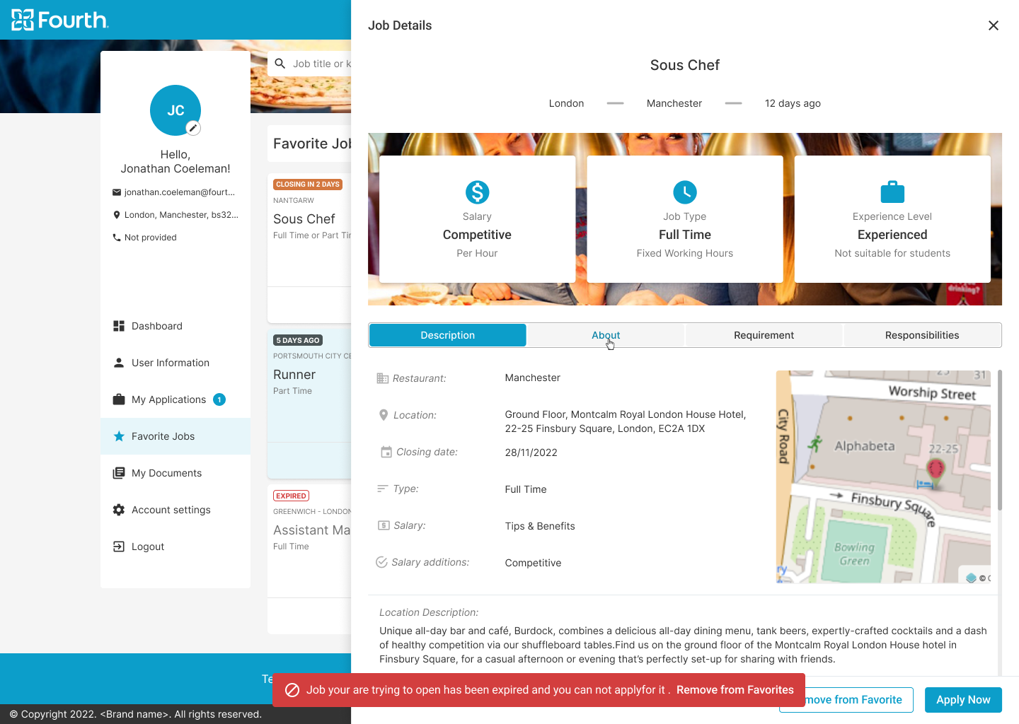
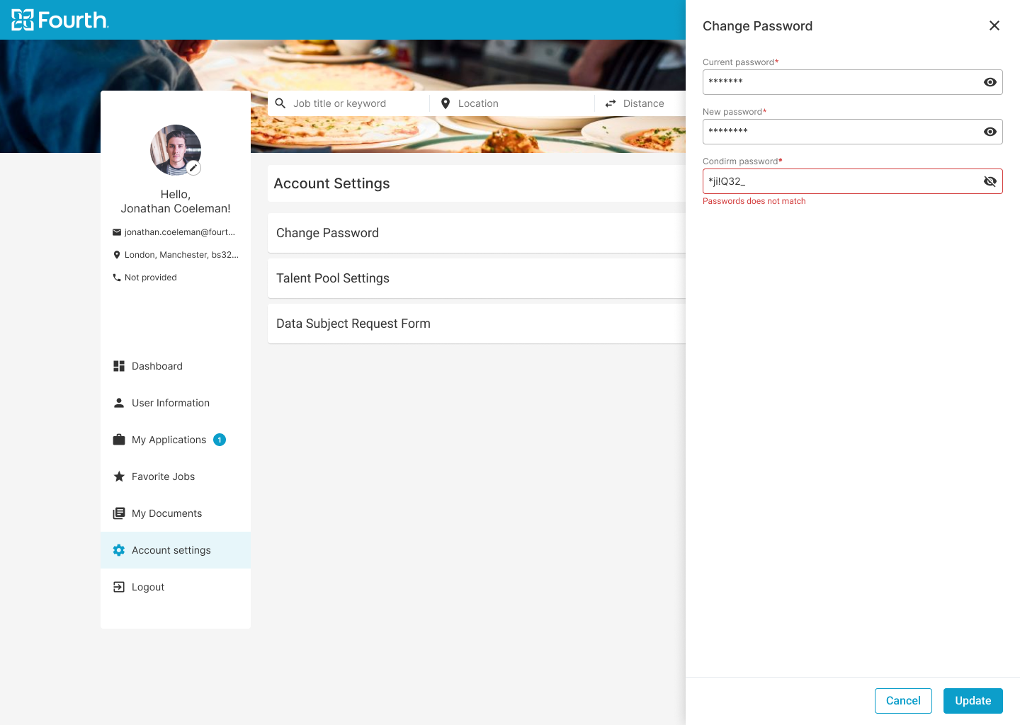
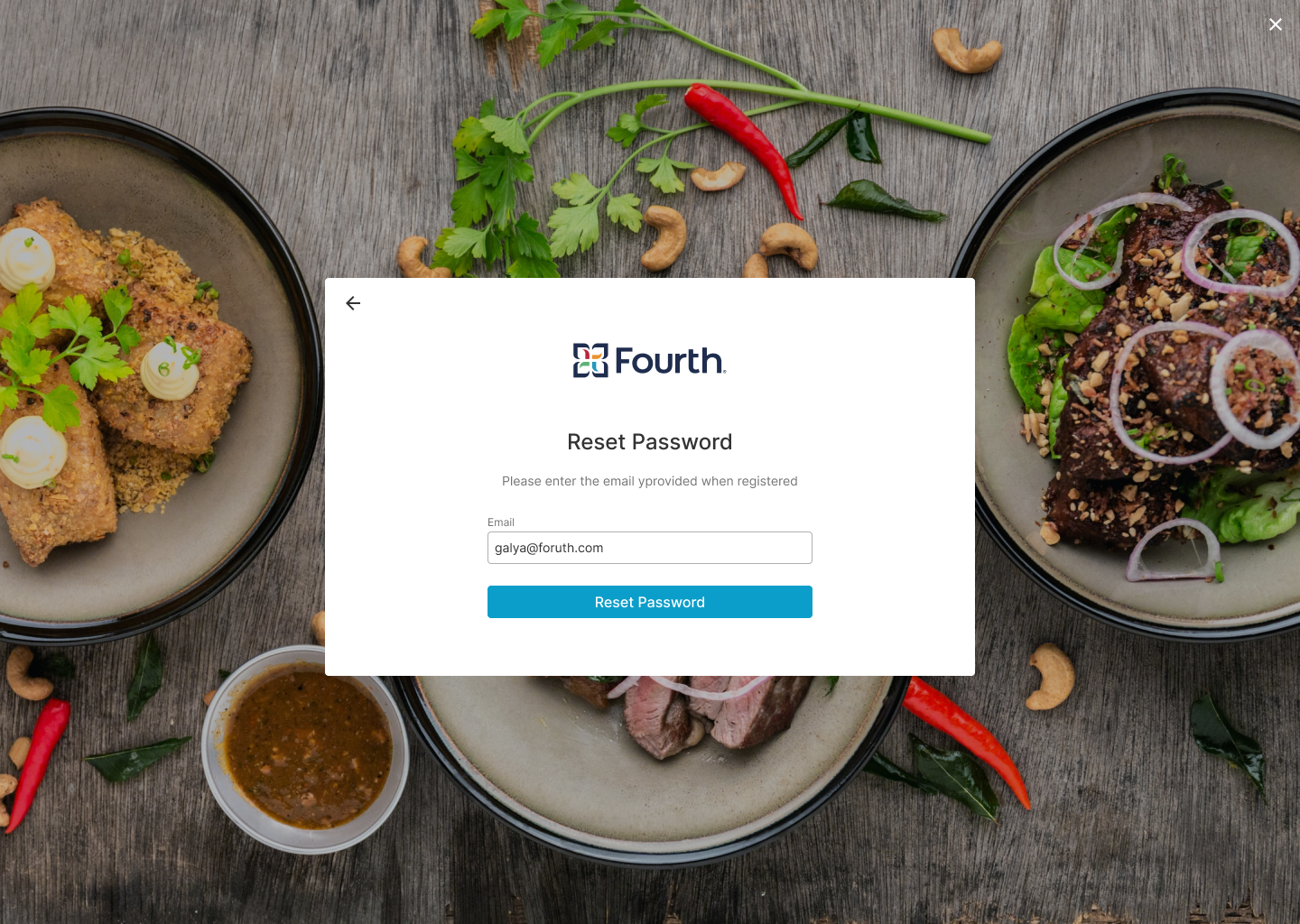
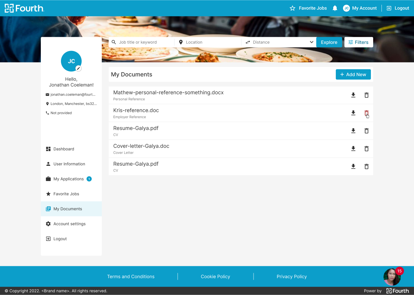
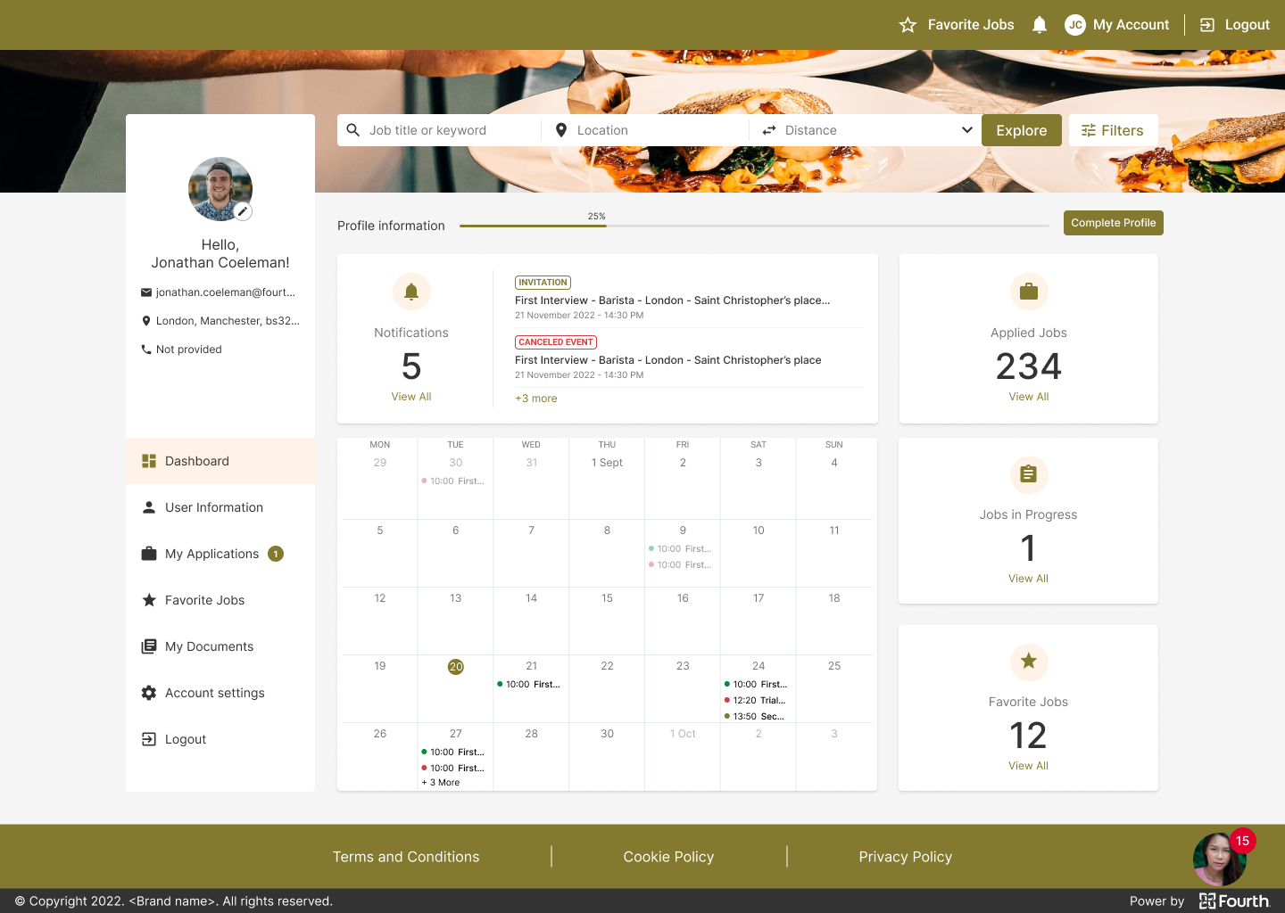
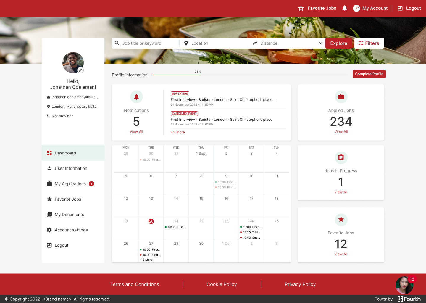
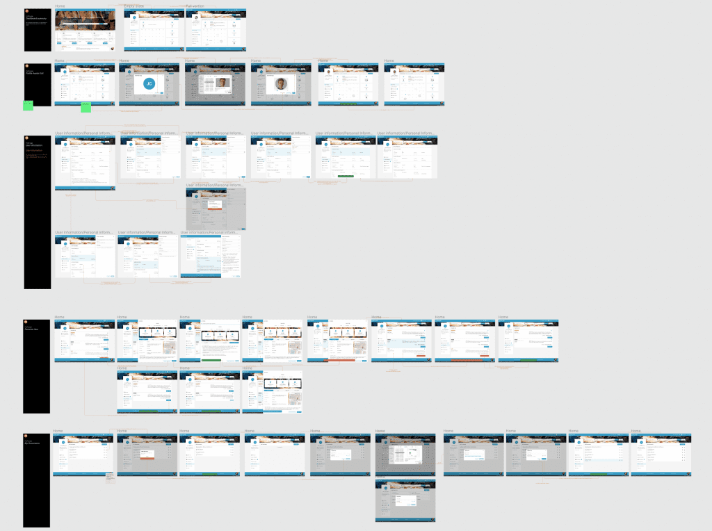
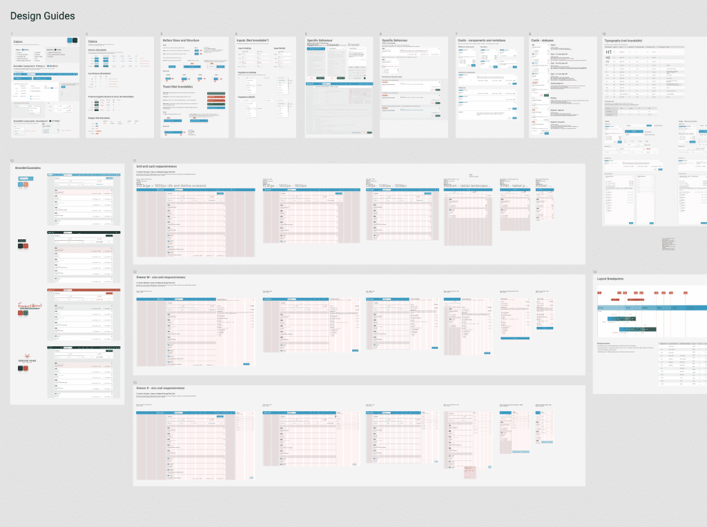
Applicant Tracking System Guest Apply Feature
Project overview
The Product
ATS (Applicant Tracking System) is dedicated to facilitating the search for reliable, passionate and service-oriented employees. ATS is a powerful applicant tracking system tools to help managers find the best candidates that fit your brand and business needs.
Project Duration
September 2022 - January 2023
The problem
Our customers complain about the high dropout rate of applicants based on Google Analytics.
The Goal
Create a new user journey - simpler and faster, so more applicants complete their application process with less frustration. The new solution should be brandable, as it is a true extension of our client's career site.
My Role
UX designer, UX Researcher, UI Designer
Responsibilities
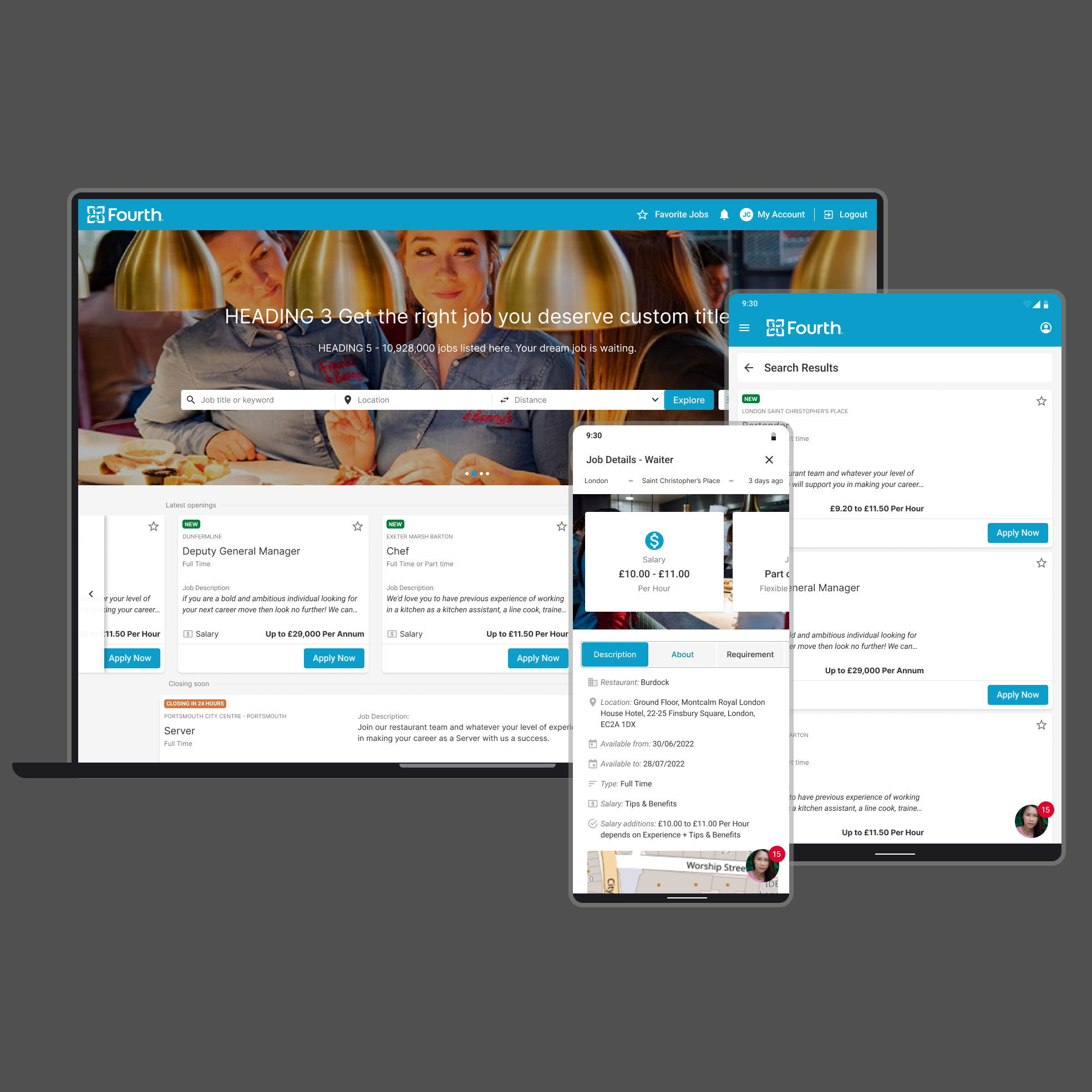
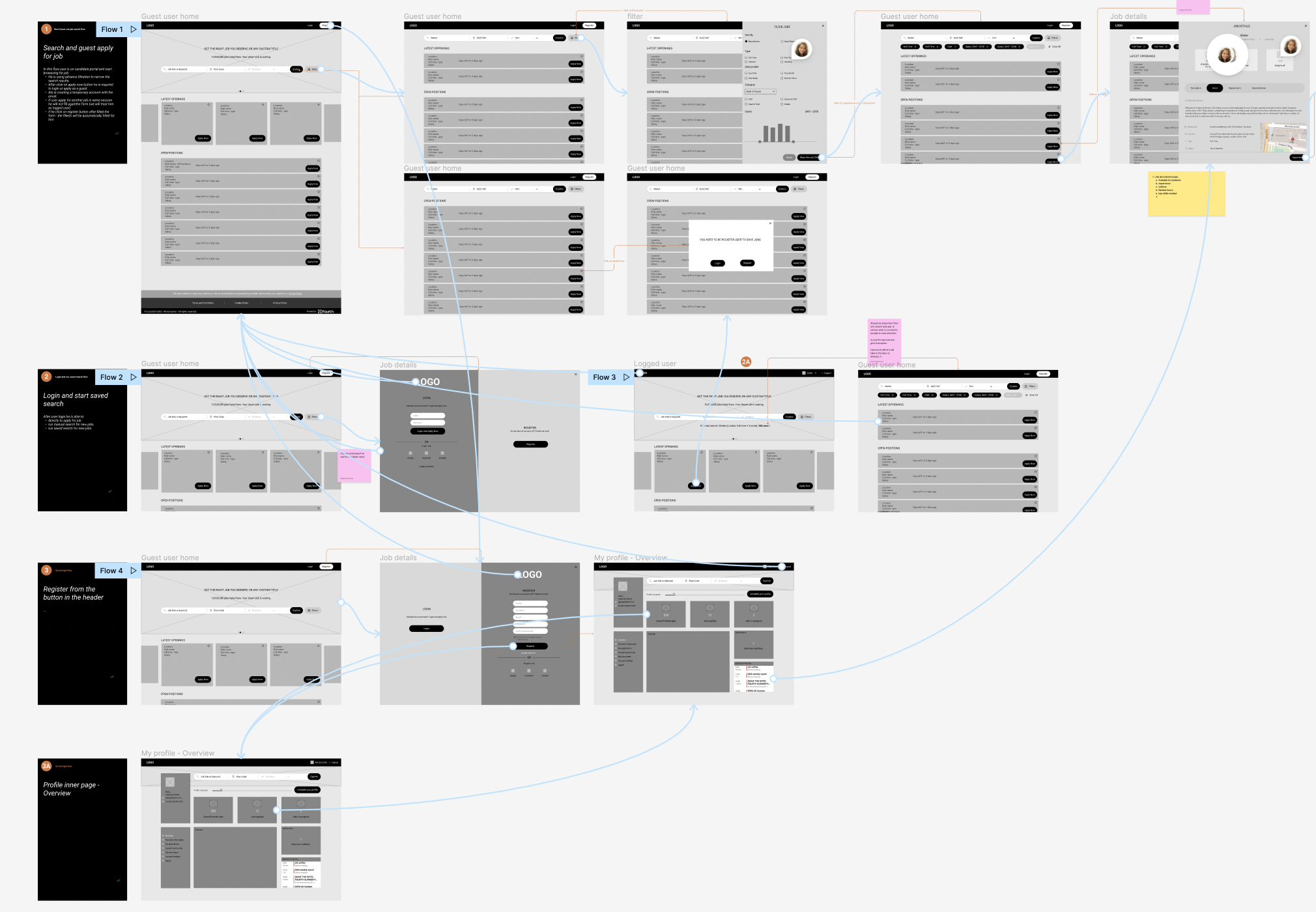
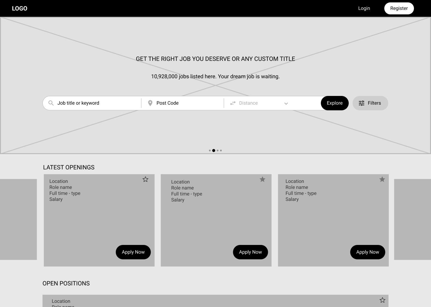
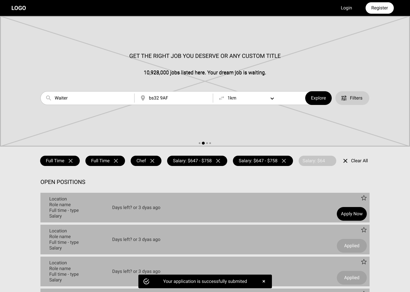
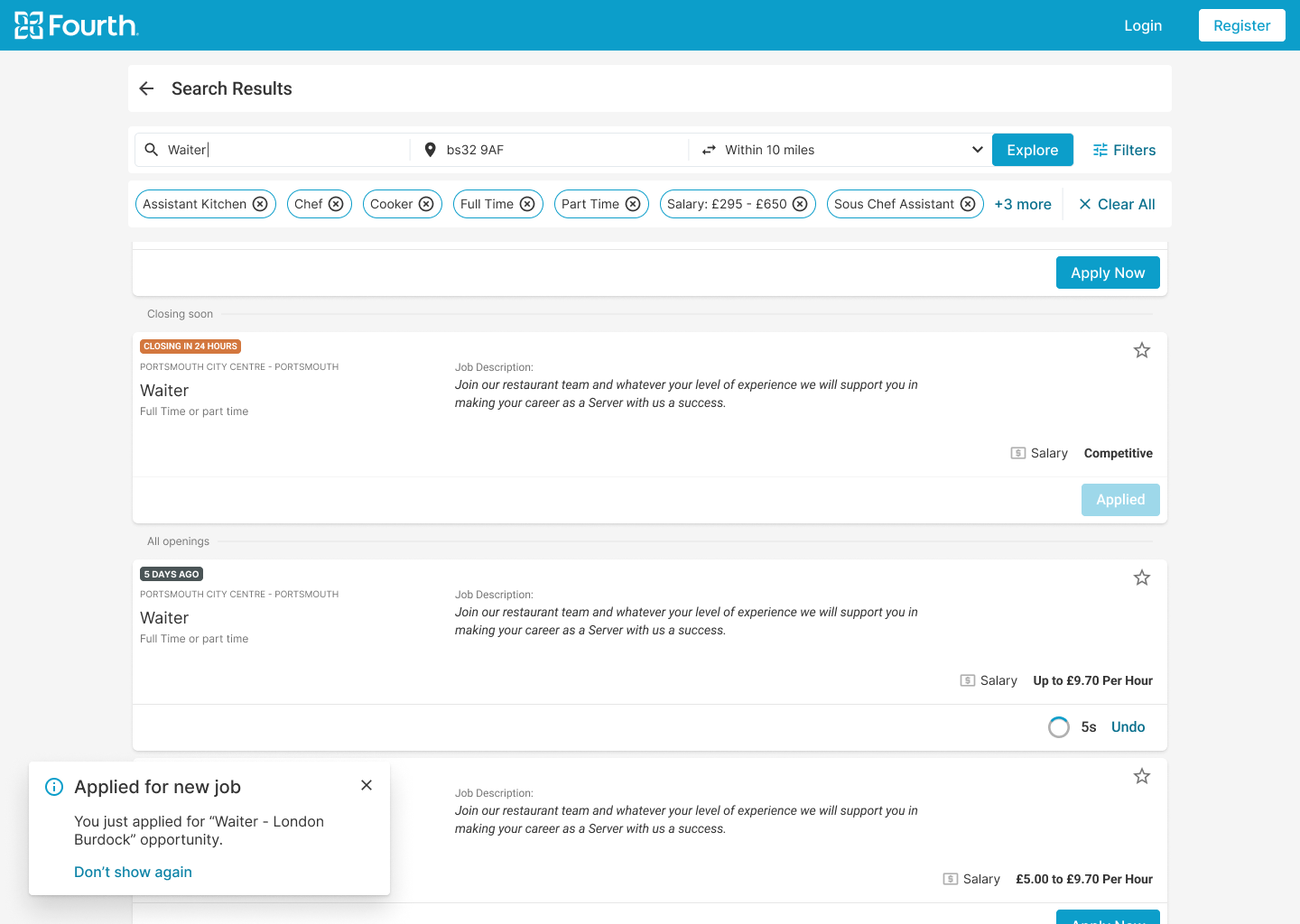
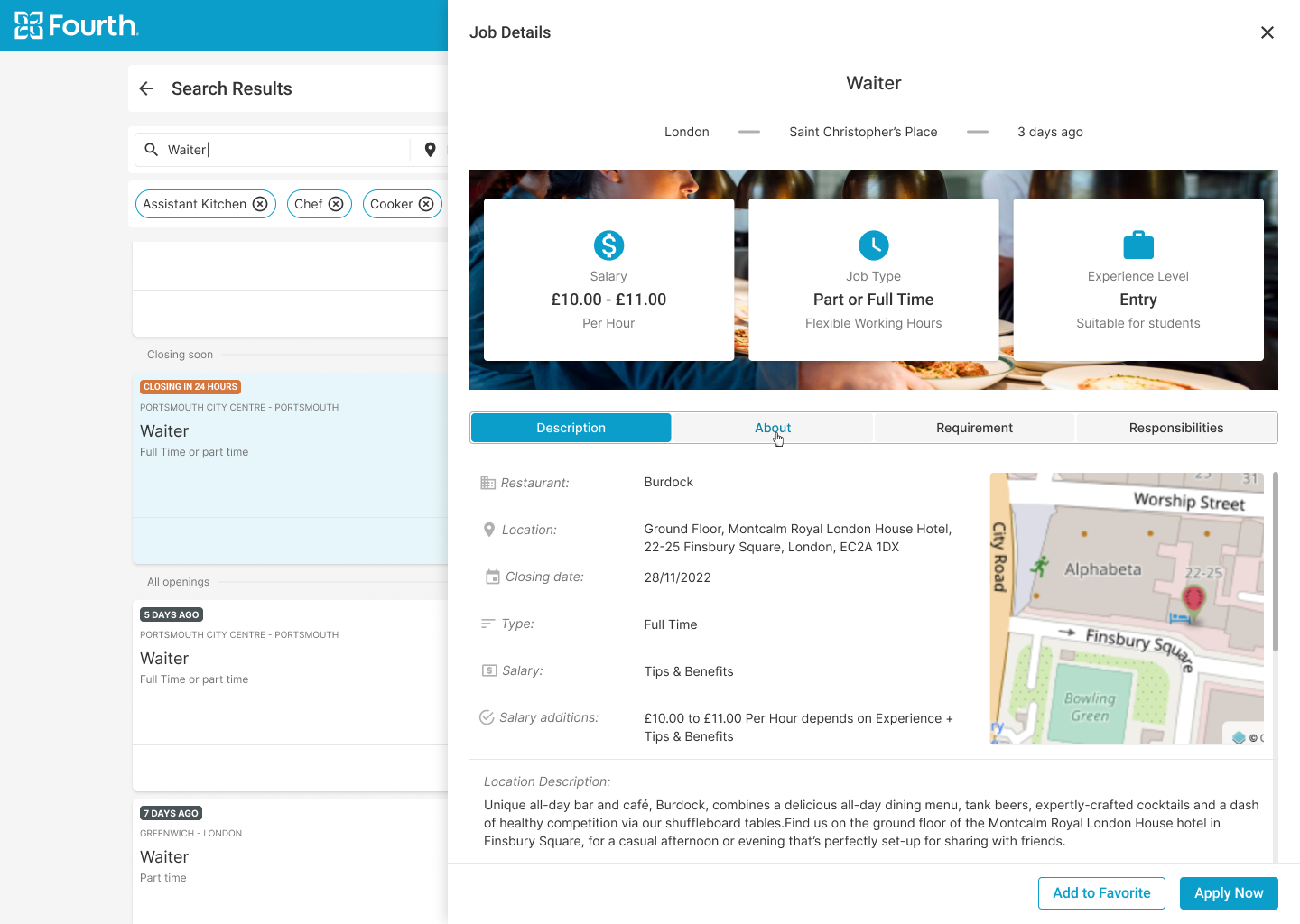
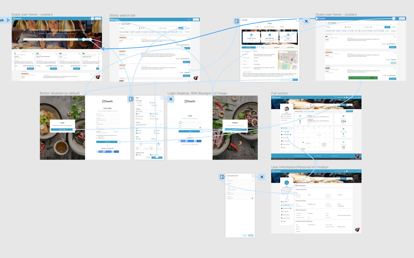
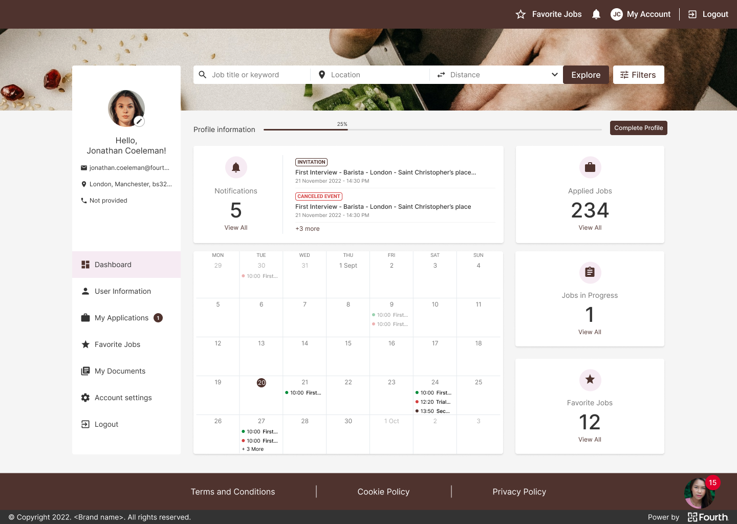
Conduct secondary research and customer interviews, digital wireframing, low and high fidelity prototyping, conduct usability studies, consider accessibility, and iterate designs. Deliver the final UI, designed based on the design system, create new patterns and components to add to the design system. Build it for both desktop and mobile devices. Document the project and support the development and QA teams until the final feature launch.
User Research Summary
I conduct some surveys and review all the statistics that our clients have. Based on this, I create personas and empathy maps to understand the users I am designing for and their needs. After research, I defined 3 main user groups that use different tools and ways to get the ATS Candidate Portal. Each group has their own pain points, but some of them are pretty close to what we assumed at the beginning of the project.
These user groups confirmed our initial assumptions that the main goal was to simplify the application process, shorten the forms, and allow users to apply without an account. We also saw the opportunity to include social logins and third-party talent providers. Users are usually applying on the go and need a quick overview of the job opening and the offer that best suits them.
Short forms
Users have no time and no desire to fill out long forms with many open questions
One click apply
Users would like to apply next time with one click, having already entered their most important information.
No account
Users do not want to create a new account for every company they apply to.
Social Logins
Applicants prefer to apply with social accounts because it is very fast and no additional account is required.
Personas
Rick's Problem Statement
Rick is a FOH manager who needs to find a specific position in a specific location quickly because that is the only position he wants to apply.
Kate's Problem Statement
Kate is an experienced Chef and busy mom of two who needs to quickly find a new job at the nearest restaurant in the candidate portal because she is limited of time.
Emma's Problem Statement
Emma is a student and waitress who needs to quickly apply for several jobs by phone because she is a dynamic person and does everything on the go.
User journey map


Opportunities for improvement
Based on the personas journey maps, I create a list of improvements. I divide them into two categories – “must have” and “nice to have”. This helps us prioritize which opportunities we should implement first and is critical for user flow.
User flows
In this specific project, we have several requirements and constraints for the processes and the path that the potential candidate should take, as we have several places where these candidates will end up in the application process.
We have candidates coming directly from the candidate portal, we have some coming from third-party job boards, and also those coming from the client website through the Recruitment Assistant (chatbot), which is also part of the big picture of this project. And they should all have similar experiences with the ATS.
Digital wireframes
Low-fidelity prototype
Usability studies
Digital Wireframes
Loading the job description on a page other than the one with the list of jobs was something that users said ended their interaction with the portal. That is why we always keep the user on the same page.
Advance filtration was one of the critical issues our users faced in order to apply for a job they really wanted to filter deeply the pen position.


Low-fidelity Prototype
Using the complete set of digital wireframes, I created a low-fidelity prototype. I covered a few main flows – users apply for the job, users register or log in and check their application status, users upload documents and resumes in their profile. All these flows were connected to a prototype that was used for a usability study.
Usability Study Parameters
I conducted a round of internal usability studies. The results of the first study helped transfer the design from wireframes to mockups. We plan to retest with the hi-fi prototype to simulate the real product experience with some external testers.
Study Type
Unmoderated usability study
Location
United Kingdom
Participant
6 participants
Duration
30-40 minutes
Usability Study Findings
Round 1 findings
Users want to be able to apply for multiple jobs in one session without having to enter their data twice or more.
Users need to have a better cue which openings are added in the last 24 hours.
Users need a way to undo their action if they accidentally clicked the Apply button.
Mockups
High-fidelity prototype
Accessibility
Hi-fi Mockups Desktop
Users wanted a better indication of which openings were added in the last 24 hours, so I added color-coded badges to indicate opening status.

Early designs allowed for some customization, and after usability studies, an undo button was introduced that applied the 5-second rule for resetting an application.

Key Mockups


Hi-fi Mockups Mobile
High-fidelity Prototype
The final high-fidelity prototype shows a cleaner and smoother way for users to search for a job and apply without an account.
Brandable Solution
The final product must be possible to brand the end product with the client company’s colors. To this end, strict rules have been established for what can and cannot be branded. The ATS internal branding tool was also revised to ensure that all rules were followed and that all colors used complied with contrast standards.
Accessibility Considerations
Facilitating access for visually impaired users by adding alt text to images for screen readers.
Icons used to make navigation easier to use.
Refine the color to make sure we cover the contrast standards.
Add color coding for statuses to make it easier for people with low vision to quickly scan the information.
Documentation
All screens are well explained, each button or iteration is visually represented and associated with the event that triggers it. In addition, the entire design is well documented in both Confluence and Figma.
This contributes to better cross-team collaboration and allows decisions to be track and referenced back to the brief.
Takeaways
Next Steps
Takeaways
Impact
This feature will improve the overall applicant experience, which will impact their application process and their willingness to complete it. All of this will improve and increase the number of applications received in the ATS. This will have a direct impact on the quality and quantity of the application process and the employees hired.
What I learned
I learned that in this highly competitive market where there are few qualified candidates and many leftover people, great user experience with the app and website can turn the wheel and increase the number of applicants. I also learned that just sticking to the business requirements that come from PO is not enough to meet people’s needs, and that I need to go deeper in my research as I did in this project.
After implementing a guest apply applications that come trough the candidate portal increase 400%. I was so impressed what a simple form and social login can do for my business.
Next Steps
After implementing the solution for all customers, further feedback will be obtained.
See Mixpanel results before and after implementing this feature.
Improving the offline application process and creating a similar experience through email and SMS communication.
Improve operations on RA, to create a better user experience and be equally present on all communication channels with applicants.
Thank you!
Thank you for taking the time to review my work on the ATS app! If you’d like to see more or get in touch, you can find my contact information below.