IncentivAI LoyaltyHub dApp
Project overview
The Product
Web application for monetizing reward points from different loyalty programs into valuable goods. IncentivAI LoyaltyHub is the ultimate loyalty program aggregator and marketplace, seamlessly integrating all user rewards and loyalty points in one easy-to-use platform. The platform marketplace enables users to exchange loyalty points between merchants and buy gift cards, maximizing reward value.
Project Duration
March 2024 - Present
The problem
User are tired of juggling multiple merchant applications and customer cards. This makes them in fact UNUSABLE. At the same time companies lose loyalty customers due to limitation of points usage and not attractive rewards.
The Goal
The goal is to onboard all users to new Web3 technology and ensure a seamless experience. And in the same time to give them more attractive and limitless choice of spending their reward points.
My Role
UX designer, UX Researcher, UI designer, Design system designer, Brand designer
Responsibilities
Conduct primary and secondary research, explore best practices, conduct competitor audits, digital wireframing, low and high fidelity prototyping, conduct usability studies, consider accessibility, and iterate designs. Create design system and deliver final UI, designed based on design system, create new samples and components to add to design system. Create the website for all device sizes - desktop, tablet and mobile. Document the project and support the development and QA teams until the final product launch.

User Research Summary
When I started this project, I had access to a user base of 1.9 million from our first partner, Bulgaria’s largest online forum, BG-Mamma. We conducted several surveys within the forum to gauge our initial user base’s familiarity with Web3 technology and identify their pain points with current loyalty program subscriptions.
Based on the data we collected, we identified several common problems faced by all users.
Web3 knowledge
User experience lack of familiarity and confidence in using cryptocurrency or blockchain technology.
Points expiration
Users worry about the expiration of loyalty points before they can redeem them, leading to a sense of urgency and pressure to use them before they expire.
Redemption Options
Users face frustration due to the limited options available for redeeming their loyalty points, which may restrict their ability to fully utilize them.
Limited Time
Users often finds often find themseves with limited free time due to their busy schedule, making it challenging to manage their loyalty points effectively.
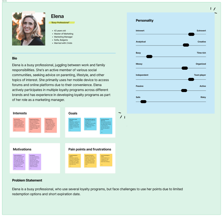
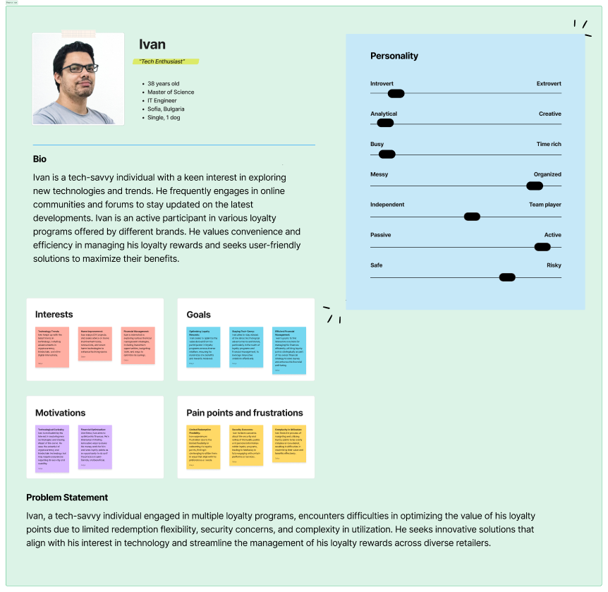
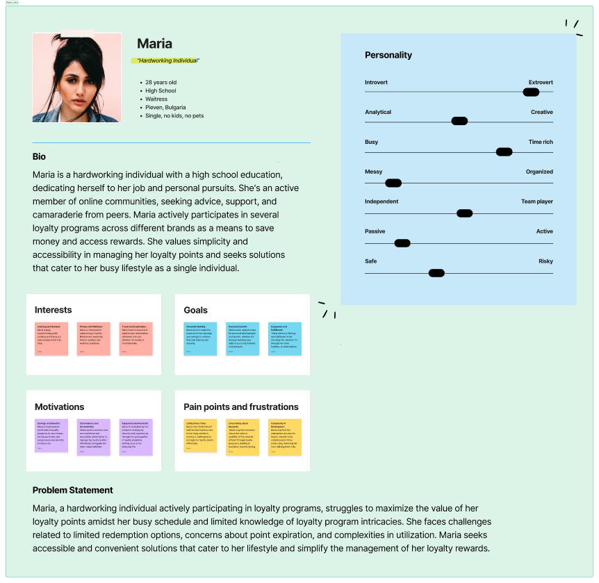
Personas
User flows
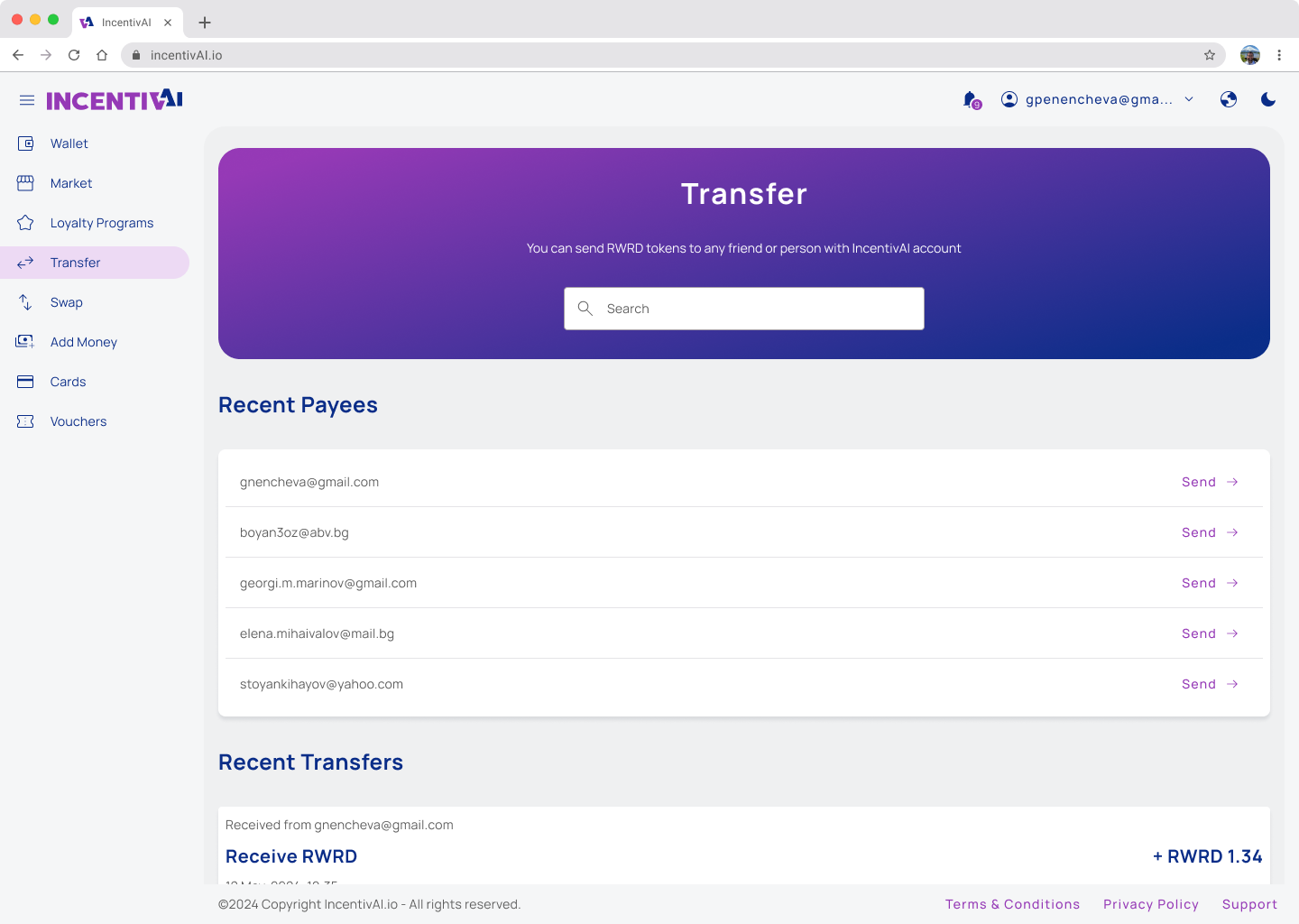
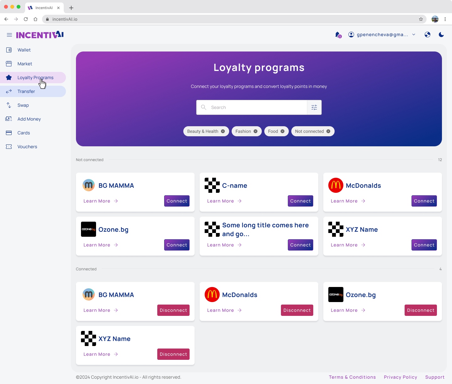
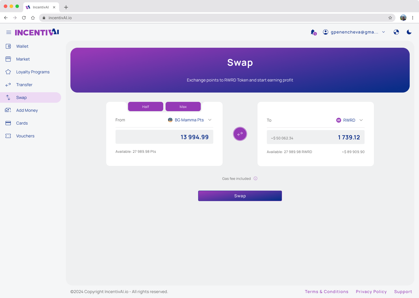
For the MVP launch we decide to cover the main functionality with the main user flows. So we wanted user to be able to:
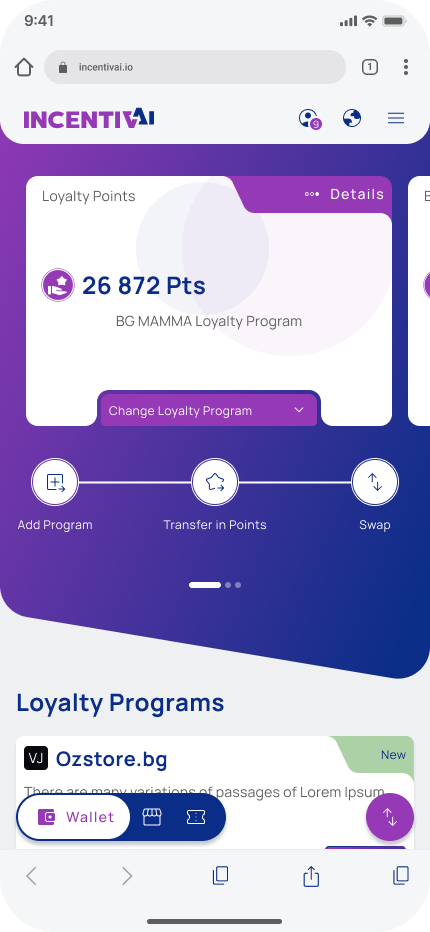
– connect their loyalty programs
– swap their points for Reward Loyalty Exchange Token (RWRD) or to other loyalty points
– send points to a friend,
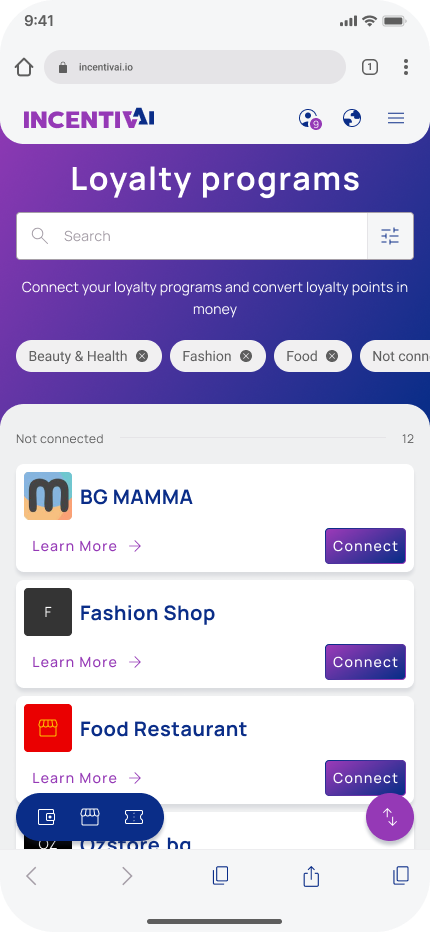
– buy vouchers from the marketplace
– stake RWRD tokens
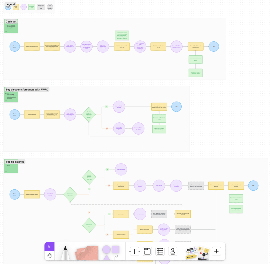
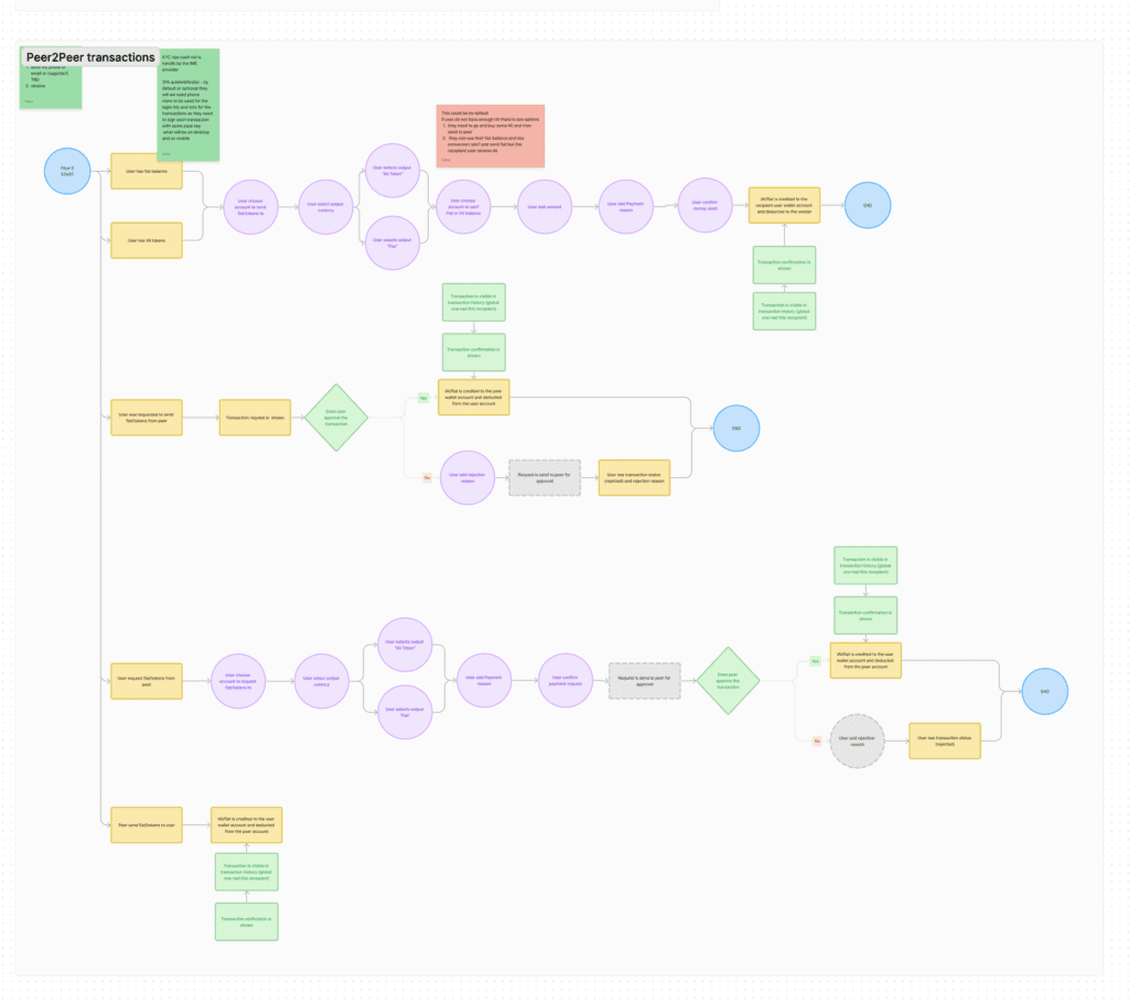
Digital wireframes
Low-fidelity prototype
Design System
Digital Wireframes
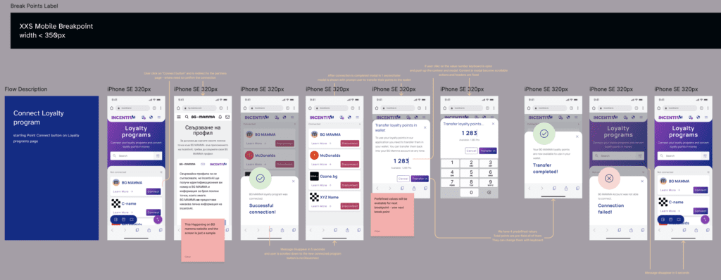
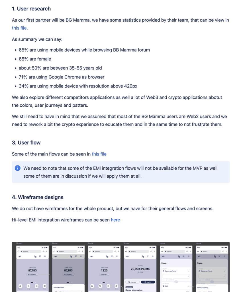
In the first iteration of the design, while clarifying the main functionality and selecting the technology to use, we started building the user flows and screen architecture using simple wireframes. We identified the main components and their placement, as well as the general user transitions between screens and functionalities. From our research and data, we knew that 70% of the users accessed the forum via mobile devices, so we decided to adopt a mobile-first approach in our design.
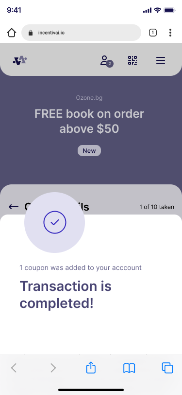
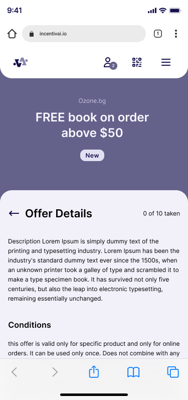
Lo-fidelity Prototype
A low-fidelity prototype was developed to showcase the primary actions that users can perform on the application. This prototype was used in a presentation to a stakeholder and meetings with EMI integration 3rd party company. Prototype is simple but covers the most important functionality of the application.
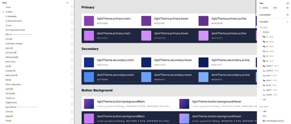
Design system & Design Language
After conducting the survey and analyzing the data from Google Analytics about our target audience (the users of the BG Mamma forum), we established a base user profile. With this information, we could start building the design language and design system that would be used in our application to represent the users’ needs and preferences.
Our target users are between 25-35 years old, use more than 10 applications on a daily basis, are interested in new technology, especially in finance, and are registered in at least 5 loyalty programs that they do not actively use.
Based on this profile, we decided to follow the latest trends and incorporate crypto design elements. We aim for our brand to be trustworthy, secure, friendly, yet professional. To achieve this, we used the following components:
Color Scheme
Use of bright and vibrant colors for accent components such as buttons, backgrounds, and icons.
Use of gradient for modern and sleek look.
Use blue and purple as main colors for secure and royal look and feel.
Use color combination for dark and light theme.
Design Language
Use of small border radius for friendly but yet serious look and feel.
Users should be able to create their own dashboard quickly by utilizing templates.
Use well known patterns and components like navigations and FA B buttons for user familiarity.
Consistency across the application for easy navigation and short learning curve.
After reviewing and considering all best practices in building design systems, we built our own design system with the most commonly used components. It is an ongoing project, and we constantly add new components to it. We maintain and document all components well to ensure easy collaboration with the development team and consistency across the entire project.
Mockups
High-fidelity prototype
Usability Study
Accessibility
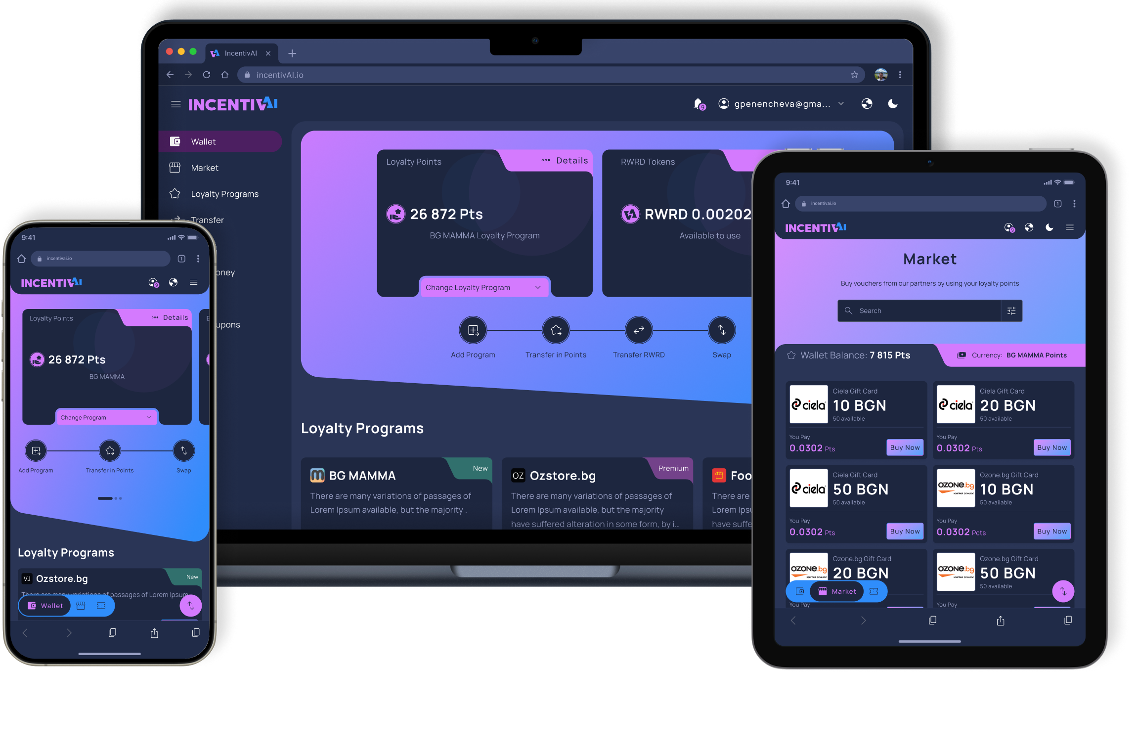
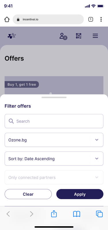
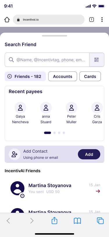
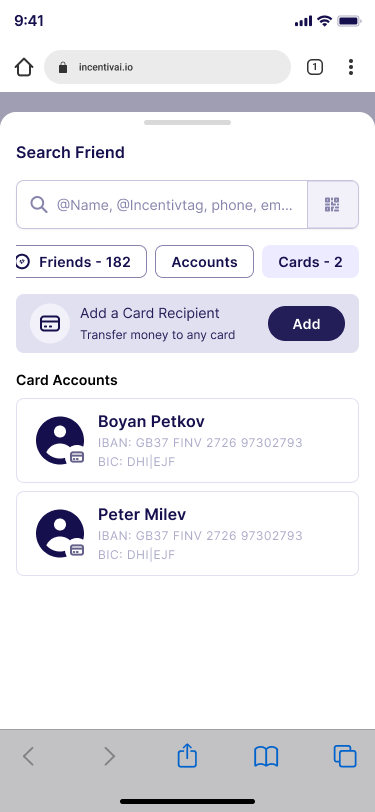
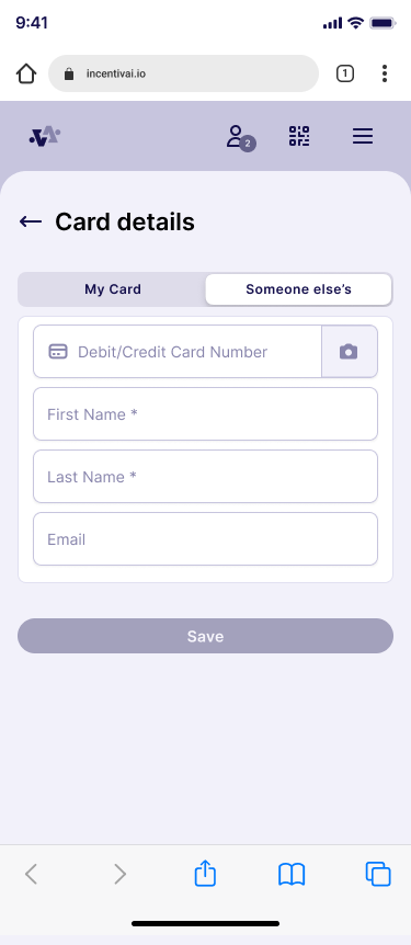
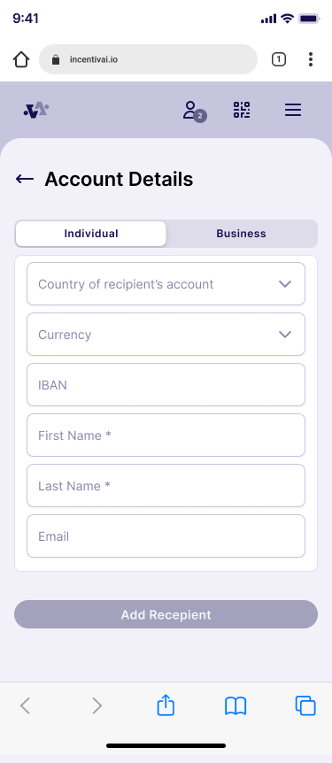
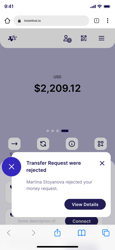
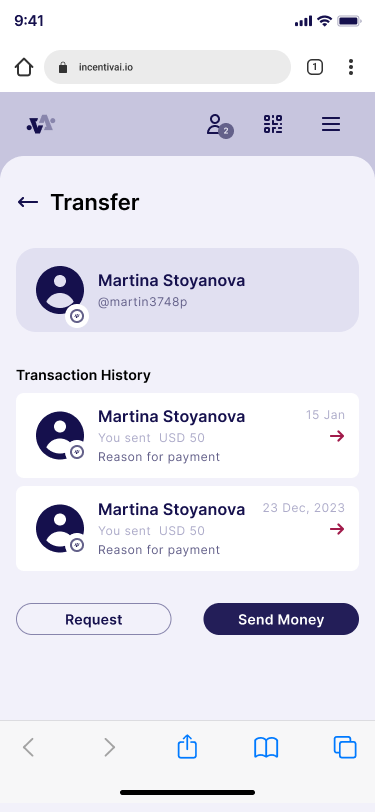
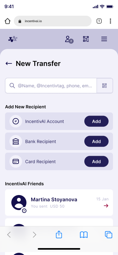
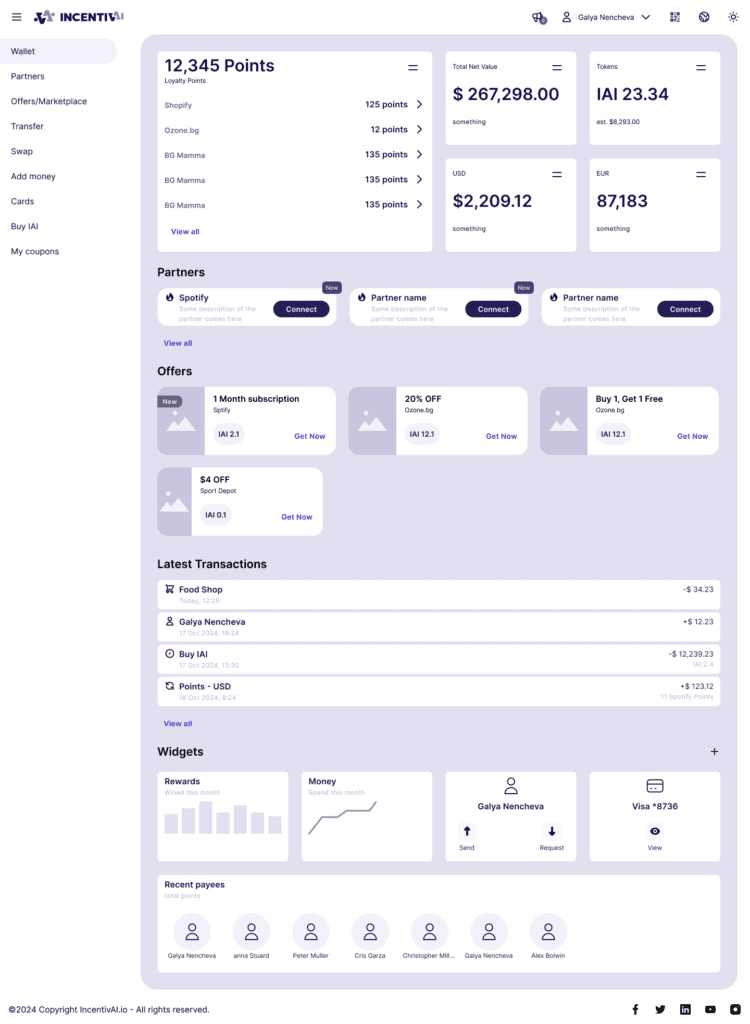
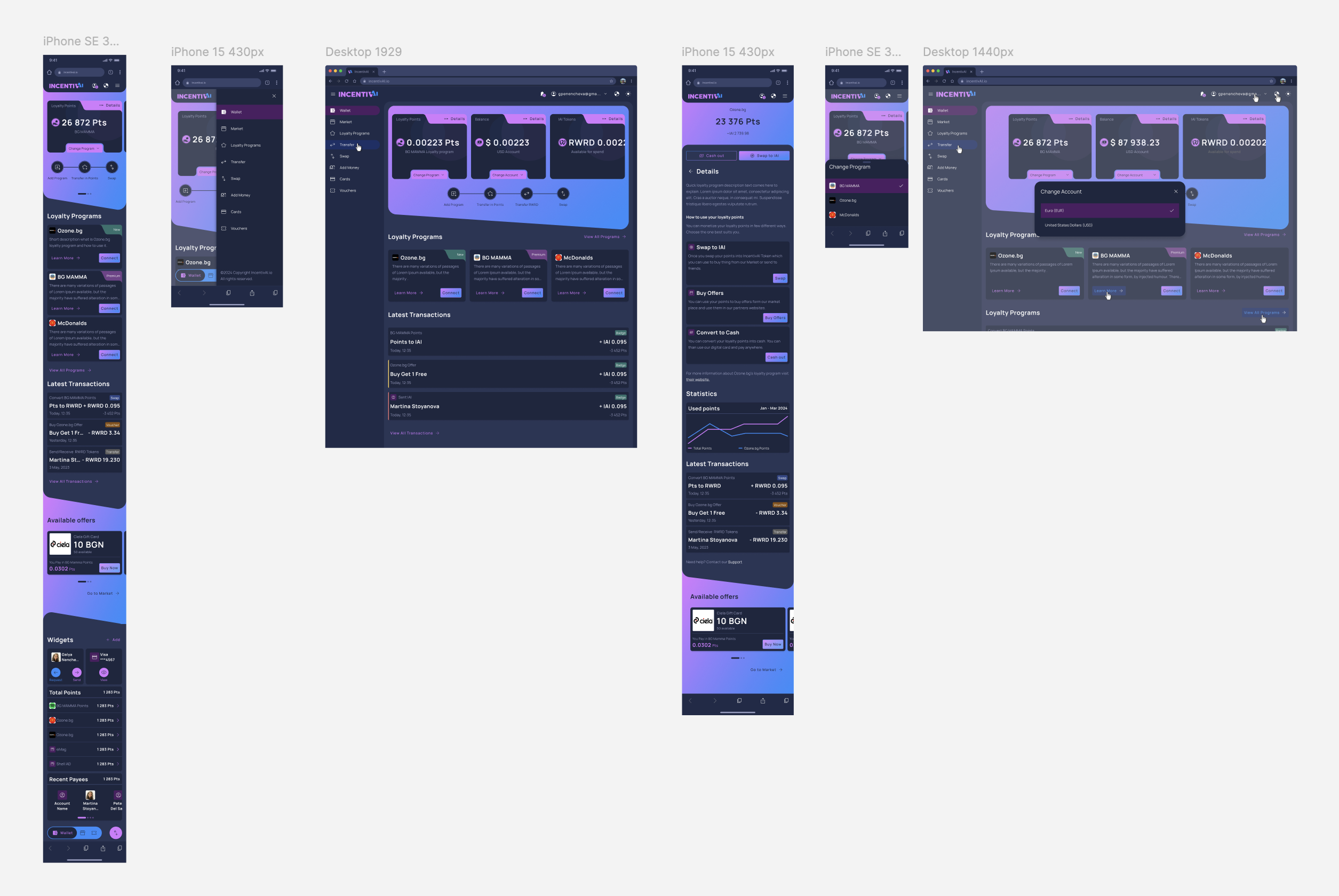
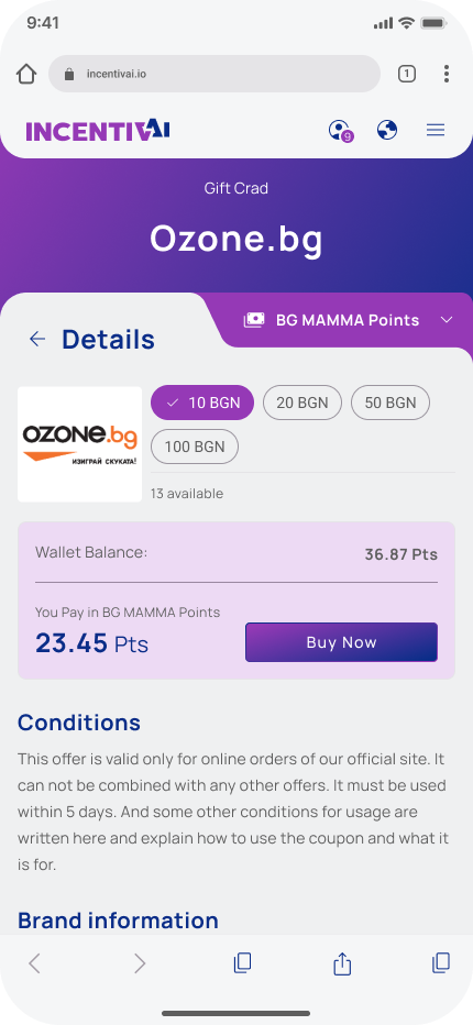
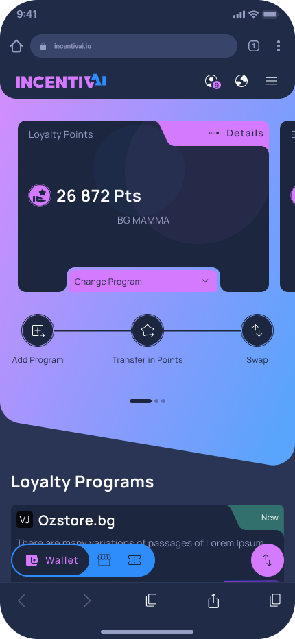
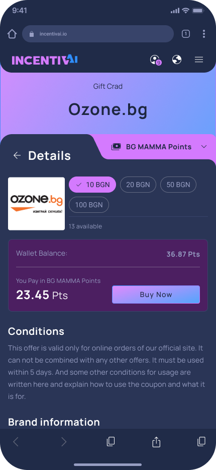
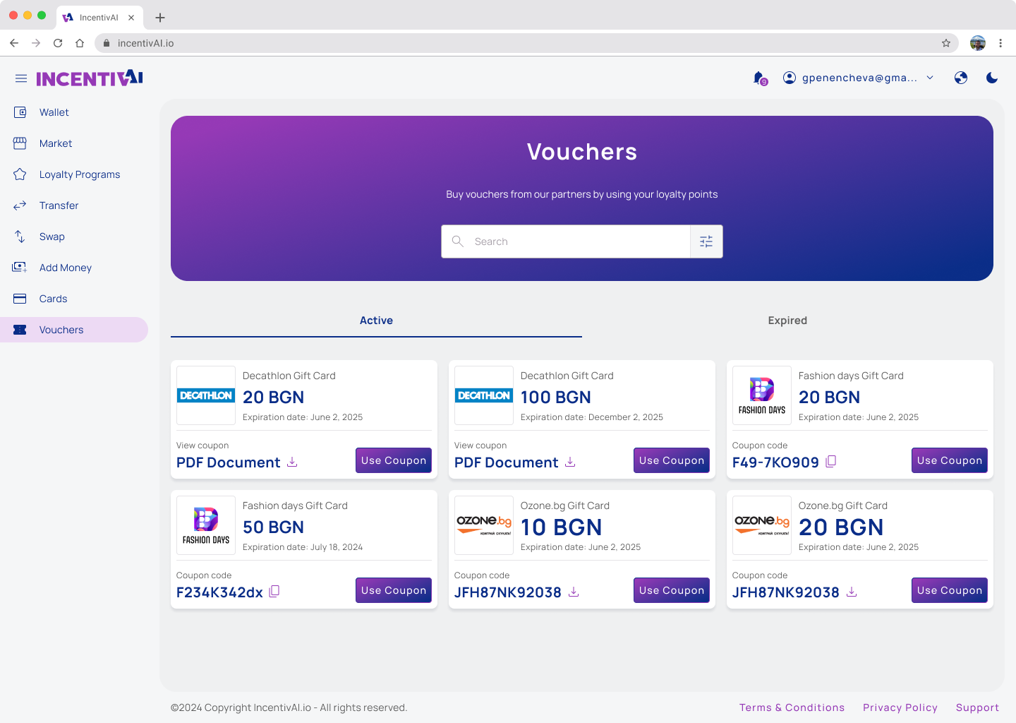
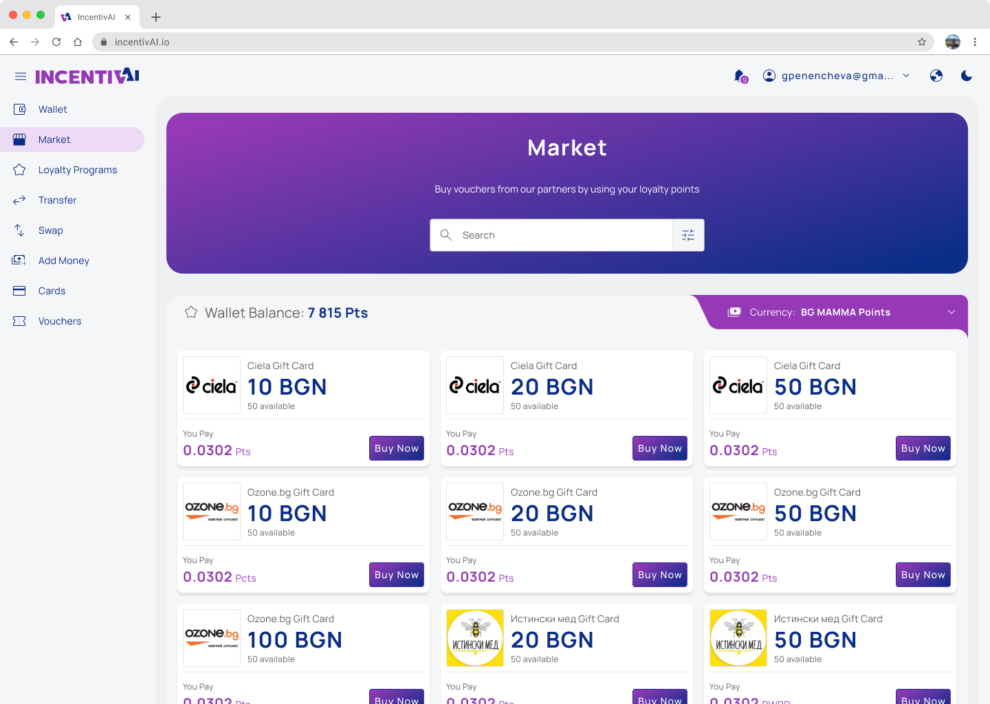
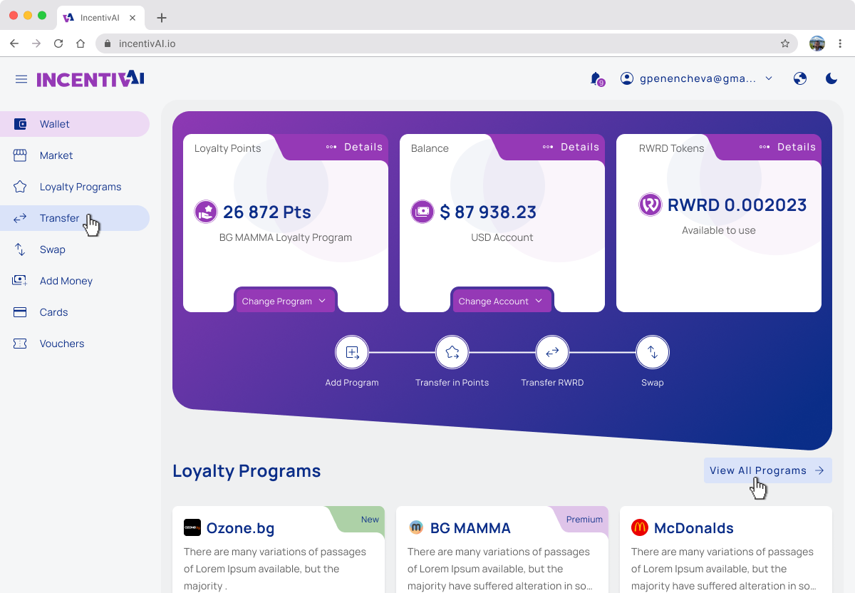
Mockups
After we clarified the core functionality we wanted to launch in the MVP and conducted tests, we had a clear vision of how the application should look and feel for optimal usability. As I mentioned before, we focused on a mobile-first design, but as a web application, we made sure it looked good on all devices, including large-scale desktops. The biggest challenge we faced was creating a Web3 dApp with the look and feel of a Web2 application, as we needed to onboard completely new users to blockchain technology without causing frustration.
To achieve this, we used cutting-edge technology such as account abstraction, passkeys, and blockchain transactions. At the same time, we ensured the application resembled well-known financial applications, so users would not feel frustrated and would feel familiar with the application from the first look.
Following theWeb3 trends and to cover the accessibility requirements we develop light and dark theme of the application.
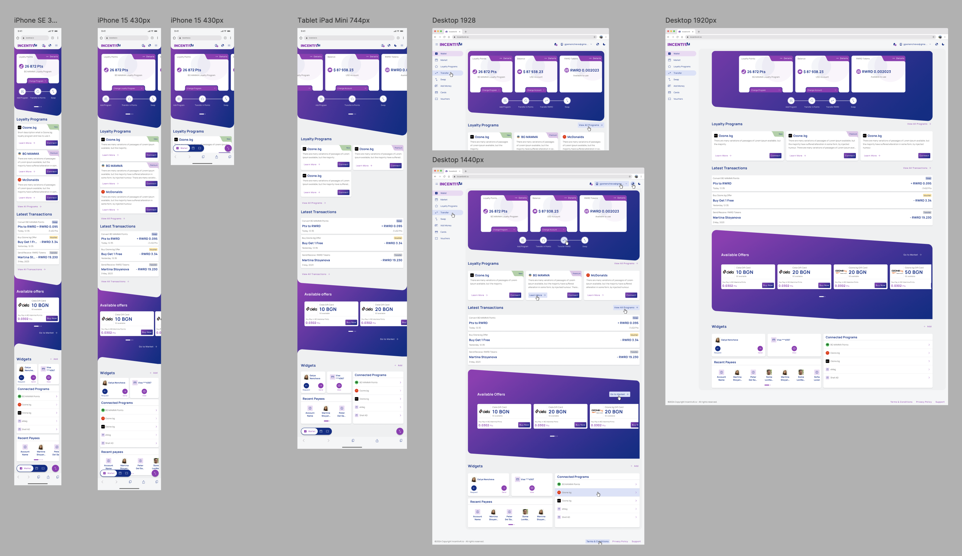
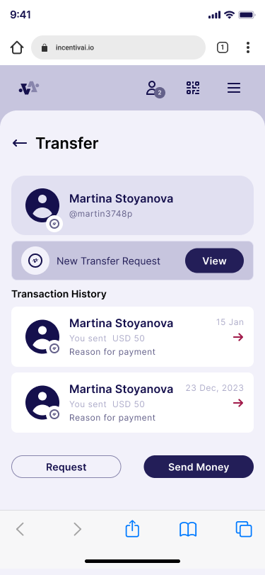
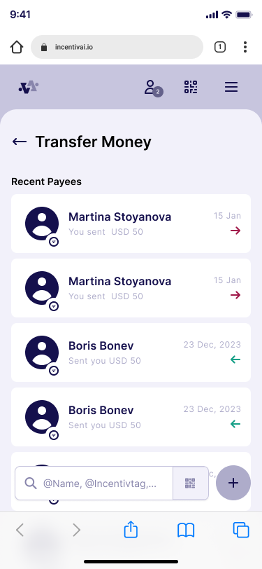
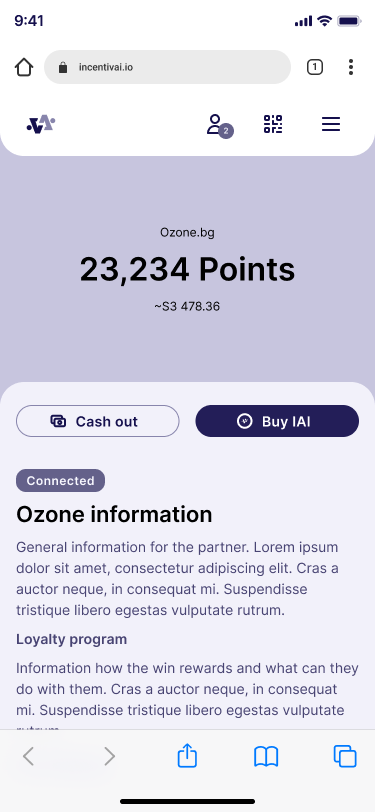
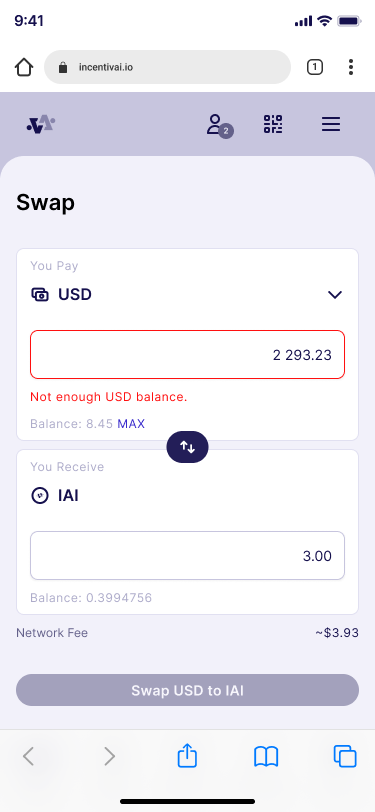
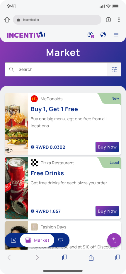
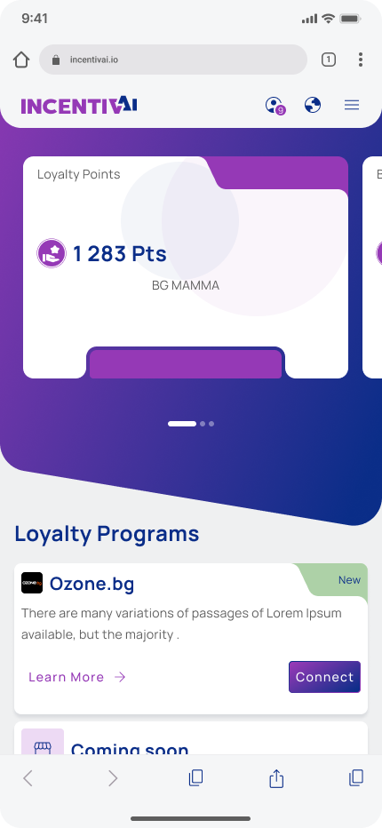
Mobile Mockups


Light & Dark Theme on mobile

Desktop Mockups
Hi-fi Mockups Refinement
During the process of finalizing the UI design, several changes were made from a functionality point of view. During this time, we finalized the tokenomics and the white label of the smart contract, so I had to adjust the design accordingly.
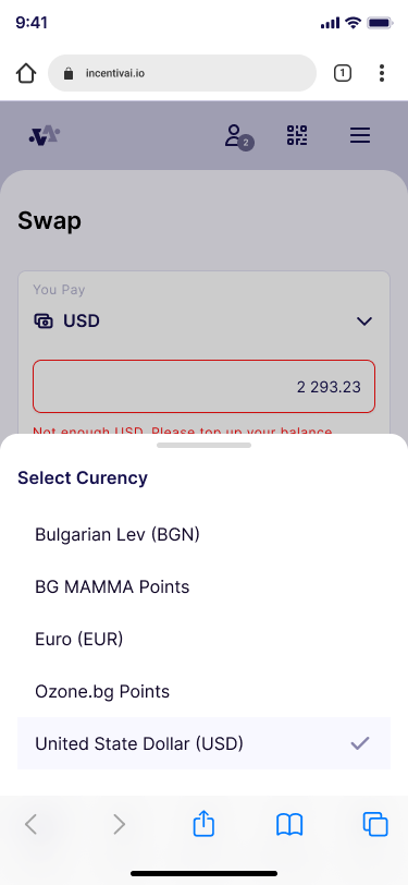
We allowed users to buy digital goods directly with loyalty points without going through RWRD tokens, which simplified the purchasing process but added complexity to the currency selection. Here are some design changes I had to make.
Refinements
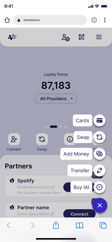
I add a quick buttons in the the wallet page for most used action.
I changed the FAB buttons to open the most common pages.
Add currency selector in the Market page.
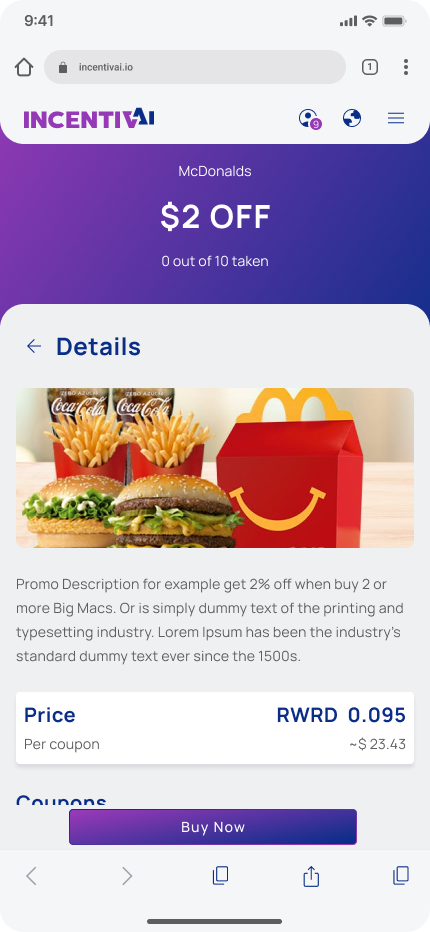
Change th product cards to show price in points and infromation from the partner we choose to use.
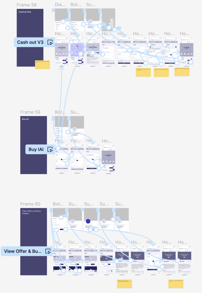
High-fidelity Prototype
The final UI design was converted into a prototype so we could use it for a usability study with real users. In the prototype, we managed to recreate the real user path and the feel of using the application. We realized that to ensure our Web2 users felt comfortable with blockchain swaps and transactions, we had to add an onboarding flow for new users.
We create both prototypes Desktop and Mobile. Desktop that you will see below was used as demo for the Sales pitch to potential partners. The mobile we use for usability study that you will be able to see more information in the section below.
Usability Study
I have conducted a round of usability studies. It was with our real customers from BG Mamma forum – the future users of the application. The results helped us refine the main flows of the application and finalize the overall functionality. They also helped me guide the designs from ideation mockups to final application view. After the round of the study, we make some design adjustments to precisely meet the needs of our future customers.
Research questions
How long does it takes a user to complete the core tasks – average for a task?
Are there parts of the user flow where users get stuck?
Are there more features that users will like to see included in the app?
Do user think the app is easy or difficult to use?
What we can learn from steps that users take to spend their loyalty points?
Key Performance Indicators (KPIs)
- Time on task: how long does it takes the user to register and connect loyalty program; how long does it takes the user to buy a voucher and use it in the partners website; how long does it takes the user to convert points into RWRD and send it to friend.
- Conversion rates: How many users successfully connect loyalty programs; How many users successfully buy voucher; How many users successfully send RWRD to fiends;
- Navigation vs. Quick buttons: percentage of user to see what method they use to go and finish some of the tasks.
- System usability scale (SUS): questions to evaluate the user feedback.
Study Type
Moderated usability study
Location
Bulgaria
Participant
8 participants
Duration
30 minutes
Results
- Complexity: 1.75 – Average difficulty rating for task completion on a scale from 1 to 5
- Time on task: 9 seconds, average time to complete the tasks
- Conversion rate: 100% of users who successfully complete all tasks
- Navigation vs. Quick buttons: 58% Percentage of users who prefer to use quick navigation buttons
- System usability scale (SUS): 4.1 – Positive rating from users who tested the application
- Learning curve: 86% of Users do not experience difficulties during repeated task completion and already know what to do
Usability Study Findings
We conduct one round of usability study based on hi-fidelity mockup design for mobile devices.
Test was focused on the main application functionality, where we aimed to ensure that we covered all aspects of point utilizations. We also wanted to make sure that it was easy to understand and use. We also add some fuctionality that we plan to be post MVP to see if user will like need and understand it. Just to point again that our target users do not have any crypto and blockchain knowedge so it was really importat to se see if they will be able to finish the core tasks. We tested the functionality with eight external users (BG Mamma forum users) who were representative of our target audience.
Observations and design refinements
86% of the users intuitively clicked on the location of the 'Transfer' button during the task for 'Point Exchange'
So we change this button to "Swap" in the MVP application.
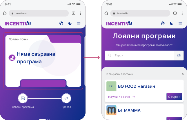
100% of the users intuitively clicked on the card during the task for connecting a loyalty program
Which means that they expect when click on the card to be able to connect new program. So we made the component interactive and clickable.
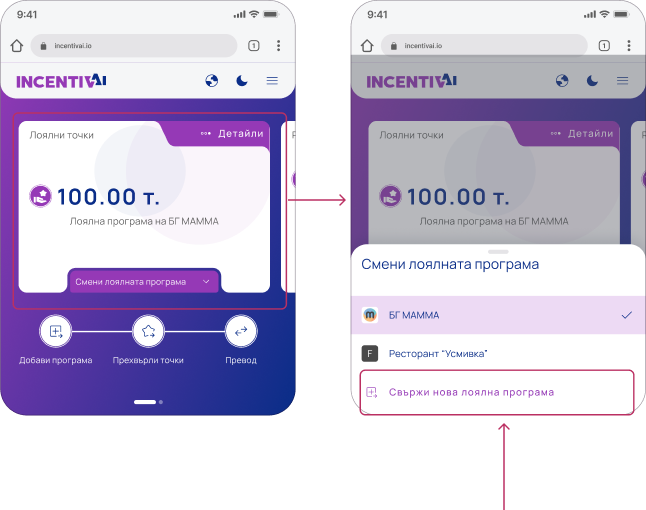
76% of the users intuitively clicked on the card during the task of changing the active loyalty program
Which means that they expect when click on the card to be able to change the active program. So we made the component clickable and to open the bottom sheet with the linked programs.

Accessibility Considerations
I used text buttons and icons to make the action hierarchy clearer and point users to the primary actions they need to take.
To ensure that the cards and brandable components meet contrast standards after branding, we created rules.
We added color-coding for above/under statuses to make it easier for people with low vision to quickly scan the information.
Finally, we refined the font and button sizes for mobile screens.
Documentation
All screens are clearly explained and each button or interaction is visually represented and connected to the event it triggers.
Additionally, the entire design is thoroughly documented in both Confluence and Figma. This enables better cross-team collaboration and provides a record of decision-making and reference to the brief.
Takeaways
Next Steps
Takeaways
Impact
The new application provides users with completely new possibilities to utilize their points and spend them on something truly valuable to them. At the same time, it helps businesses grow customer loyalty by allowing them to use their points in a way that suits them. Companies also benefit of the shared user pool and transparency of the blockchain technology.
What I learned
I have gained deeper knowledge of blockchain technology and the latest cutting-edge tools that help users engage with the Web3 world. I learned that even the most skeptical customers can be onboarded into the crypto world if the UX is designed correctly.
The future lies in merging major retailers. This application is the future!
I liked it. I use other apps with virtual cards, and this one is very intuitive for me. I will use it.
Next Steps
Launch the MVP this August, collect direct user feedback, and analyze it for future improvements.
Create partners portal so they can manage their points pool and RWRD tokens.
Develop partner functionality for staking and managing liquidity pools.
Develop staking and farming functionality to onboard end users into crypto operations.
Expand and enhance current functionality based on user feedback.
Thank you!
Thank you for your time reviewing my work on the IncentivAI Loyalty Hub app! If you’d like to see more or get in touch, my contact information is provided below.